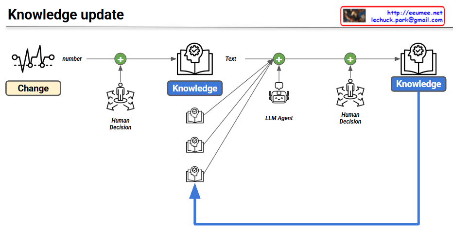
Knowledge update

This image is a workflow diagram illustrating a “Knowledge update” process, demonstrating how artificial intelligence and human collaboration continuously refine a knowledge base.

Image Interpretation:

  • Initial Data and Human Input: The process begins on the far left with a “Change” icon representing data fluctuations. This quantitative data (“number”) flows into the first integration node (+), where a “Human Decision” is applied to formulate the initial block of “Knowledge.”
  • LLM and Knowledge Integration: This foundational knowledge is then passed forward as “Text” to the next processing stage. Here, the workflow incorporates an “LLM Agent” (Large Language Model) alongside multiple existing foundational knowledge sources to enrich and process the information.
  • Final Review and Feedback Loop: The enriched text undergoes a second round of “Human Decision” for final review and validation before being solidified into the final “Knowledge” state. Crucially, a large blue feedback arrow loops from this final “Knowledge” output back to the underlying knowledge sources, illustrating a continuous learning cycle where new updates strengthen the overall system.

Summary

The flowchart maps out a “Human-in-the-loop” AI-driven knowledge management system. It highlights a cyclical process that combines raw data changes, human oversight, and LLM processing capabilities to continuously verify, update, and improve a dynamic knowledge base.

#KnowledgeManagement #ArtificialIntelligence #LLM #Workflow #DataProcessing #AISystems #HumanInTheLoop #KnowledgeUpdate

The 4 Core Pillars of AI Technology

This image is a highly structured infographic titled “4 CORE PILLARS OF AI TECHNOLOGY: A CONTINUOUS CYCLE.” It visually explains the architecture of an AI system and its interaction with humans. Arranged around a central AI engine, four primary domains are connected by dynamic arrows, illustrating a continuous, organic flow of information and feedback.

  1. Center – AI Framework & Reasoning: Situated at the very heart of the diagram as a diamond-shaped core, this represents the “brain” of the AI. It acts as the central hub that ingests data from all pillars, processes it, and generates reasoned outputs.
  2. Bottom Left – Numbers (Core Logic & Telemetry): Decorated with mathematical symbols, binary code, and various charts. This section symbolizes the quantitative foundation of AI—the raw data, understanding of change, and the prediction logic that form the physical and structural core of the system.
  3. Bottom Right – Text (Human Knowledge Base): Illustrated with books, documents, and scrolls. It represents the qualitative foundation: human knowledge, context, and language-based insights. This is how the AI learns to understand the nuances and accumulated wisdom of humanity.
  4. Middle Right – UX Output (Insights & Interface): Depicted as a digital dashboard featuring a robot chatbot icon and data summaries. This domain shows how complex AI computations are translated into user-friendly formats. It provides clear “Key Insights,” “Actionable Steps,” and summaries so humans can easily grasp the results.
  5. Top & Middle Left – Human Control & Data Verification: At the absolute top, a human figure in a suit stands as “The Ultimate Authority.” This highlights the human responsibility in rule setting, adding knowledge, and execution confirmation. On the left side, the imagery of hands meticulously analyzing a clipboard and charts—now clearly labeled “DATA VERIFICATION”—emphasizes the critical, hands-on role humans play in evaluating, auditing, and refining the AI’s output.

📌 Summary

This diagram intuitively maps the operational loop of modern AI: raw “Numbers” (logic) and qualitative “Text” (knowledge) feed into the AI engine, which then translates its findings into a user-friendly “UX Output.” Crucially, it highlights that this entire automated cycle is overseen, verified, and refined by humans. It serves as a powerful reminder that “Human-in-the-loop” remains the ultimate authority and the indispensable final step in ensuring AI reliability.

#AITechnology #ArtificialIntelligence #DataVerification #HumanInTheLoop #UXDesign #DataScience #TechTrends #AIInfographic

With Gemini

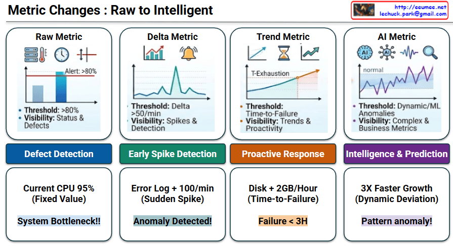
Metric Changes : Raw to Intelligent

This image, titled “Metric Changes : Raw to Intelligent,” illustrates the evolution of IT system monitoring and data analysis across four progressive stages. Moving from left to right, it demonstrates how systems transition from basic, reactive alert mechanisms to smart, predictive operations.

Stage-by-Stage Description

  • Stage 1: Raw Metric
    • Concept: This is the most fundamental monitoring method. It relies on a static, fixed threshold (e.g., Alert: >80%). The primary focus is on basic visibility regarding current status and defects.
    • Goal: Defect Detection
    • Example: If the current CPU usage hits a fixed value of 95%, the system immediately flags it as a “System Bottleneck!!”
  • Stage 2: Delta Metric
    • Concept: Moving beyond static numbers, this stage monitors the rate of change (Delta). It tracks how rapidly a metric fluctuates over a specific timeframe (e.g., Delta >50/min) to catch sudden spikes.
    • Goal: Early Spike Detection
    • Example: If error logs experience a sudden spike of +100 per minute, the system recognizes this rapid change and triggers an “Anomaly Detected!” alert.
  • Stage 3: Trend Metric
    • Concept: This stage utilizes historical data to forecast the future. Instead of a hard number, the threshold becomes “Time-to-Failure.” It calculates the trajectory to determine the exact point of resource exhaustion (T-Exhaustion).
    • Goal: Proactive Response
    • Example: By observing that a disk is filling up at a rate of +2GB/Hour (Time-to-Failure), the system proactively warns that a “Failure < 3H” (failure in less than 3 hours) is imminent.
  • Stage 4: AI Metric
    • Concept: The most advanced stage, utilizing Machine Learning (ML) and Artificial Intelligence. It establishes dynamic thresholds by learning what a “normal” baseline looks like, enabling it to detect complex anomalies and deviations from standard business metrics.
    • Goal: Intelligence & Prediction
    • Example: If a metric exhibits 3X Faster Growth—which acts as a Dynamic Deviation from its learned normal state—the AI intelligently diagnoses it as a “Pattern anomaly!”

📝 Summary

This infographic perfectly visualizes the roadmap of monitoring systems. It highlights the paradigm shift from merely reacting to fixed thresholds, to understanding rates of change and future trends, and ultimately utilizing AI for dynamic, autonomous prediction and intelligent anomaly detection.

#DataAnalysis #SystemMonitoring #AIOps #ArtificialIntelligence #MachineLearning #AnomalyDetection #TrendAnalysis #ITInfrastructure

With Gemini

LLM Evaluations

The provided image is a flowchart diagram titled “LLM Evaluations.” It visually describes the workflow for evaluating an AI Agent’s responses and the iterative process of tuning prompts.

Here is a step-by-step description of the diagram’s flow:

  • Input Stage:
    • On the left side, there is a green block labeled “Question (Prompt).”
    • Below it, several supporting elements are listed: EVENT LOG, Config, Metrics, and Manual + @. These elements are grouped together within a light blue background, indicating they are all part of the prompt engineering or configuration process.
  • Processing Stage:
    • An arrow points from the input section to the central purple block labeled “AI Agent,” which features a cute, smiling robot icon underneath it. This shows the prompt being fed into the AI system.
  • Output & Evaluation Stage:
    • The AI Agent’s output travels via an arrow to a green block on the right labeled “Agent response Summary & Analysis.”
    • This response is directly compared (indicated by a black “VS” badge) against a grey block labeled “Answer Sheet.”
    • Attached to the “VS” badge is a blue circle that reads “By Another Agent.” This signifies that the comparative evaluation between the AI’s response and the correct answer sheet is performed automatically by a secondary AI agent.
  • Scoring & Feedback Stage:
    • The result of the comparison flows down into a large, burgundy circle labeled “SCORE.”
    • At the bottom left, there is a light blue circle labeled “Tuning Prompt.” A dashed purple arrow connects this circle directly to the “SCORE” circle, accompanied by the text “To get more .” This illustrates a feedback loop where prompts are iteratively tuned and improved to achieve better evaluation scores.
  • Additional Details:
    • In the top right corner, there is a small box containing a URL ([http://eeumee.net](http://eeumee.net)) and an email address (lechuck.park@gmail.com), likely indicating the creator or source of the diagram.

📝 Summary

This diagram illustrates the lifecycle of an automated LLM evaluation system. It shows how a prompt is processed by a primary AI agent, how the resulting response is evaluated against a golden answer sheet by a secondary AI agent to generate a score, and how that score drives the continuous tuning of the original prompt for better performance.This diagram illustrates the lifecycle of an automated LLM evaluation system. It shows how a prompt is processed by a primary AI agent, how the resulting response is evaluated against a golden answer sheet by a secondary AI agent to generate a score, and how that score drives the continuous tuning of the original prompt for better performance.

#LLM #AIAgent #PromptEngineering #LLMEvaluation #ArtificialIntelligence #PromptTuning #AIWorkflow

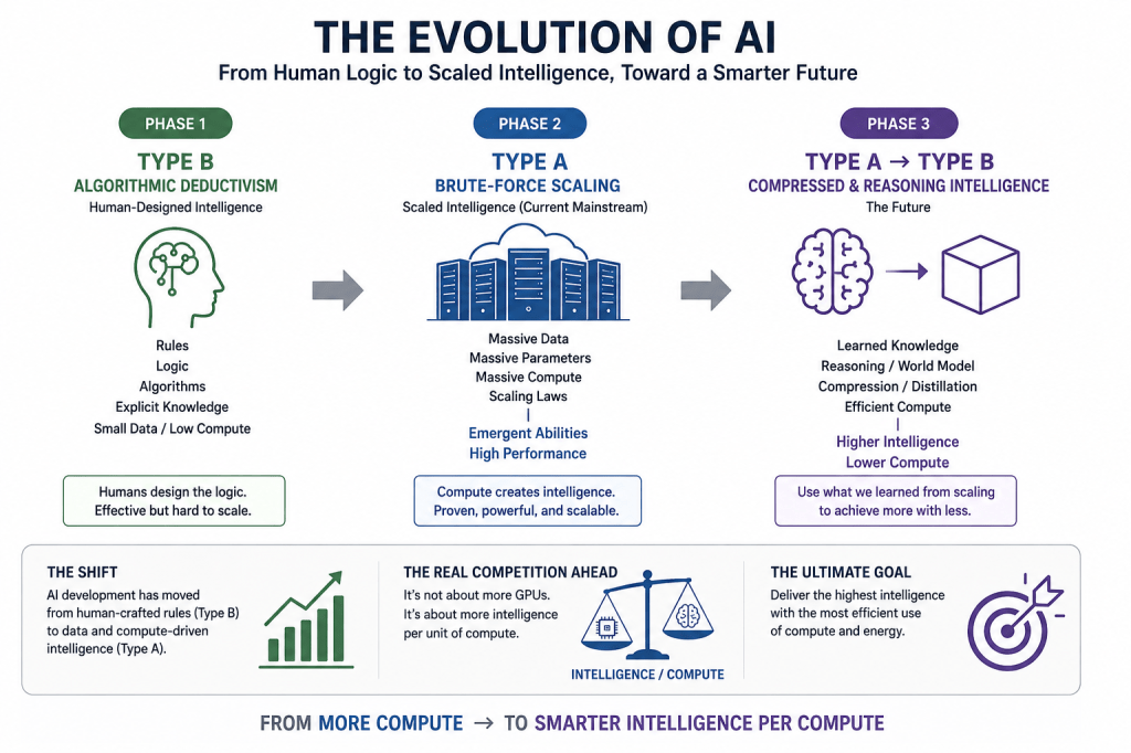
“New Type” Evolution

From human-designed rules → massive compute → efficient intelligence.

  • Type B: Humans design rules and algorithms.
  • Type A: More data + more compute → stronger AI.
  • Type A → Type B: Learn from massive scaling, then compress intelligence to achieve more with less.
  • Future Goal: Higher Intelligence / Lower Compute

#AI #ArtificialIntelligence #LLM #AIScaling #AIReasoning #AIInfrastructure #ComputeEfficiency #FutureOfAI

With ChatGPT

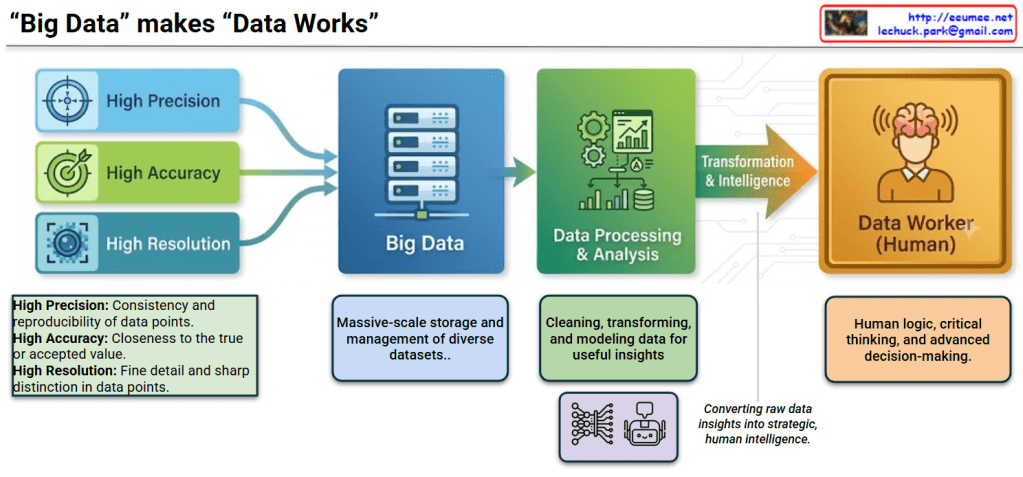
“Data” makes “Data Works”

The image illustrates the workflow of data processing and utilization under the title “Data” makes “Data Works”. It breaks down the journey from raw data input on the left to human decision-making on the right into four distinct stages.

📊 Detailed Image Breakdown

Step 1: Data Attributes (Input Stage) On the far left, three essential attributes of high-quality data are shown feeding into the Big Data system:

  • High Precision: Represented by a crosshair icon, this refers to the consistency and reproducibility of data points.
  • High Accuracy: Represented by a dart hitting a bullseye, indicating the closeness of data to the true or accepted value.
  • High Resolution: Represented by a camera lens icon, meaning fine detail and sharp distinction in data points.

Step 2: Big Data (Storage & Management)

  • Depicted by a server rack icon, this stage represents the destination for the high-quality inputs.
  • It highlights the massive-scale storage and management of diverse datasets.

Step 3: Data Processing & Analysis

  • Illustrated with gears and charts, this phase involves cleaning, transforming, and modeling data to extract useful insights.
  • The neural network and robot icons below this box suggest the heavy involvement of AI, automation, and machine learning in processing the data.

Step 4: Transformation & Intelligence ➔ Data Worker (Human)

  • An arrow labeled “Transformation & Intelligence” bridges the gap between machines and humans, with a note stating it is “Converting raw data insights into strategic, human intelligence.”
  • The workflow culminates at the Data Worker (Human), represented by a person with a glowing brain. This emphasizes that human logic, critical thinking, and advanced decision-making are the ultimate goals and necessities, even with advanced data systems.

📝 Summary

This diagram illustrates the comprehensive workflow of modern data science. It shows how highly precise, accurate, and high-resolution data is collected into Big Data systems, processed and modeled using analytical and AI tools, and ultimately transformed into actionable intelligence that empowers a human Data Worker to apply critical thinking and make strategic decisions.

#BigData #DataAnalysis #DataScience #ArtificialIntelligence #DataWorker #DecisionMaking #DataVisualization

With Gemini

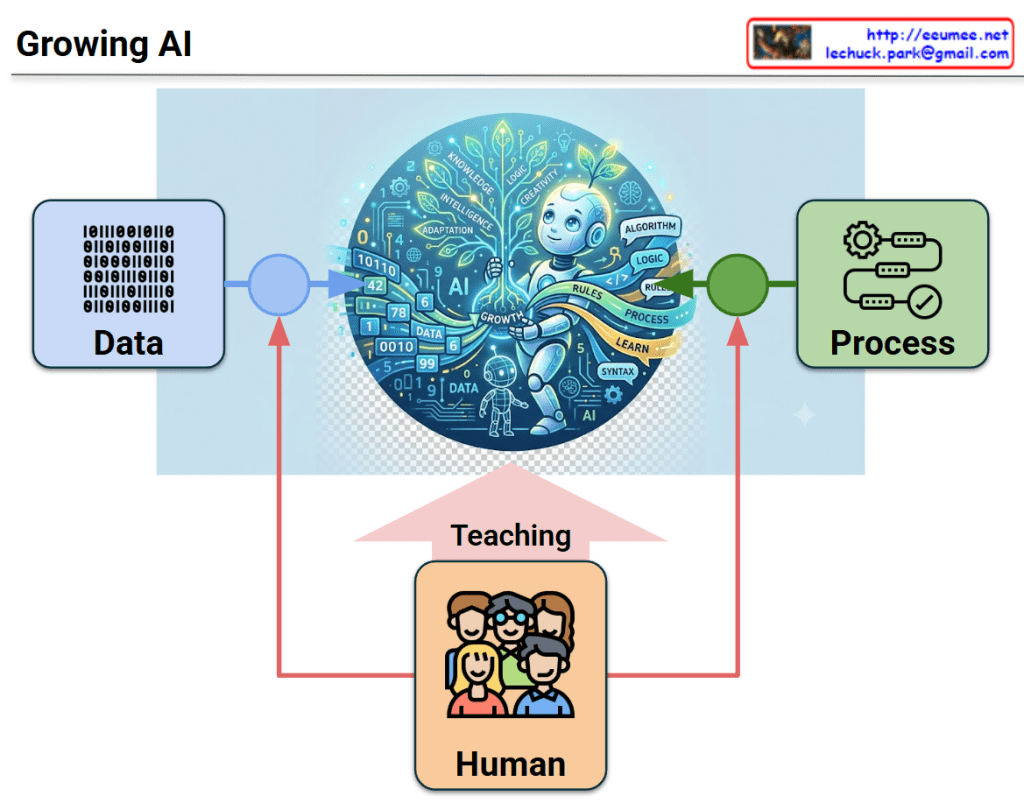
Growing AI

This image titled “Growing AI,” is an infographic that visually explains the fundamental components required for artificial intelligence to learn and develop.

Description of Key Components:

  • Central Illustration (The Growing AI): At the center of the circular graphic, a child-like robot is shown nurturing a glowing, digital tree. The branches and surrounding space are filled with words like ‘KNOWLEDGE’, ‘CREATIVITY’, ‘LOGIC’, ‘DATA’, and ‘ALGORITHM’. This illustrates the AI expanding its intelligence and growing in multiple dimensions.
  • Data: The light blue box on the left contains binary code (1s and 0s). This represents the raw information and foundational material required for the AI to learn, with an arrow pointing directly toward the central AI.
  • Process: The light green box on the right features gears and a workflow icon. This symbolizes the algorithms, rules, and computational steps used to process the information, which also feeds into the central AI.
  • Human & Teaching: The orange box at the bottom depicts a group of people. Red lines originating from the ‘Human’ box intersect the arrows coming from both ‘Data’ and ‘Process’. This indicates human mediation, control, and involvement in managing inputs and algorithms. Furthermore, a large pink arrow pointing from the humans directly to the AI is labeled “Teaching,” emphasizing that human guidance and education are the most critical foundation for AI development.

📝 Summary

This image conveys the message that Artificial Intelligence does not evolve solely through raw Data and technical Processes. Instead, it truly flourishes into a knowledgeable and creative entity (a “Growing AI”) only when it is guided and shaped by the continuous Teaching and involvement of Humans.

#ArtificialIntelligence #AILearning #DataProcessing #HumanCenteredAI #MachineLearning #GrowingAI #TechAndHumanity #AIEducation