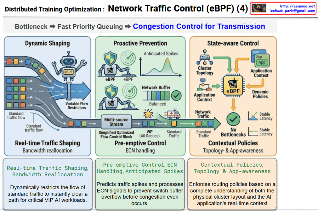
New, New, New

Analysis and Interpretation of the Business Transformation Roadmap

This diagram provides a comprehensive visualization of how modern business is shaped by rapid technological and environmental shifts. It illustrates a cause-and-effect relationship, moving from changes to challenges, and ultimately to new business value.

The diagram is structured with a detailed, text-based flow at the top and a high-level, visual metaphoric flow at the bottom.

Overall Flow Interpretation

The logical progression is a linear transformation:

1. New Changes -> 2. New Challenges -> 3. New Business Value / New Business

This structure suggests that rapid environmental changes (1) give rise to new risks and challenges (2), which, when successfully overcome, create new business value and models (3).


Detailed Interpretation of the Upper Flow

  1. New Changes:
    • Initiation: The starting point (red box) triggers the entire process.
    • Specificity: It is detailed into three grey boxes that define the nature of modern changes:
      • large-Scale: Defined as “Rapid Capacity Growth” (e.g., cloud computing, massive data increases).
      • High Density: Defined as “Power & Heat Concentration” (e.g., increased server density in data centers).
      • High Volatility: Defined as “Sudden Load & Thermal Spikes” (e.g., unpredictable traffic bursts, unstable operating environments).
  2. New Challenges:
    • The specific changes converge at the ‘New Challenges’ (amber box), indicating that these factors combined create a new set of challenges.
  3. Outcomes (Risks and Opportunities):
    • New challenges produce results in two directions (risk-oriented vs. opportunity-oriented):
    • Risk-Oriented Outcomes: (Red/Orange boxes)
      • Operation Risk: Operational risks that need to be managed.
      • Failure & Loss: Defined as “Availability & SLA (Service Level Agreement) Risk,” highlighting potential negative consequences like service downtime.
    • Opportunity-Oriented Outcomes: (Purple/Violet boxes)
      • Competitive Edge: The strategic advantage gained by overcoming the challenges.
      • Cost Reduction: Defined as “Operating expenditure (Opex) optimization,” pointing towards financial efficiency as an opportunity.
  4. New Business Value:
    • By managing risks, preventing failures, securing a competitive edge, and reducing costs, new business value (purple/magenta box) is generated.
  5. OPS Capability as a Service:
    • The ultimate output is the “OPS Capability as a Service” (white box with text). This signifies that the new business value is realized through a new business model: providing standardized, efficient operational capabilities to external or internal clients as a service.

Detailed Interpretation of the Lower Flow (Visual Metaphors)

The lower section visualizes the same three-stage process using sophisticated isometric icons.

  1. New Changes (City Icon):
    • A complex, intricate city landscape with a handshake, a data cube, and a rocket. This symbolizes the complex and innovative nature of ‘New Changes’, visualizing the text-based changes from above.
  2. New Challenges (Mountain Icon):
    • A sophisticated mountain maze with many pathways. This symbolizes the difficult and exploratory nature of ‘New Challenges’, directly visualizing the central amber box from above.
  3. New Business (Refined City Icon):
    • A city landscape similar to the first, but much more refined and organized. The city looks cleaner and more complete. The rocket is poised for launch. This symbolizes the sophisticated and realized ‘New Business’, visualizing the final “New Business Value” and “Capability as a Service.”

In summary, this diagram is a roadmap showing how a complex interplay of large-scale, high-density, and high-volatility changes creates new operational challenges, but by managing these risks and seizing the opportunities, a company can create new business value and a new “Operations Capability as a Service” business model.


#BusinessTransformation #TechShifts #OperationsManagement #BusinessValue #OperationRisk #SLA #CostOptimization #CompetitiveEdge #CapabilityAsAService #BusinessDiagram #ProcessFlow #ScaleUp #DataCenter #NewBusiness #InnovationRoadmap

With Gemini

PIML(Physics-Informed Machine Learning)

PIML (Physics-Informed Machine Learning) Explained

This diagram illustrates how PIML (Physics-Informed Machine Learning) combines the strengths of physics-based models and data-driven machine learning to create a more powerful and reliable approach.


1. Top: Physics (White-box Model)

  • Definition: These are models where the underlying principles are fully explained by mathematical equations, such as Computational Fluid Dynamics (CFD) or thermodynamic simulations.
  • Characteristics:
    • High Precision: They are very accurate because they are based on fundamental physical laws.
    • High Resource Cost: They are computationally intensive, requiring significant processing power and time.
    • Lack of Real-time Processing: Complex simulations are difficult to use for real-time prediction or control.

2. Middle: Machine Learning (Black-box Model)

  • Definition: These models rely solely on large amounts of training data to find correlations and make predictions, without using underlying physical principles.
  • Characteristics:
    • Data-dependent: Their performance depends heavily on the quality and quantity of the data they are trained on.
    • Edge-case Risks: In situations not covered by the data (edge cases), they can make illogical predictions that violate physical laws.
    • Hard to Validate: It is difficult to understand their internal workings, making it challenging to verify the reliability of their results.

3. Bottom: Physics-Informed Machine Learning (Grey-box Approach)

  • Definition: This approach integrates the knowledge of physical laws (equations) into a machine learning model as mathematical constraints, combining the best of both worlds.
  • Benefits:
    • Overcome Cold Start Problem: By using existing knowledge like mathematical constraints, PIML can function even when training data is scarce, effectively addressing the initial (“Cold Start”) state.
    • High Efficiency: Instead of learning physics from scratch, the ML model focuses on learning only the residuals (real-world deviations) between the physics-based model and actual data. This makes learning faster and more efficient with less data.
    • Safety Guardrails: The integrated physics framework acts as a set of safety guardrails, providing constraints that prevent the model from making physically impossible predictions (“Hallucinations”) and bounding errors to ensure safety.

#AI #PIML #MachineLearning #Physics #HybridAI #DataScience #ExplainableAI #XAI #ComputationalPhysics #Simulation

with Gemini

Event Roll-Up by LLM

The provided image illustrates an AIOps-based event pipeline architecture. It demonstrates how Large Language Models (LLMs) hierarchically roll up and analyze the flood of real-time events occurring within a data center or large-scale IT infrastructure over time.

The core objective here is to compress countless simple alarms into meaningful insights, drastically reducing alert fatigue and minimizing Mean Time To Repair (MTTR). The architecture can be broken down into three main areas:

1. Separation by Purpose (Top Banner)

  • Operation/Monitoring: Encompasses the 1-minute and 1-hour analysis cycles. This zone is dedicated to immediate anomaly detection and real-time incident response.
  • Predictive/Report: Encompasses the 1-week and 1-month analysis cycles. By leveraging accumulated data, this zone focuses on identifying long-term failure trends, assisting with infrastructure capacity planning, and automatically generating weekly or monthly operational reports.

2. N:1 Hierarchical Roll-Up Mechanism (Center Pipeline)

The robot icons (LLM Agents) deployed at each time interval act as summarization engines, merging data from the lower tier and passing it up the chain.

  • Every Minute: The agent collects numerous real-time events (N) and compresses them into a summarized, 1-minute contextual block (1).
  • Every Hour / Week / Month: The agents aggregate multiple analytical outputs (N) from the preceding stage into a single, comprehensive analysis for the larger time window (1).
  • Through this mechanism, granular noise is progressively filtered out over time, leaving only the macroscopic health status and the most critical issues of the entire infrastructure.

3. Context & Knowledge Injection (Bottom Left)

For an LLM to go beyond simple text summarization and accurately assess the actual state of the infrastructure, it requires grounding. These elements provide that crucial context and are heavily injected during the initial (1-minute) analysis phase.

  • Stateful (with Recent History): Instead of treating events as isolated incidents, the system remembers recent context to track the continuity and transitions of system states.
  • CMDB (with topology): By integrating with the Configuration Management Database, the system understands the physical and logical relationships (e.g., power dependencies, network paths) between the alerting equipment and the rest of the infrastructure.
  • Document (Vector DB for RAG): This is a vectorized repository of operational manuals, past incident resolutions, and Standard Operating Procedures (SOPs). Utilizing Retrieval-Augmented Generation (RAG), it feeds specific domain knowledge to the LLM, enabling it to diagnose root causes and recommend highly accurate remediation steps.

In Summary:

This architecture represents a significant leap from traditional rule-based monitoring. It is a highly systematic blueprint designed to intelligently interpret real-time events by powering LLM agents with RAG and CMDB topology context. Ultimately, it paves the way for reducing manual operator intervention and achieving truly autonomous and proactive infrastructure management.


#AIOps #LLM #AgenticAI #RAG #EventRollUp #ITInfrastructure #AutonomousOperations #MTTR #Observability #TechArchitecture

2 GPU Throttling

This image is a Visual Engineering diagram that contrasts the fundamental control mechanisms of Power Throttling and Thermal Throttling at a glance, specifically highlighting the critical impact thermal throttling has on the system.


1. Philosophical and Structural Contrast (Top Section)

The diagram places the two throttling methods side-by-side, clearly distinguishing them not just as similar performance limiters, but as mechanisms with completely different operational philosophies.

  • Left: Power Throttling
    • Operational Boundary: Indicates that this acts as a safety line, keeping the system operating ‘normally’ within its designed power limits.
    • Feedforward Control (Proactive): Specifies that this is a proactive control method that restricts input (power demand) before a negative result occurs, fundamentally preventing the issue from happening.
  • Right: Thermal Throttling
    • Emergency Fallback: Shows that this is not a normal operational state, but a ‘last line of defense’ triggered to prevent physical destruction.
    • Feedback Control (Reactive): Emphasizes that this is a reactive control method that drops clock speeds only after detecting the result (high heat exceeding the safe threshold).

2. Four Fatal Risks of Thermal Throttling (Bottom Tree Structure)

The core strength of the diagram lies in placing the sub-tree structure exclusively under Thermal Throttling. This highlights that this phenomenon goes beyond a simple performance drop, breaking down its complex, detrimental impacts on the infrastructure into four key factors:

  1. Physics & Hardware Degradation: Refers to direct damage to semiconductors (silicon) and the shortening of their lifespan (MTBF) due to the accumulated stress of high heat.
  2. Straggler Effect: Points out the bottleneck phenomenon in environments like distributed AI training. A delay in a single, thermally throttled node drags down the synchronization and data processing speed of the entire cluster.
  3. Thermal Inertia & Thermal Oscillations: Describes the unstable fluctuation of system performance. Because heat does not dissipate instantly (thermal inertia), the system repeatedly drops and recovers clock speeds, causing the performance to oscillate.
  4. Cooling Failure Indicator: Acts as a severe alarm. It implies that the issue extends beyond a hot chip—it indicates that the facility’s infrastructure, such as the rack-level Direct Liquid Cooling (DLC) capacity, has reached its physical limit or experienced an anomaly.

Overall Summary:

The diagram logically and intuitively delivers a powerful core message: “Power Throttling is a normal, proactive control within predictable bounds, whereas Thermal Throttling is a severe, reactive warning at both the hardware and infrastructure levels after control is lost.” It is an excellent piece of work that elegantly structures complex system operations using concise text and layout.

#DataCenter #AIInfrastructure #GPUCooling #ThermalThrottling #PowerThrottling #HardwareEngineering #HighPerformanceComputing #LiquidCooling #SystemArchitecture

Universe : Connected & Changing

The provided image is an intuitive infographic that visualizes the fundamental operating principles of the universe and all things through two key concepts: ‘Connected’ and ‘Changing’.

Here is a detailed breakdown of how this diagram translates complex systemic concepts into a clear visual engineering illustration:

1. Left Section: The Interconnected World (Everything – Connected)

  • Meaning: It illustrates the basic premise that ‘Everything’ in the world does not exist in isolation but is intricately ‘Connected’.
  • Visual Elements: The globe covered by a network and the node structure icon at the top symbolize that not only the physical world, but all elements—including systems, infrastructure, and information—are bound together in an organic network.

2. Center Arrow: Causality (Connection -> Change)

  • Meaning: This represents that the ‘connectivity’ on the left acts as a catalyst, inevitably triggering the phenomena on the right. In other words, because everything is interconnected, interactions are bound to occur, driving the system forward to the next phase.

3. Right Section: The Cycle of Energy and Change (Energy & Changing Loop)

The right side depicts a continuous, dynamic system born from these interactions.

  • Energy: Represented by the orange circles at the top and bottom. The lightning bolt and green circular arrows signify that energy is the underlying driving force of the system—it is never destroyed but continuously flows and transforms.
  • Changing: The central purple area. It combines gear and clock icons, visually explaining that the system operates mechanically or physically upon receiving energy (gears), and its state undergoes continuous transformation over time (clock).
  • Feedback Loop (Large Yellow Arrows): Energy creates change, and that change, in turn, sustains the continuous flow of energy, forming a massive, perpetual feedback loop.

💡 Summary

This diagram effectively structures a complex systems-thinking concept from a visual engineering perspective: “Every element in the universe is connected through a massive network, forming a perpetual system where things continuously interact and change over time, driven by the flow of energy.”

#EverythingIsConnected #EnergyFlow #TechDiagram #ConceptualDesign #Connectivity