DC Data Service Model


DC Data Service Model Overview

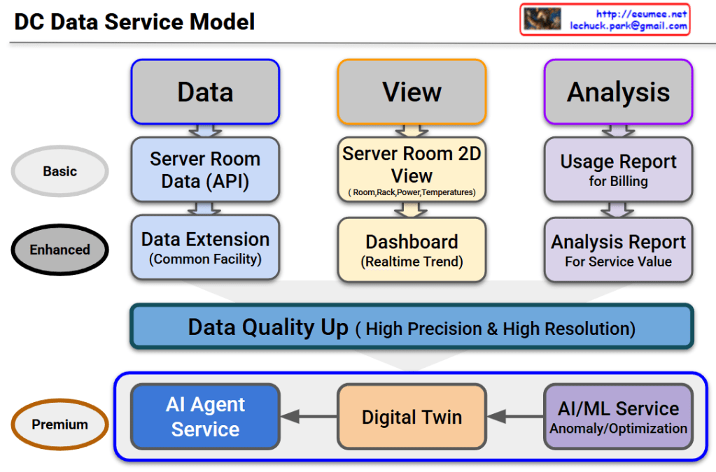
This diagram outlines the evolutionary roadmap of a Data Center (DC) Data Service Model. It illustrates how data center operations advance from basic monitoring to a highly autonomous, AI-driven environment. The model is structured across three functional pillars—Data, View, and Analysis—and progresses through three key service tiers.

Here is a breakdown of the evolving stages:

1. Basic Tier (The Foundation)

This is the foundational level, focusing on essential monitoring and billing.

  • Data: It begins with collecting Server Room Data via APIs.
  • View: Operators use a Server Room 2D View to track basic statuses like room layouts, rack placement, power consumption, and temperatures.
  • Analysis: The collected data is used to generate a basic Usage Report, primarily for customer billing.

2. Enhanced Tier (Real-time & Expanded Scope)

This tier broadens the monitoring scope and provides deeper operational insights.

  • Data: Data collection is expanded beyond the server room to include the Common Facility (Data Extension).
  • View: The user interface upgrades to a dynamic Dashboard that displays real-time operational trends.
  • Analysis: Reporting evolves into an Analysis Report, designed to extract deeper insights and improve overall service value.

3. The Bridge: Data Quality Up

Before transitioning to the ultimate AI-driven tier, there is a critical prerequisite layer. To effectively utilize AI, the system must secure data of High Precision & High Resolution. High-quality data is the fuel for the advanced services that follow.

4. Premium Tier (AI Agent as the Ultimate Orchestrator)

This is the ultimate goal of the model. The updated diagram highlights a clear, sequential flow where each advanced technology builds upon the last, culminating in a comprehensive AI Agent Service:

  • AI/ML Service: The high-quality data is first processed here to automatically detect anomalies and calculate optimizations (e.g., maximizing cooling and power efficiency).
  • Digital Twin: The analytical insights from the AI/ML layer are then integrated into a Digital Twin—a virtual, highly accurate replica of the physical data center used for real-time simulation and spatial monitoring.
  • AI Agent Service: This is the final and most critical layer. The AI Agent does not just sit alongside the other tools; it acts as the central brain. Through this final Agent Service, the capabilities of all preceding services are expanded and put into action. By leveraging the predictive power of the AI/ML models and the comprehensive visibility of the Digital Twin, the AI Agent can autonomously manage, resolve issues, and optimize the data center, maximizing the ultimate value of the entire data pipeline.

#DataCenter #DCIM #AIAgent #DigitalTwin #MachineLearning #ITOperations #TechInfrastructure #FutureOfTech #SmartDataCenter

Predictive Count/Resolve Time for .


the “Predictive Count/Resolve Time” Diagram

This diagram illustrates the workflow of IT Operations or System Maintenance, specifically comparing Predictive Maintenance (Proactive) versus Recovery/Reactive (Reactive) processes.

It is divided into two main flows: the Preventive Flow (Left) and the Reactive Flow (Right).

1. Left Flow: Predictive Maintenance

This represents the ideal process where anomalies are detected and addressed before a full system failure occurs.

  • Process:
    • Work Changes / Monitoring: Routine operations and continuous system monitoring.
    • Anomaly: The system exhibits abnormal patterns, but it hasn’t failed yet.
    • Detection (Awareness): Monitoring tools or operators detect this anomaly.
    • Predictive Maintenance: Maintenance is performed proactively to prevent the fault.
  • Key Performance Indicators (KPIs):
    • Count: The number of times predictive maintenance was performed.
    • PTM Success Rate: A metric to measure success (e.g., considered successful if no disability/failure occurs within 14 days after the predictive maintenance).

2. Right Flow: Reactive Recovery

This is the response process when an anomaly is missed, leading to an actual system failure.

  • Process:
    • Abnormal → Alert: The condition worsens, triggering an alert. The time taken to reach this point is MTTD (Mean Time To Detect).
    • Fault Down: The system actually fails or goes down.
    • Propagation Time (to Experts): The time it takes to escalate the issue to the right experts. This relates to MTTE (Mean Time To Engage Expert).
    • Recovery Time: The time taken by experts to fix the issue.
  • Key Performance Indicators (KPIs):
    • MTTR (Mean Time To Resolve/Repair): The total time from the failure (Fault Down) until the system is fully recovered. Reducing this time is a critical operational goal.

3. Summary & Key Takeaway

The diagram visually emphasizes the importance of “preventing issues before they happen (Left)” rather than “fixing them after they break (Right).”

  • Flow Logic: If an ‘Anomaly’ is successfully ‘Detected’, it leads to ‘Predictive Maintenance’. If missed, it escalates to ‘Abnormal’ and results in a ‘Fault Down’.
  • Goal: The objective is to minimize MTTR (downtime) on the right side and increase the PTM Count (proactive prevention) on the left side to ensure high system availability.

#DevOps #SRE #PredictiveMaintenance #MTTR #IncidentManagement #ITOperations #SystemMonitoring #DisasterRecovery #MTTD #TechMaintenance

With Gemini

AI Workload with Power/Cooling


Breakdown of the “AI Workload with Power/Cooling” Diagram

This diagram illustrates the flow of Power and Cooling changes throughout the execution stages of an AI workload. It divides the process into five phases, explaining how data center infrastructure (Power, Cooling) reacts and responds from the start to the completion of an AI job.

Here are the key details for each phase:

1. Pre-Run (Preparation Phase)

  • Work Job: Job Scheduling.
  • Key Metric: Requested TDP (Thermal Design Power). It identifies beforehand how much heat the job is expected to generate.
  • Power/Cooling: PreCooling. This is a proactive measure where cooling levels are increased based on the predicted TDP before the job actually starts and heat is generated.

2. Init / Ramp-up (Initialization Phase)

  • Work Job: Context Loading. The process of loading AI models and data into memory.
  • Key Metric: HBM Power Usage. The power consumption of High Bandwidth Memory becomes a key indicator.
  • Power/Cooling: As VRAM operates, Power consumption begins to rise (Power UP).

3. Execution (Execution Phase)

  • Work Job: Kernel Launch. The point where actual computation kernels begin running on the GPU.
  • Key Metric: Power Draw. The actual amount of electrical power being drawn.
  • Power/Cooling: Instant Power Peak. A critical moment where power consumption spikes rapidly as computation begins in earnest. The stability of the power supply unit (PSU) is vital here.

4. Sustained (Heavy Load Phase)

  • Work Job: Heavy Load. Continuous heavy computation is in progress.
  • Key Metric: Thermal/Power Cap. Monitoring against set limits for temperature or power.
  • Power/Cooling:
    • Throttling: If “What-if” scenarios occur (such as power supply leaks or reaching a Thermal Over-Limit), protection mechanisms activate. DVFS (Dynamic Voltage and Frequency Scaling) triggers Throttling (Down Clock) to protect the hardware.

5. Cooldown (Completion Phase)

  • Work Job: Job Complete.
  • Key Metric: Power State. The state changes to “Change Down.”
  • Power/Cooling: Although the job is finished, Residual Heat remains in the hardware. Instead of shutting off fans immediately, Ramp-down Control is used to cool the equipment gradually and safely.

Summary & Key Takeaways

This diagram demonstrates that managing AI infrastructure goes beyond simply “running a job.” It requires active control of the infrastructure (e.g., PreCooling, Throttling, Ramp-down) to handle the specific characteristics of AI workloads, such as rapid power spikes and high heat generation.

Phase 1 (PreCooling) for proactive heat management and Phase 4 (Throttling) for hardware protection are the core mechanisms determining the stability and efficiency of an AI Data Center.


#AI #ArtificialIntelligence #GPU #HPC #DataCenter #AIInfrastructure #DataCenterOps #GreenIT #SustainableTech #SmartCooling #PowerEfficiency #PowerManagement #ThermalEngineering #TDP #DVFS #Semiconductor #SystemArchitecture #ITOperations

With Gemini

Operations by Metrics

1. Big Data Collection & 2. Quality Verification

  • Big Data Collection: Represented by the binary data (top-left) and the “All Data (Metrics)” block (bottom-left).
  • Data Quality Verification: The collected data then passes through the checklist icon (top flow) and the “Verification (with Resolution)” step (bottom flow). This aligns with the quality verification step, including ‘resolution/performance’.

3. Change Data Capture (CDC)

  • Verified data moves to the “Change Only” stage (central pink box).
  • If there are “No Changes,” it results in “No Actions,” illustrating the CDC (Change Data Capture) concept of processing only altered data.
  • The magnifying glass icon in the top flow also visualizes this ‘change detection’ role.

4. State/Numeric Processing & 5. Analysis, Severity Definition

  • State/Numeric Processing: Once changes are detected (after the magnifying glass), the data is split into two types:
    • State Changes (ON/OFF icon): Represents changes in ‘state values’.
    • Numeric Changes (graph icon): Represents changes in ‘numeric values’.
  • Statistical Analysis & Severity Definition:
    • These changes are fed into the “Analysis” step.
    • This stage calculates the “Count of Changes” (statistics on the number of changes) and “Numeric change Diff” (amount of numeric change).
    • The analysis result leads to “Severity Tagging” to define the ‘Severity’ level (e.g., “Critical? Major? Minor?”).

6. Notification & 7. Analysis (Retrieve)

  • Notification: Once the severity is defined, the “Notification” step (bell/email icon) is triggered to alert personnel.
  • Analysis (Retrieve):
    • The notified user then performs the “Retrieve” action.
    • This final step involves querying both the changed data (CDD results) and the original data (source, indicated by the URL in the top-right) to analyze the cause.

Summary

This workflow begins with collecting and verifying all data, then uses CDC to isolate only the changes. These changes (state or numeric) are analyzed for count and difference to assign a severity level. The process concludes with notification and a retrieval step for root cause analysis.

#DataProcessing #DataMonitoring #ChangeDataCapture #CDC #DataAnalysis #SystemMonitoring #Alerting #ITOperations #SeverityAnalysis

With Gemini