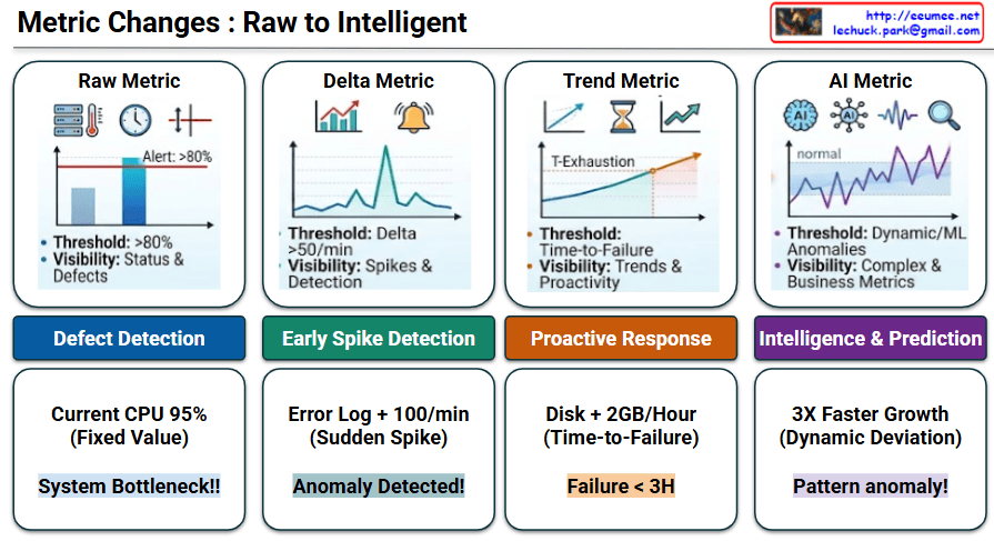
Metric Changes : Raw to Intelligent

This image, titled “Metric Changes : Raw to Intelligent,” illustrates the evolution of IT system monitoring and data analysis across four progressive stages. Moving from left to right, it demonstrates how systems transition from basic, reactive alert mechanisms to smart, predictive operations.

Stage-by-Stage Description

  • Stage 1: Raw Metric
    • Concept: This is the most fundamental monitoring method. It relies on a static, fixed threshold (e.g., Alert: >80%). The primary focus is on basic visibility regarding current status and defects.
    • Goal: Defect Detection
    • Example: If the current CPU usage hits a fixed value of 95%, the system immediately flags it as a “System Bottleneck!!”
  • Stage 2: Delta Metric
    • Concept: Moving beyond static numbers, this stage monitors the rate of change (Delta). It tracks how rapidly a metric fluctuates over a specific timeframe (e.g., Delta >50/min) to catch sudden spikes.
    • Goal: Early Spike Detection
    • Example: If error logs experience a sudden spike of +100 per minute, the system recognizes this rapid change and triggers an “Anomaly Detected!” alert.
  • Stage 3: Trend Metric
    • Concept: This stage utilizes historical data to forecast the future. Instead of a hard number, the threshold becomes “Time-to-Failure.” It calculates the trajectory to determine the exact point of resource exhaustion (T-Exhaustion).
    • Goal: Proactive Response
    • Example: By observing that a disk is filling up at a rate of +2GB/Hour (Time-to-Failure), the system proactively warns that a “Failure < 3H” (failure in less than 3 hours) is imminent.
  • Stage 4: AI Metric
    • Concept: The most advanced stage, utilizing Machine Learning (ML) and Artificial Intelligence. It establishes dynamic thresholds by learning what a “normal” baseline looks like, enabling it to detect complex anomalies and deviations from standard business metrics.
    • Goal: Intelligence & Prediction
    • Example: If a metric exhibits 3X Faster Growth—which acts as a Dynamic Deviation from its learned normal state—the AI intelligently diagnoses it as a “Pattern anomaly!”

📝 Summary

This infographic perfectly visualizes the roadmap of monitoring systems. It highlights the paradigm shift from merely reacting to fixed thresholds, to understanding rates of change and future trends, and ultimately utilizing AI for dynamic, autonomous prediction and intelligent anomaly detection.

#DataAnalysis #SystemMonitoring #AIOps #ArtificialIntelligence #MachineLearning #AnomalyDetection #TrendAnalysis #ITInfrastructure

With Gemini
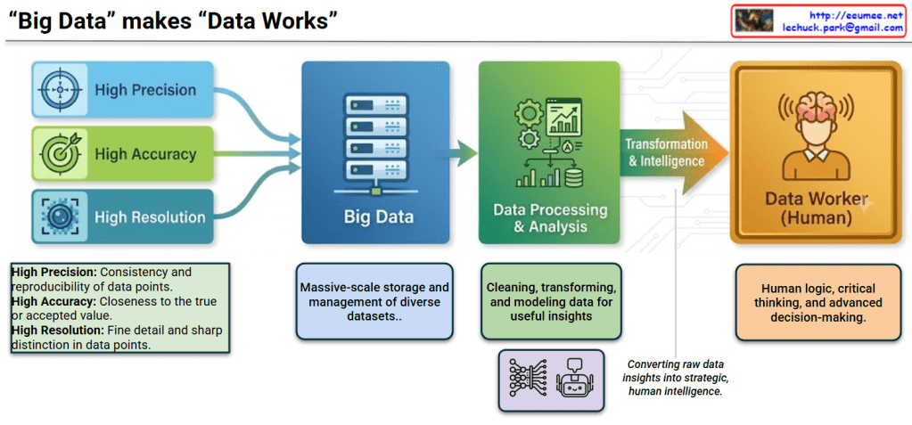
“Data” makes “Data Works”

The image illustrates the workflow of data processing and utilization under the title “Data” makes “Data Works”. It breaks down the journey from raw data input on the left to human decision-making on the right into four distinct stages.

📊 Detailed Image Breakdown

Step 1: Data Attributes (Input Stage) On the far left, three essential attributes of high-quality data are shown feeding into the Big Data system:

  • High Precision: Represented by a crosshair icon, this refers to the consistency and reproducibility of data points.
  • High Accuracy: Represented by a dart hitting a bullseye, indicating the closeness of data to the true or accepted value.
  • High Resolution: Represented by a camera lens icon, meaning fine detail and sharp distinction in data points.

Step 2: Big Data (Storage & Management)

  • Depicted by a server rack icon, this stage represents the destination for the high-quality inputs.
  • It highlights the massive-scale storage and management of diverse datasets.

Step 3: Data Processing & Analysis

  • Illustrated with gears and charts, this phase involves cleaning, transforming, and modeling data to extract useful insights.
  • The neural network and robot icons below this box suggest the heavy involvement of AI, automation, and machine learning in processing the data.

Step 4: Transformation & Intelligence ➔ Data Worker (Human)

  • An arrow labeled “Transformation & Intelligence” bridges the gap between machines and humans, with a note stating it is “Converting raw data insights into strategic, human intelligence.”
  • The workflow culminates at the Data Worker (Human), represented by a person with a glowing brain. This emphasizes that human logic, critical thinking, and advanced decision-making are the ultimate goals and necessities, even with advanced data systems.

📝 Summary

This diagram illustrates the comprehensive workflow of modern data science. It shows how highly precise, accurate, and high-resolution data is collected into Big Data systems, processed and modeled using analytical and AI tools, and ultimately transformed into actionable intelligence that empowers a human Data Worker to apply critical thinking and make strategic decisions.

#BigData #DataAnalysis #DataScience #ArtificialIntelligence #DataWorker #DecisionMaking #DataVisualization

With Gemini

Operations by Metrics

1. Big Data Collection & 2. Quality Verification

  • Big Data Collection: Represented by the binary data (top-left) and the “All Data (Metrics)” block (bottom-left).
  • Data Quality Verification: The collected data then passes through the checklist icon (top flow) and the “Verification (with Resolution)” step (bottom flow). This aligns with the quality verification step, including ‘resolution/performance’.

3. Change Data Capture (CDC)

  • Verified data moves to the “Change Only” stage (central pink box).
  • If there are “No Changes,” it results in “No Actions,” illustrating the CDC (Change Data Capture) concept of processing only altered data.
  • The magnifying glass icon in the top flow also visualizes this ‘change detection’ role.

4. State/Numeric Processing & 5. Analysis, Severity Definition

  • State/Numeric Processing: Once changes are detected (after the magnifying glass), the data is split into two types:
    • State Changes (ON/OFF icon): Represents changes in ‘state values’.
    • Numeric Changes (graph icon): Represents changes in ‘numeric values’.
  • Statistical Analysis & Severity Definition:
    • These changes are fed into the “Analysis” step.
    • This stage calculates the “Count of Changes” (statistics on the number of changes) and “Numeric change Diff” (amount of numeric change).
    • The analysis result leads to “Severity Tagging” to define the ‘Severity’ level (e.g., “Critical? Major? Minor?”).

6. Notification & 7. Analysis (Retrieve)

  • Notification: Once the severity is defined, the “Notification” step (bell/email icon) is triggered to alert personnel.
  • Analysis (Retrieve):
    • The notified user then performs the “Retrieve” action.
    • This final step involves querying both the changed data (CDD results) and the original data (source, indicated by the URL in the top-right) to analyze the cause.

Summary

This workflow begins with collecting and verifying all data, then uses CDC to isolate only the changes. These changes (state or numeric) are analyzed for count and difference to assign a severity level. The process concludes with notification and a retrieval step for root cause analysis.

#DataProcessing #DataMonitoring #ChangeDataCapture #CDC #DataAnalysis #SystemMonitoring #Alerting #ITOperations #SeverityAnalysis

With Gemini