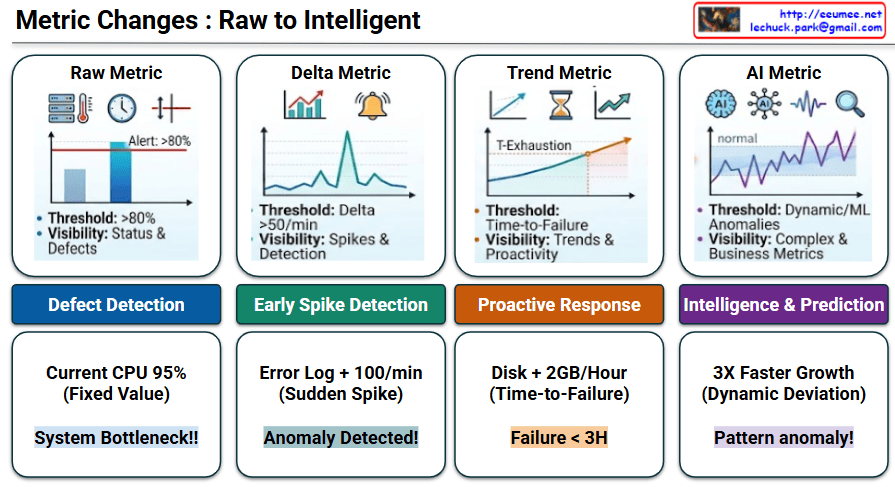
Metric Changes : Raw to Intelligent

This image, titled “Metric Changes : Raw to Intelligent,” illustrates the evolution of IT system monitoring and data analysis across four progressive stages. Moving from left to right, it demonstrates how systems transition from basic, reactive alert mechanisms to smart, predictive operations.

Stage-by-Stage Description

  • Stage 1: Raw Metric
    • Concept: This is the most fundamental monitoring method. It relies on a static, fixed threshold (e.g., Alert: >80%). The primary focus is on basic visibility regarding current status and defects.
    • Goal: Defect Detection
    • Example: If the current CPU usage hits a fixed value of 95%, the system immediately flags it as a “System Bottleneck!!”
  • Stage 2: Delta Metric
    • Concept: Moving beyond static numbers, this stage monitors the rate of change (Delta). It tracks how rapidly a metric fluctuates over a specific timeframe (e.g., Delta >50/min) to catch sudden spikes.
    • Goal: Early Spike Detection
    • Example: If error logs experience a sudden spike of +100 per minute, the system recognizes this rapid change and triggers an “Anomaly Detected!” alert.
  • Stage 3: Trend Metric
    • Concept: This stage utilizes historical data to forecast the future. Instead of a hard number, the threshold becomes “Time-to-Failure.” It calculates the trajectory to determine the exact point of resource exhaustion (T-Exhaustion).
    • Goal: Proactive Response
    • Example: By observing that a disk is filling up at a rate of +2GB/Hour (Time-to-Failure), the system proactively warns that a “Failure < 3H” (failure in less than 3 hours) is imminent.
  • Stage 4: AI Metric
    • Concept: The most advanced stage, utilizing Machine Learning (ML) and Artificial Intelligence. It establishes dynamic thresholds by learning what a “normal” baseline looks like, enabling it to detect complex anomalies and deviations from standard business metrics.
    • Goal: Intelligence & Prediction
    • Example: If a metric exhibits 3X Faster Growthโ€”which acts as a Dynamic Deviation from its learned normal stateโ€”the AI intelligently diagnoses it as a “Pattern anomaly!”

๐Ÿ“ Summary

This infographic perfectly visualizes the roadmap of monitoring systems. It highlights the paradigm shift from merely reacting to fixed thresholds, to understanding rates of change and future trends, and ultimately utilizing AI for dynamic, autonomous prediction and intelligent anomaly detection.

#DataAnalysis #SystemMonitoring #AIOps #ArtificialIntelligence #MachineLearning #AnomalyDetection #TrendAnalysis #ITInfrastructure

With Gemini
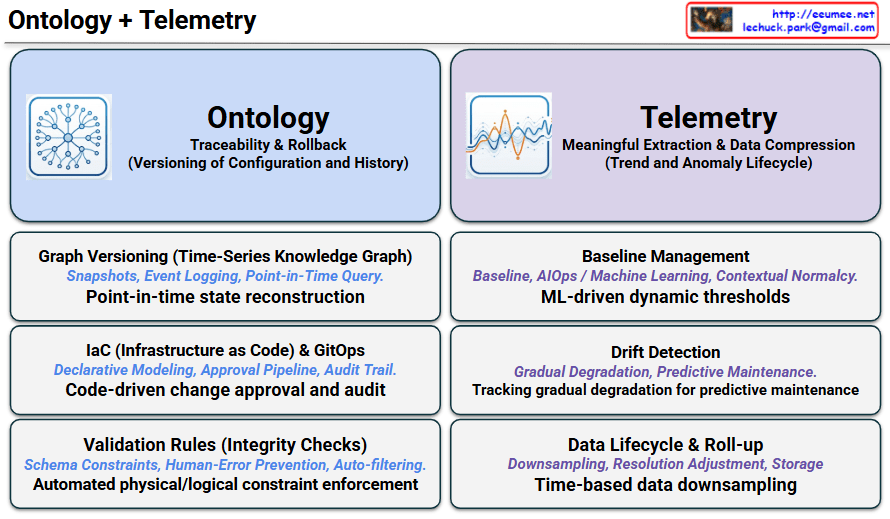
Ontology+Telemetry

The image is titled “Ontology + Telemetry” at the top and is divided into two main columns: a blue-themed section for “Ontology” on the left, and a purple-themed section for “Telemetry” on the right.

1. Left Section: Ontology At the top left, there is an icon of a network graph with connected nodes. The primary focus of this section is “Traceability & Rollback,” which involves the versioning of configuration and history. It details three key components:

  • Graph Versioning (Time-Series Knowledge Graph): Associated with snapshots, event logging, and point-in-time queries. Its main function is “Point-in-time state reconstruction.”
  • IaC (Infrastructure as Code) & GitOps: Focuses on declarative modeling, approval pipelines, and audit trails to enable “Code-driven change approval and audit.”
  • Validation Rules (Integrity Checks): Utilizes schema constraints and auto-filtering to prevent human error, leading to “Automated physical/logical constraint enforcement.”

2. Right Section: Telemetry At the top right, there is an icon depicting line graphs and fluctuating data waves. The primary focus here is “Meaningful Extraction & Data Compression,” managing the lifecycle of trends and anomalies. It also lists three key components:

  • Baseline Management: Uses AIOps and machine learning for contextual normalcy, establishing “ML-driven dynamic thresholds.”
  • Drift Detection: Involves monitoring gradual degradation and enables “Tracking gradual degradation for predictive maintenance.”
  • Data Lifecycle & Roll-up: Deals with downsampling, resolution adjustment, and storage optimization through “Time-based data downsampling.”

๐Ÿ’ก Summary
This infographic outlines a comprehensive framework for managing modern IT infrastructure and data centers. It contrasts and combines two essential pillars: “Ontology,” which handles the static configuration, tracing structural changes and rollbacks, and “Telemetry,” which processes dynamic operational metrics to extract meaningful trends and predict anomalies.

#Ontology #Telemetry #ITInfrastructure #DataCenterManagement #AIOps #ConfigurationManagement #PredictiveMaintenance #GitOps

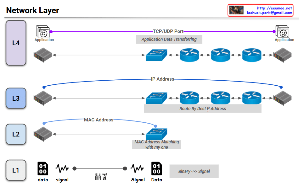
Network : Road to the peer

The provided image is a diagram that visually explains the roles and addressing schemes used by the lower four layers (L1 to L4) of a network model during data communication. Here is a detailed breakdown of each layer shown in the image:

  • L4 (Transport Layer):
    • A purple line illustrates the logical end-to-end connection between Applications on the source and destination servers.
    • It uses TCP/UDP Port numbers to identify the specific application receiving the data, handling “Application Data Transferring.”
  • L3 (Network Layer):
    • A blue line represents the logical connection from the source host to the destination host across the network.
    • It utilizes the IP Address, where intermediate routers perform routing to find the best path to the destination (“Route By Dest IP Address”).
  • L2 (Data Link Layer):
    • A light blue line demonstrates node-to-node communication between directly connected devices (e.g., a server and a switch).
    • It uses the MAC Address for local delivery, ensuring the destination MAC address matches the device’s own hardware address (“MAC Address Matching with my one”).
  • L1 (Physical Layer):
    • This layer depicts the conversion between digital information and physical transmission mediums.
    • It shows how binary data (“01 00 data”) is translated into electrical, light, or radio waveforms (“signal”) and vice versa (“Binary <-> Signal”) over cables or wireless antennas.

๐Ÿ“ Summary

This image is an excellent educational visualization that breaks down how data travels across network devices (servers, switches, routers). It intuitively maps out the specific protocols and addressing systems applied at each level: L1 (Physical Signals) -> L2 (MAC Addresses) -> L3 (IP Addresses) -> L4 (Port Numbers).This image is an excellent educational visualization that breaks down how data travels across network devices (servers, switches, routers). It intuitively maps out the specific protocols and addressing systems applied at each level: L1 (Physical Signals) -> L2 (MAC Addresses) -> L3 (IP Addresses) -> L4 (Port Numbers).

#NetworkLayer #OSIModel #NetworkingBasics #L1toL4 #DataCommunication #TCPIP #ITInfrastructure

With Gemini

CRITICAL RAPID RESPONSE CHALLENGES

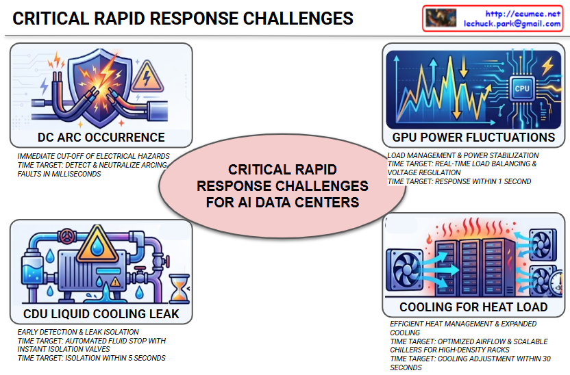
This image is an infographic structured around the central core theme, “CRITICAL RAPID RESPONSE CHALLENGES FOR AI DATA CENTERS,” presented within an oval, under the general title “CRITICAL RAPID RESPONSE CHALLENGES.”

It conveys the crucial message that as AI technology advancements cause data center power densities and heat loads to skyrocket, an extremely rapid response is absolutely essential whenever unexpected equipment failures or hazardous situations occur. Surrounding the central core theme, four specific threat scenarios and their target response times are detailed with corresponding visual icons.It conveys the crucial message that as AI technology advancements cause data center power densities and heat loads to skyrocket, an extremely rapid response is absolutely essential whenever unexpected equipment failures or hazardous situations occur. Surrounding the central core theme, four specific threat scenarios and their target response times are detailed with corresponding visual icons.

  1. DC ARC OCCURRENCE – Top Left:
    • Visual Elements: Powerful sparks (arcs) are flying between electrical cables, with a shield and a warning sign featuring a lightning bolt symbol blocking them.
    • Description: An arc, which is a luminous electrical discharge across a gap in a circuit, poses a severe fire hazard. The infographic calls for an immediate cut-off of electrical hazards and specifically sets a target time to detect and neutralize arcing faults in milliseconds.
  2. GPU POWER FLUCTUATIONS – Top Right:
    • Visual Elements: A combination of a wildly fluctuating line graph, a CPU chip icon labeled ‘CPU’, and a lightning bolt symbol.
    • Description: GPUs performing high-performance AI computations consume massive amounts of power, and consequently, the fluctuations in their power supply are significant. This can lead to system instability. To address this, load management and power stabilization are required, with a target response within 1 second achieved through real-time load balancing and voltage regulation.
  3. CDU LIQUID COOLING LEAK – Bottom Left:
    • Visual Elements: A cooling system (CDU, Coolant Distribution Unit) composed of pipes, a pump, and a tank is actively dripping water droplets, accompanied by a warning triangle and an hourglass icon.
    • Description: A leak in the liquid cooling system used to cool high-density server racks can be fatal to sensitive electronic equipment. Early detection and leak isolation are the top priority, with a target to achieve isolation within 5 seconds by implementing an automated fluid stop with instant isolation valves.
  4. COOLING FOR HEAT LOAD – Bottom Right:
    • Visual Elements: Hot heat icons are rising above multiple server racks, while powerful cooling fans around them are operating to circulate the air.
    • Description: Controlling the immense heat generated by the massive computations of AI servers is a cornerstone of data center operations. There is a need for efficient heat management and expanded cooling systems, with a target to complete a cooling adjustment within 30 seconds through optimized airflow and scalable chillers for high-density racks.

Summary

This infographic highlights four fatal risk factors related to power and thermal management that AI-dedicated data centers face. The key takeaway is the critical need for an extremely rapid, automated response, ranging from milliseconds to tens of seconds, when these issues occur to prevent major catastrophes such as system downtime or fire.This infographic highlights four fatal risk factors related to power and thermal management that AI-dedicated data centers face. The key takeaway is the critical need for an extremely rapid, automated response, ranging from milliseconds to tens of seconds, when these issues occur to prevent major catastrophes such as system downtime or fire.

#AIDataCenter #DataCenterEquipment #RapidResponse #DCArc #GPUPowerFluctuations #LiquidCoolingLeak #HeatLoadManagement #DataCenterSafety #SmartDataCenter #ITInfrastructure

With Gemini

Network Monitoring For Facilities

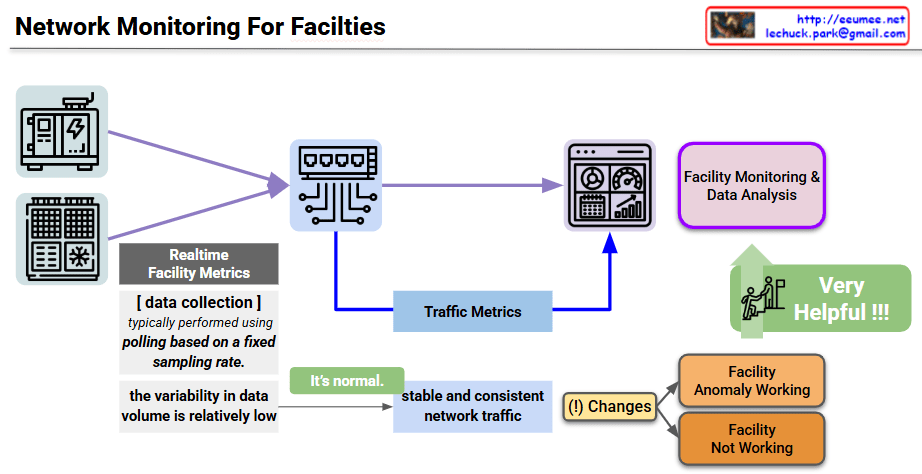
The provided image is a conceptual diagram illustrating how to monitor the status and detect anomalies in critical industrial facility infrastructure (such as power and cooling) through network traffic patterns. I also noticed the author’s information (Lechuck) in the top right corner! Let’s break down the main data flow and core ideas of your diagram step-by-step.

1. Realtime Facility Metrics

  • Target: Physical facility equipment such as generators (power infrastructure) and HVAC/cooling units.
  • Collection Method: A central monitoring server primarily uses a Polling method, requesting and receiving status data from the equipment based on a fixed sampling rate.
  • Characteristics: Because a specific amount of data is exchanged at designated times, the variability in data volume during normal operation is relatively low.

2. Traffic Metrics (Inferring Status via Traffic Characteristics)

This section contains the core insight of the diagram. Beyond just analyzing the payload of the collected sensor data, the pattern of the network traffic itself is utilized as an indicator of the facility’s health.

  • Normal State (It’s normal): When the equipment is operating normally, the network traffic occurs in a very stable and consistent manner in sync with the polling cycle.
  • Detecting Traffic Changes ((!) Changes): If a change occurs in this expected stable traffic pattern (e.g., traffic spikes, response delays, or disconnections), it is flagged as an anomaly in the facility.
  • Status Classification: Based on these abnormal traffic patterns, the system can infer whether the equipment is operating abnormally (Facility Anomaly Working) or has completely stopped functioning (Facility Not Working).

3. Facility Monitoring & Data Analysis

  • This architecture combines standard dashboard monitoring with Traffic Metrics extracted from network switches, feeding them into the data analysis system.
  • This cross-validation approach is highly effective for distinguishing between actual sensor data errors and network segment failures. As highlighted in the diagram, this ultimately improves the overall reliability of the facility monitoring system (Very Helpful !!!).

๐Ÿ’ก Summary

This architecture presents a highly intuitive and efficient approach to data center and facility operations. By leveraging the network engineering characteristic that facility equipment communicates in regular patterns, it demonstrates an excellent monitoring logic. It allows operators to perform initial fault detection almost immediately simply by observing “changes in the consistency of network traffic,” even before conducting complex sensor data analysis.

#NetworkMonitoring #DataCenterOperations #FacilityManagement #TrafficAnalysis #AnomalyDetection #NetworkEngineering #ITInfrastructure #AIOps #SmartFacilities

With Gemini

AI Data Center Operation Platform Layer

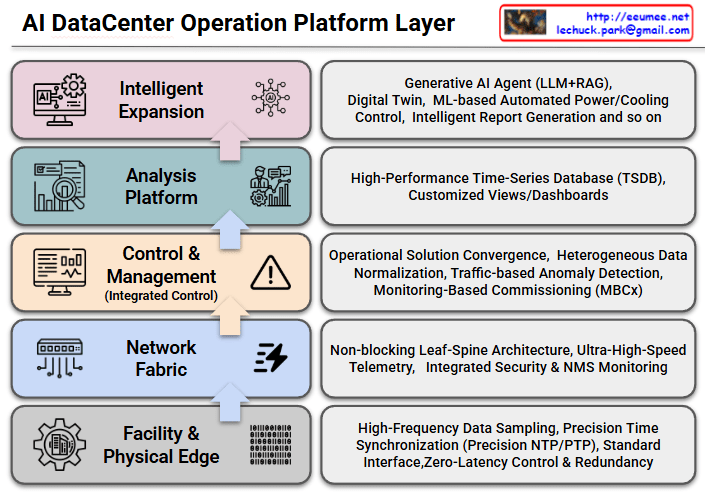
The provided image illustrates the architecture of an AI DataCenter Operation Platform, mapping it out in five distinct stages from the physical foundation layer up to the top-tier artificial intelligence application layer.

The upward-pointing arrows depict the flow of raw data collected from the infrastructure, demonstrating the system’s upward evolution and how the data is ultimately utilized intelligently by AI.

Here is the breakdown of the core roles and components of each layer:

  • Layer 1: Facility & Physical Edge
    • Role: The foundational layer responsible for collecting data and controlling the physical infrastructure equipment of the data center, such as power and cooling systems.
    • Key Elements: High-Frequency Data Sampling, Precision Time Synchronization (Precision NTP/PTP), Standard Interfaces, and Zero-Latency Control & Redundancy. This layer focuses on extracting data and issuing control commands to hardware with extreme speed and accuracy.
  • Layer 2: Network Fabric
    • Role: The neural network of the data center. It reliably and rapidly transmits the massive amounts of collected data to the upper platforms without bottlenecks.
    • Key Elements: Non-blocking Leaf-Spine Architecture, Ultra-High-Speed Telemetry, and Integrated Security & NMS (Network Management System) Monitoring. These elements work together to efficiently handle large-scale traffic.
  • Layer 3: Control & Management (Integrated Control)
    • Role: The layer that integrates and normalizes heterogeneous data streaming in from various facilities and solutions to execute practical operations and management.
    • Key Elements: Operational Solution Convergence, Heterogeneous Data Normalization, Traffic-based Anomaly Detection, and Monitoring-Based Commissioning (MBCx). It acts as a critical gateway to identify infrastructure issues early and improve overall operational efficiency.
  • Layer 4: Analysis Platform
    • Role: The stage where refined data is stored, analyzed, and visualized, allowing administrators to intuitively grasp the system’s status at a glance.
    • Key Elements: Utilizes a High-Performance Time-Series Database (TSDB) to record state changes over time and provides Customized Views/Dashboards for tailored monitoring.
  • Layer 5: Intelligent Expansion
    • Role: The ultimate destination of this platform. It is the highest layer where AI autonomously operates and optimizes the data center, leveraging the well-organized data provided by the lower layers.
    • Key Elements: Generative AI Agent (LLM+RAG), Digital Twin technology, ML-based Automated Power/Cooling Control, and Intelligent Report Generation.

This blueprint clearly demonstrates the overall solution architecture: precisely collecting and transmitting raw data from hardware facilities (Layers 1-2), standardizing, storing, and analyzing that data (Layers 3-4), and ultimately achieving advanced, autonomous operations through intelligent, automatic control of power and cooling systems via a Generative AI Agent (Layer 5).


#AIDataCenter #AIOps #DataCenterManagement #GenerativeAI #DigitalTwin #NetworkFabric #ITInfrastructure #SmartDataCenter #MachineLearning #TechArchitecture

With Gemini

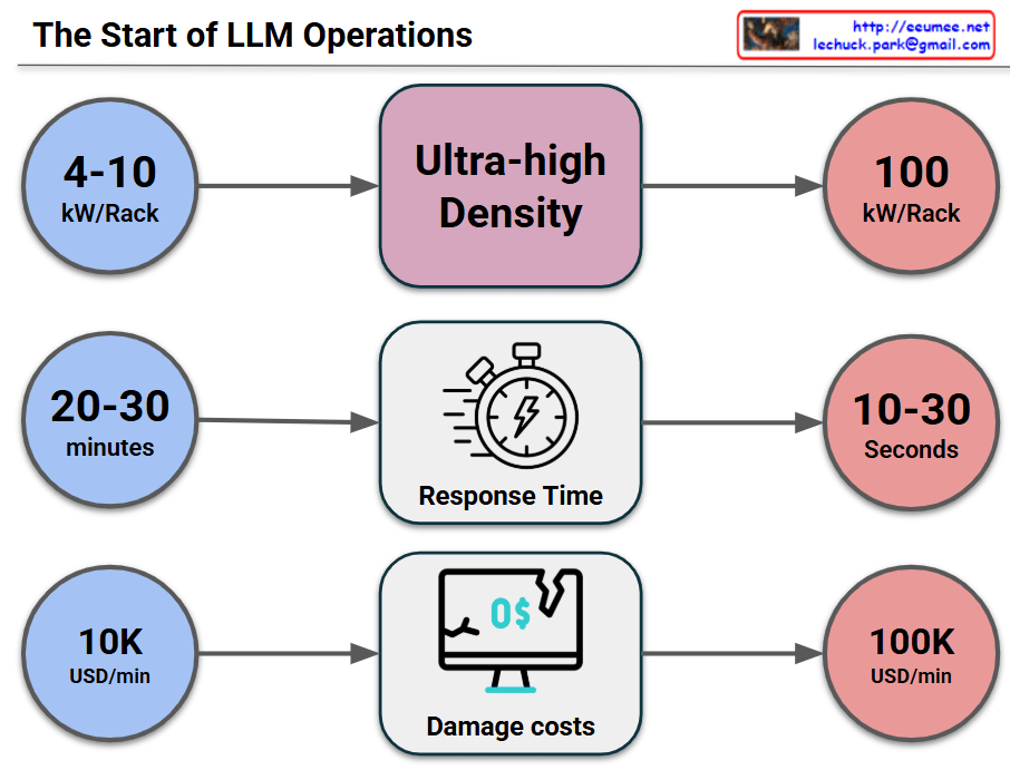
The High Stakes of Ultra-High Density: Seconds to React, Massive Costs

This image visually compares the critical changes and risks that occur when a data center or IT infrastructure transitions to an “Ultra-high Density” environment across three key metrics.

1. Surge in Power Density (Top Row)

  • Past/Standard Environment (Blue): Racks typically operated at a power density of 4-10 kW per Rack.
  • Transition (Middle): The shift toward Ultra-high Density infrastructure (driven by AI, High-Performance Computing, etc.).
  • Current/Ultra-high Density (Red): Power density explodes to 100 kW per Rack, which is a 10-fold increase.

2. Drastic Drop in Response Time (Middle Row)

  • Past/Standard Environment: In the event of a cooling failure or system issue, operators had a comfortable golden window of 20-30 minutes to react before systems went down.
  • Transition: Focusing on the change in Response Time.
  • Current/Ultra-high Density: Due to the massive, instantaneous heat generation, the reaction window plummets to a mere 10-30 seconds. This makes manual human intervention practically impossible.

3. Explosion of Damage Costs (Bottom Row)

  • Past/Standard Environment: The financial loss caused by system downtime was around $10,000 (10K USD) per minute.
  • Transition: Focusing on the change in Damage costs.
  • Current/Ultra-high Density: Because of the high value of the equipment and the critical nature of the data being processed, the cost of downtime skyrockets to $100,000 (100K USD) per minuteโ€”a 10x increase.

๐Ÿ’ก Overall Summary

The core message of this infographic is a strong warning: “In ultra-high density environments reaching 100kW per rack, the window for disaster response shrinks from minutes to mere seconds, while the financial loss per minute multiplies tenfold.” This perfectly illustrates why immediate, automated cooling and response systems (such as liquid cooling or AI-driven automation) are no longer optional, but mandatory for modern data centers.


#DataCenter #UltraHighDensity #HighDensityComputing #ITInfrastructure #Downtime #CostOfDowntime #RiskManagement

With Gemini