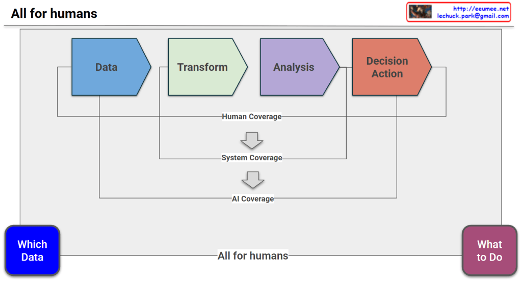
This image is a diagram that visually explains the data processing workflow and how the roles of humans, traditional systems, and AI evolve across this process as technology advances.
- Core Workflow (The Pipeline): At the center of the diagram, there are four chevron-shaped boxes flowing from left to right. They represent the standard steps of data processing: a blue box for “Data,” a green box for “Transform,” a purple box for “Analysis,” and an orange box for “Decision Action”.
- Evolution of Roles (Coverage): Above and below this core flow, there are brackets and downward arrows indicating who or what is responsible for these steps.
- The topmost bracket, “Human Coverage,” shows that historically, humans had to manually handle the entire process from data collection all the way to the final action.
- Following the arrow down, we see “System Coverage.” This illustrates that with traditional IT advancements, systems took over the middle stages—”Transform” and “Analysis”—relieving humans of the manual processing and calculation burdens.
- Following the next arrow down leads to “AI Coverage.” This demonstrates that in the modern era, Artificial Intelligence is capable of covering almost the entire pipeline again, expanding its reach from the initial “Data” stage all the way through to “Decision Action”.
- Core Message: The most profound and central message of this diagram is located at the very bottom. On the far left, there is a blue rounded box labeled “Which Data,” and on the far right, a purple rounded box labeled “What to Do”. A long line connects these two boxes, carrying the phrase “All for humans”.
Summary
This diagram conveys a philosophical message: Even though AI technology has advanced enough to automate the entire data pipeline—from collection through analysis to decision execution—the foundational tasks of defining the problem (“Which Data”) and determining the ultimate goal or value (“What to Do”) remain exclusively human responsibilities.
#DataPipeline #ArtificialIntelligence #AIAutomation #DecisionMaking #HumanRole #DigitalTransformation #DataAnalytics