Metric Data

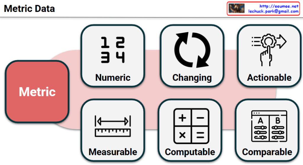
This image visually and intuitively defines the “6 Core Criteria of a Good Metric.” It effectively encompasses both the technical properties of the data itself and its practical value in a business context.

📊 The 6 Core Elements of a Metric

1. Data Foundation

  • Numeric: Represented by the 1 2 3 4 icon. A metric must be expressed as objective, quantifiable numbers rather than subjective feelings or qualitative text.
  • Measurable: Represented by the ruler icon. The data must be accurately collected and tracked using systems, logs, or measurement tools.

2. Data Processing

  • Changing: Represented by the refresh arrows icon. A metric is not a fixed constant; it must dynamically fluctuate over time, environments, or in response to user actions.
  • Computable: Represented by the calculator icon. You should be able to process raw data using mathematical operations (addition, division, ratios) to derive a meaningful value.

3. Business Value

  • Actionable: Represented by the hand adjusting a gear icon. A good metric should not just be “nice to know.” It must drive concrete actions, strategic adjustments, or immediate decision-making to improve a system or service.
  • Comparable: Represented by the A/B panel icon. A metric gains its true meaning when evaluated against past data (e.g., month-over-month), target goals, or different user cohorts (A/B testing) to diagnose current performance.

💡 Summary

Overall, this slide provides an excellent framework that bridges the gap between data engineering (how data is collected and computed) and business strategy (how data drives decisions). It is a highly polished visual guide for defining ideal metrics!

#Metrics #KPI #BusinessIntelligence #DataStrategy #DataEngineering #ActionableInsights

With Gemini

Event Processing Functional Architecture

This image illustrates a Data Processing Pipeline (Architecture) where raw data is ingested, analyzed through an AI engine, and converted into actionable business intelligence.


## Image Interpretation: AI-Driven Data Pipeline

### 1. Input Layer (Left: Data Ingestion)

This represents the raw data collected from various sources within the infrastructure:

  • Log Data (Document Icon): System logs and event records that capture operational history.
  • Sensor Data (Thermometer & Waveform Icons): Real-time monitoring of physical environments, specifically focusing on Thermal (heat) and Acoustic (noise) patterns.
  • Topology Map (Network Icon): The structural map of equipment and their interconnections, providing context for how data flows through the system.

### 2. Integration & Processing (Center: The AI Funnel)

  • The Funnel/Pipe Shape: This symbolizes the process of data fusion and refinement. It represents different data types being standardized and processed through an AI model or analytics engine to filter out noise and identify patterns.

### 3. Output Layer (Right: Actionable Insights)

The final results generated by the analysis, designed to provide immediate value to operators:

  • Root Cause Report (Document with Magnifying Glass): Identifies the underlying reason for a specific failure or anomaly.
  • Step-by-Step Recovery Guide (Checklist with Arrows): Provides a sequential, automated, or manual procedure to restore the system to a healthy state.
  • Predictive Maintenance (Gear with Upward Arrow): Utilizes historical trends to predict potential failures before they occur, optimizing maintenance schedules and reducing downtime.

# Summary

The diagram effectively visualizes the transition from complex raw data to actionable intelligence. It highlights the core value of an AI-driven platform: reducing cognitive load for human operators by providing clear, data-backed directions for maintenance and recovery.


#AI #DataCenter #PredictiveMaintenance #DataAnalytics #SmartInfrastructure #RootCauseAnalysis #DigitalTransformation #OperationsOptimization

With Gemini

Intelligent Event Analysis Framework ( Holistic Intelligent Diagnosis)

This diagram illustrates a sophisticated framework for Intelligent Event Processing, designed to provide a comprehensive, multi-layered diagnosis of system events. It moves beyond simple alerts by integrating historical context, spatial correlations, and future projections.

1. The Principle of Recency-First Scoring (Top Section)

The orange cone expanding toward the Current Events represents the Time-Decay or Recency-First Scoring model.

  • Weighted Importance: While “Old Events” are maintained for context, the system assigns significantly higher weight to the most recent data.
  • Sensitivity: This ensures the AI remains highly sensitive to emerging trends and immediate anomalies while naturally phasing out obsolete patterns.

2. Multi-Dimensional Correlation Search (Box 1)

When a current event is detected, the system immediately executes a Correlation Search across three primary dimensions to establish a spatial and logical context:

  • Device Context: Investigates if the issue is isolated to the same device, related devices, or common device types.
  • Spatial Context (Place): Analyzes if the event is tied to a specific location, a relative area (e.g., the same rack), or a common facility environment.
  • Customer Context: Checks for patterns across the same customer, relative accounts, or common customer profiles.

3. Similarity-Based Pattern Matching (Box 2)

By combining the results of the Correlation Search with the library of “Old Events,” the system performs Pattern Matching with Priorities.

  • This step identifies historical precedents that most closely resemble the current event’s “fingerprint.”
  • It functions similarly to Case-Based Reasoning (CBR), leveraging past solutions to address present challenges.

4. Holistic Intelligent Diagnosis (Green Box)

This is the core engine where three distinct analytical disciplines converge to create an actionable output:

  • ③ Historical Analysis: Utilizes the recency-weighted scores to understand the evolution of the current issue.
  • ④ Root Cause Analysis (RCA): Drills down into the underlying triggers to identify the “why” behind the event.
  • ⑤ Predictive Analysis: Projects the likely future trajectory of the event, allowing for proactive rather than reactive management.

Summary

For the platform, this diagram serves as the “brain” of the operation. It demonstrates how the agent doesn’t just see a single data point, but rather a “Holistic” picture that connects the dots across time, space, and causality.


#DataCenterOps #AI #EventProcessing #RootCauseAnalysis #PredictiveMaintenance #DataAnalytics #IntelligentDiagnosis #SystemMonitoring #TechInfrastructure

with Gemini