A huge distinction

From Claude with some prompting
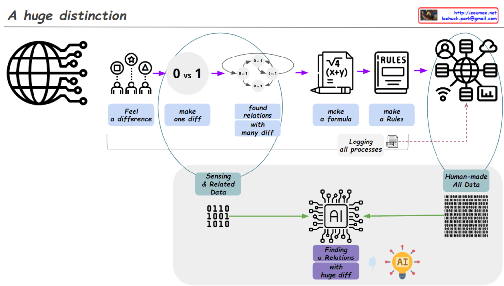
Image Analysis: “A huge distinction”

  1. Human Data Processing:
    • “Feel a difference”: Humans start by recognizing basic differences.
    • “Make one diff (0 vs 1)”: Creating the most fundamental distinction.
    • “Found relations with many diff”: Discovering relationships among various differences.
    • “Make a formula”: Developing formulas based on discovered relationships.
    • “Make a Rules”: Establishing rules based on these formulas.
    • “Human-made All Data”: Accumulation of data created through this entire process.
  2. Process Recording:
    • “Logging all processes”: The data creation process itself is recorded as data.
  3. AI Data Processing:
    • “Sensing & Related Data”: AI receives basic sensory data and related information.
    • “Human-made All Data”: All human-created data serves as input for AI.
    • “Finding a Relations with huge diff”: AI analyzes relationships and differences within this vast dataset.
  4. Result:
    • AI icon: Represents the final derivation of insights through AI.

Evaluation:

  1. Insightfulness: The diagram effectively illustrates the fundamental difference between human data processing methods and AI’s data processing capabilities. It highlights how humans follow a step-by-step logical process, while AI can process large-scale data simultaneously.
  2. Process Continuity: The diagram well expresses how human data processing forms the foundation for AI learning. This conveys the important concept that AI develops based on human knowledge and experience.
  3. Importance of Data: By emphasizing the importance of digitalizing all processes, the diagram effectively represents the core of our modern data-centric society.
  4. Visualization Effectiveness: Complex concepts are represented using simple icons and arrows, making them easy to understand.
  5. Future Expectation: We look forward to seeing additional explanations about AI’s output results or its potential applications. This would enhance the comprehensiveness of the diagram, providing a fuller picture of the AI process from input to output and its real-world impact.

Overall, this image effectively contrasts human data processing with AI’s data analysis capabilities, showcasing how these two domains operate complementarily. It provides a clear visual representation of the journey from basic human distinctions to complex AI-driven insights, highlighting the ‘huge distinction’ in scale and capability between human and artificial intelligence processing.

New Infra Age

From Claude with some prompting
This diagram illustrates the cyclical evolution of computing infrastructure, emphasizing the re-entry into a new computing infrastructure era driven by AI technology:

  1. Development cycle:
    • Traditional infrastructure era (Infra age) → Software era (SW Age) → New infrastructure era (New Infra age)
  2. Core elements of the new infrastructure era:
    • AI/ML (highlighted with red circles): Processing humanity’s accumulated experiences and data
    • GPU: Key computing infrastructure for AI
  3. Driving forces of development:
    • More Users
    • More Data
    • These are visualized by the icons at the bottom
  4. Key connection points (highlighted with red circles):
    • PC: Increased user base due to personal computer proliferation
    • Internet: Enhanced global connectivity
    • Web: Improved information accessibility
    • Mobile: Anytime, anywhere access environment
    • AI/ML: Processing and utilization of accumulated data
  5. Cyclical development:
    • User increase → Data increase → Infrastructure development to process this data → Attraction of more users, creating a cyclical structure

This diagram emphasizes that as AI technology begins to comprehensively process and utilize humanity’s accumulated experiences and data, it necessitates the expansion of new GPU-centric computing infrastructure to support this. It demonstrates a cyclical structure where processing more users and data leads to further infrastructure development, which in turn enables handling even more users and data.

Changes of the network traffic

From Claude with some prompting
Here’s an interpretation of the diagram in English, focusing on the major changes in internet traffic types:

  1. Early Internet (Start): The small “Bytecode” circle represents the limited data exchange of the early internet. This period was primarily characterized by simple, text-based information exchange.
  2. Web Era (Web): The larger “bytecode HTTP” circle illustrates the surge in HTTP traffic with the advent of the World Wide Web. This represents increased traffic from web browsing, email, and early online services.
  3. Streaming Age (Streaming): The addition of the “Video Streaming” circle signifies the explosive growth in video streaming traffic, driven by platforms like YouTube and Netflix. This marks a paradigm shift in internet bandwidth usage.
  4. Big Data and AI Era (Big Data IoT / Machine Learning & LLM): The largest circle, “Big Data For AI,” represents the enormous traffic increase due to IoT device proliferation, cloud computing ubiquity, and large-scale data processing for AI and machine learning. This suggests it now constitutes the largest portion of internet traffic.

This diagram effectively shows the evolution of internet traffic from simple data exchange to web-based services, media streaming, and the current data-centric, AI-driven era.

Comments (points to be cautious about):

  1. Accuracy: It’s unclear if the circle sizes accurately reflect actual traffic volumes. This should be understood as a conceptual representation.
  2. Time scale: The time intervals between stages may not be uniform, which is not indicated in the diagram.
  3. Overlap: In reality, these traffic types coexist and are not as distinctly separated as the diagram suggests.
  4. Recent trends: The diagram doesn’t reflect traffic changes due to latest technological trends like 5G or edge computing.
  5. Regional differences: These changes may not have occurred uniformly worldwide, which is not reflected in the diagram.

It’s important to consider these points when interpreting the diagram. Overall, this image effectively conveys the macroscopic trends in the evolution of internet traffic in a concise and impactful manner.

Both are equally unexplainable

From Claude with some prompting
This image compares human intelligence and artificial intelligence, emphasizing that both are “equally unexplainable” in certain aspects:

  1. Human Intelligence:
    • Uses 100% math and logic, but based on limited experience and data.
    • Labeled “Not 100% depend on Experience,” indicating experience alone is insufficient.
    • When decision-making under time constraints, humans make the “best choice” rather than a 100% perfect choice.
    • Shows a process of: Event → Decision with Time Limit → Action.
  2. Artificial Intelligence:
    • Based on big data, GPU/CPU processing, and AI models (including LLMs).
    • Labeled as “Unexplainable AI Model,” highlighting the difficulty in fully interpreting AI decision-making processes.
    • Demonstrates a flow of: Data input → Neural network processing → “Nice but not 100%” output.
    • Like human intelligence, AI also makes best choices within limited data and time constraints.
  3. Key Messages:
    • AI is not a simple logic calculator but a system mimicking human intelligence.
    • AI decisions, like human decisions, are not 100% perfect but the best choice under given conditions.
    • We should neither overestimate nor underestimate AI, but understand its limitations and possibilities in a balanced way.
    • Both human and artificial intelligence have unexplainable aspects, reflecting the complexity and limitations of both systems.

This image emphasizes the importance of accurately understanding and appropriately utilizing AI capabilities by comparing it with human intelligence. It reminds us that while AI is a powerful tool, human judgment and ethical considerations remain crucial. The comparison underscores that AI, like human intelligence, is making the best possible decisions based on available data and constraints, rather than providing infallible, 100% correct answers.

Finding Rules

From Claude with some prompting
This image, titled “Finding Rules,” illustrates the contrast between two major learning paradigms:

  1. Traditional Human-Centric Learning Approach:
    • Represented by the upper yellow circle
    • “Human Works”: Learning through human language and numbers
    • Humans directly analyze data and create rules
    • Leads to programming and legacy AI systems
  2. Machine Learning (ML) Approach:
    • Represented by the lower pink circle
    • “Machine Works”: Learning through binary digits (0 and 1)
    • Based on big data
    • Uses machine/deep learning to automatically discover rules
    • “Finding Rules by Machines”: Machines directly uncover patterns and rules

The diagram showcases a paradigm shift:

  • Two coexisting methods in the process from input to output
  • Transition from human-generated rules to machine-discovered rules
  • Emphasis on data processing in the “Digital World”

Key components:

  • Input and Output: Marking the start and end of the process
  • Analysis: Central to both approaches
  • Rules: Now discoverable by both humans and machines
  • Programming & Legacy AI: Connected to the human-centric approach
  • Machine/Deep Learning: Core of the ML approach

This visualization effectively demonstrates the evolution in data analysis and rule discovery brought about by advancements in artificial intelligence and machine learning. It highlights the shift from converting data into human-readable formats for analysis to leveraging vast amounts of binary data for machine-driven rule discovery.

A series of decisions

From Claude with some prompting
The image depicts a diagram titled “A series of decisions,” illustrating a data processing and analysis workflow. The main stages are as follows:

  1. Big Data: The starting point for data collection.
  2. Gathering Domains by Searching: This stage involves searching for and collecting relevant data.
  3. Verification: A step to validate the collected data.
  4. Database: Where data is stored and managed. This stage includes “Select Betters” for data refinement.
  5. ETL (Extract, Transform, Load): This process involves extracting, transforming, and loading data, with a focus on “Select Combinations.”
  6. AI Model: The stage where artificial intelligence models are applied, aiming to find a “More Fit AI Model.”

Each stage is accompanied by a “Visualization” icon, indicating that data visualization plays a crucial role throughout the entire process.

At the bottom, there’s a final step labeled “Select Results with Visualization,” suggesting that the outcomes of the entire process are selected and presented through visualization techniques.

Arrows connect these stages, showing the flow from Big Data to the AI Model, with “Select Results” arrows feeding back to earlier stages, implying an iterative process.

This diagram effectively illustrates the journey from raw big data to refined AI models, emphasizing the importance of decision-making and selection at each stage of the data processing and analysis workflow.

More abstracted Data & Bigger Error possibility

From Claude with some prompting
This image illustrates the data processing, analysis, and machine learning application process, emphasizing how errors can be amplified at each stage:

  1. Data Flow:
    • Starts with RAW data.
    • Goes through multiple ETL (Extract, Transform, Load) processes, transforming into new forms of data (“NEW”) at each stage.
    • Time information is incorporated, developing into statistical data.
    • Finally, it’s processed through machine learning techniques, evolving into more sophisticated new data.
  2. Error Propagation and Amplification:
    • Each ETL stage is marked with a “WHAT {IF.}” and a red X, indicating the possibility of errors.
    • Errors occurring in early stages propagate through subsequent stages, with their impact growing progressively larger, as shown by the red arrows.
    • The large red X at the end emphasizes how small initial errors can have a significant impact on the final result.
  3. Key Implications:
    • As the data processing becomes more complex, the quality and accuracy of initial data become increasingly crucial.
    • Thorough validation and preparation for potential errors at each stage are necessary.
    • Particularly for data used in machine learning models, initial errors can be amplified, severely affecting model performance, thus requiring extra caution.

This image effectively conveys the importance of data quality management in data science and AI fields, and the need for systematic preparation against error propagation. It highlights that as data becomes more abstracted and processed, the potential impact of early errors grows, necessitating robust error mitigation strategies throughout the data pipeline.