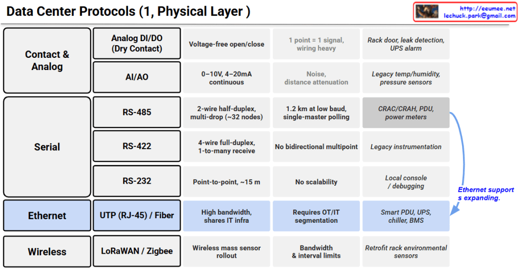
This image is a detailed table titled “Data Center Protocols (1, Physical Layer)”. It breaks down the hardware communication methods used in data center facilities into four main categories: Contact & Analog, Serial, Ethernet, and Wireless, detailing their technical specifications, limitations, and primary use cases.
- Contact & Analog:
- Analog DI/DO (Dry Contact): Uses voltage-free open/close signals for basic alerts like rack door sensors, leak detection, and UPS alarms. It notes that “1 point = 1 signal,” making the wiring heavy and complex.
- AI/AO: Uses 0–10V or 4–20mA continuous signals, typically for legacy temperature, humidity, and pressure sensors, but is vulnerable to noise and distance attenuation.
- Serial:
- RS-485: A 2-wire half-duplex system supporting multi-drop topology (up to ~32 nodes). It is the standard for CRAC/CRAH units, PDUs, and power meters.
- RS-422 & RS-232: RS-422 is used for legacy instrumentation, while RS-232 is strictly for point-to-point local console debugging over very short distances (~15m).
- Ethernet:
- UTP (RJ-45) / Fiber: Offers high bandwidth and shares existing IT infrastructure, requiring OT/IT network segmentation. It is the go-to for modern Smart PDUs, UPS systems, chillers, and BMS. A prominent blue arrow on the right highlights a major industry shift, indicating that “Ethernet support is expanding” from traditional serial devices.
- Wireless:
- LoRaWAN / Zigbee: Ideal for retrofit mass sensor rollouts in existing facilities without adding new cables, though they are constrained by bandwidth and collection interval limits.
Summary
This reference chart provides a comprehensive overview of the physical data collection mediums essential for Data Center Infrastructure Management (DCIM). It effectively contrasts the limitations and specific use cases of legacy analog and serial connections with modern networking solutions. Crucially, it highlights the ongoing industry trend of migrating traditional facility equipment toward high-bandwidth, Ethernet-based communication.This reference chart provides a comprehensive overview of the physical data collection mediums essential for Data Center Infrastructure Management (DCIM). It effectively contrasts the limitations and specific use cases of legacy analog and serial connections with modern networking solutions. Crucially, it highlights the ongoing industry trend of migrating traditional facility equipment toward high-bandwidth, Ethernet-based communication.
#DataCenter #NetworkProtocols #PhysicalLayer #DCIM #Infrastructure #Ethernet #IoT #FacilityManagement
With Gemini



 Lechuck Park