Data Security

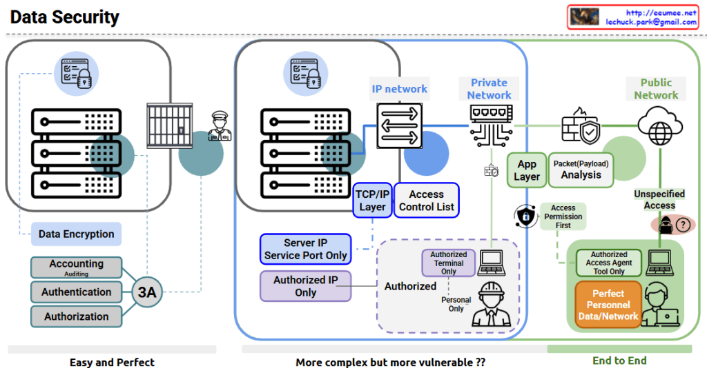
The image shows a comprehensive data security diagram with three main approaches to securing data systems. Let me explain each section:

  1. Left Section – “Easy and Perfect”:
    • Features data encryption for secure storage
    • Implements the “3A” security principles: Accounting (with Auditing), Authentication, and Authorization
    • Shows server hardware protected by physical security (guard)
    • Represents a straightforward but effective security approach
  2. Middle Section – “More complex but more vulnerable??”:
    • Shows an IP network architecture with:
      • Server IP and service port restrictions
      • TCP/IP layer security
      • Access Control Lists
      • Authorized IP only policy
      • Authorized terminal restrictions
      • Personnel authorization controls
  3. Right Section – “End to End”:
    • Divides security between Private Network and Public Network
    • Includes:
      • Application layer security
      • Packet/Payload analysis
      • Access Permission First principle
      • Authorized Access Agent Tool restrictions
      • “Perfect Personnel Data/Network” security approach
      • Unspecified Access concerns (shown with question mark)

The diagram illustrates the evolution of data security approaches from simpler encryption and authentication methods to more complex network security architectures, and finally to comprehensive end-to-end security solutions. The diagram questions whether more complex systems might actually introduce more vulnerabilities, suggesting that complexity doesn’t always equal better security.

With Claude
Connected in AI DC

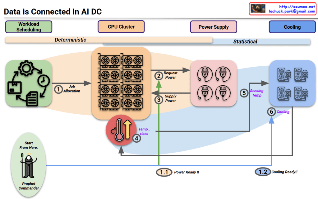
This diagram titled “Data is Connected in AI DC” illustrates the relationships starting from workload scheduling in an AI data center.

Key aspects of the diagram:

  1. The entire system’s interconnected relationships begin with workload scheduling.
  2. The diagram divides the process into two major phases:
    • Deterministic phase: Primarily concerned with power requirements that operate in a predictable, planned manner.
    • Statistical phase: Focused on cooling requirements, where predictions vary based on external environmental conditions.
  3. The “Prophet Commander” at the workload scheduling stage can predict/direct future requirements, allowing the system to prepare power (1.1 Power Ready!!) and cooling (1.2 Cooling Ready!!) in advance.
  4. Process flow:
    • Job allocation from workload scheduling to GPU cluster
    • GPUs request and receive power
    • Temperature rises due to operations
    • Cooling system detects temperature and activates cooling

This diagram illustrates the interconnected workflow in AI data centers, beginning with workload scheduling that enables predictive resource management. The process flows from deterministic power requirements to statistical cooling needs, with the “Prophet Commander” enabling proactive preparation of power and cooling resources. This integrated approach demonstrates how workload prediction can drive efficient resource allocation throughout the entire AI data center ecosystem.

With Claude

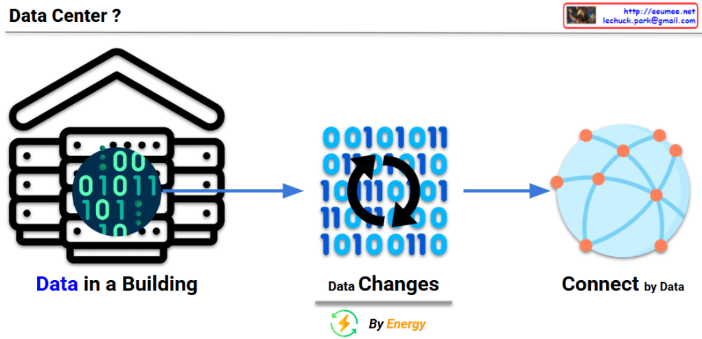
Data Center

This image explains the fundamental concept and function of a data center:

  1. Left: “Data in a Building” – Illustrates a data center as a physical building that houses digital data (represented by binary code of 0s and 1s).
  2. Center: “Data Changes” – With the caption “By Energy,” showing how data is processed and transformed through the consumption of energy.
  3. Right: “Connect by Data” – Demonstrates how processed data from the data center connects to the outside world, particularly the internet, forming networks.

This diagram visualizes the essential definition of a data center – a physical building that stores data, consumes energy to process that data, and plays a crucial role in connecting this data to the external world through the internet.

With Claude

Data Explosion in Data Center

This image titled “Data Explosion in Data Center” illustrates three key challenges faced by modern data centers:

  1. Data/Computing:
    • Shows the explosive growth of data from computing servers to internet/cloud infrastructure and AI technologies.
    • Visualizes the exponential increase in data volume from 1X to 100X, 10,000X, and ultimately to 1,000,000,000X (one billion times).
    • Depicts how servers, computers, mobile devices, and global networks connect to massive data nodes, generating and processing enormous amounts of information.
  2. Power:
    • Addresses the increasing power supply requirements needed to support the data explosion in data centers.
    • Shows various energy sources including traditional power plants, wind turbines, solar panels, and battery storage systems to meet the growing energy demands.
    • Represents energy efficiency and sustainable power supply through a cyclical system indicated by green arrows.
  3. Cooling:
    • Illustrates the heat management challenges resulting from increased data processing and their solutions.
    • Explains the shift from traditional air cooling methods to more efficient server liquid cooling technologies.
    • Visualizes modern cooling solutions with blue circular arrows representing the cooling cycle.

This diagram comprehensively explains how the exponential growth of data impacts data center design and operations, particularly highlighting the challenges and innovations in power consumption and thermal management.

With Claude

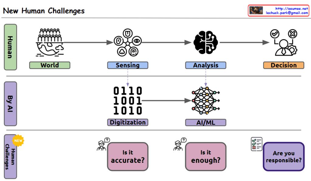
New Human Challenges

This image titled “New Human Challenges” illustrates the paradigm shift in information processing in the AI era and the new roles humans must assume.

The diagram is structured in three tiers:

  1. Human (top row): Shows the traditional human information processing flow. Humans sense information from the “World,” perform “Analysis” using the brain, and make final “Decisions” based on this analysis.
  2. By AI (middle row): In the modern technological environment, information from the world is “Digitized” into binary code, and this data is then processed through “AI/ML” systems.
  3. Human Challenges (bottom row): Highlights three key challenges humans face in the AI era:
    • “Is it accurate?” – Verifying the quality and integrity of data collection processes
    • “Is it enough?” – Ensuring the trained data is sufficient and balanced to reflect all perspectives
    • “Are you responsible?” – Reflecting on whether humans can take ultimate responsibility for decisions suggested by AI

This diagram effectively demonstrates how the information processing paradigm has shifted from human-centered to AI-assisted systems, transforming the human role from direct information processors to supervisors and accountability holders for AI systems. Humans now face new challenges focused on ensuring data quality, data sufficiency and balance, and taking responsibility for final decision-making.

With Claude

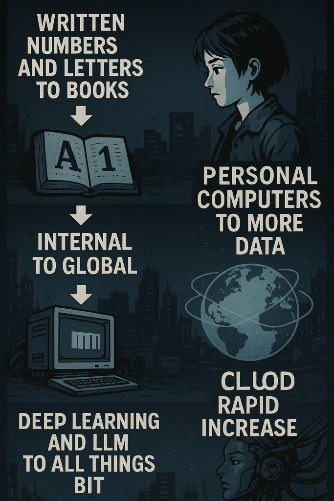
Massive increase in data

The Explosive Growth of Data – Step by Step

  1. Writing and Books
    Humans started recording information with letters and numbers in books.
    Data was physical and limited.
  2. Computers and Servers
    We began creating and storing digital data using computers and internal servers.
    Data became digitized.
  3. Personal Computers
    PCs allowed individuals to create, store, and use data on their own.
    Data became personalized and widespread.
  4. The Internet
    Data moved beyond local use and spread globally through the internet.
    Data became connected worldwide.
  5. Cloud Computing
    With cloud technology, data storage and processing expanded rapidly.
    Big data was born.
  6. AI, Deep Learning, and LLMs
    Data now powers AI. Deep learning and large language models analyze and generate human-like content.
    Everything is becoming data.
  7. Beyond – Total Bit Transformation
    In the future, we will digitize everything—from thoughts to actions—into bits.
    Data will define all reality.

As data has grown explosively, computing has evolved to process it—from early machines to AI and LLMs—and soon, everything will be digitized into data.

With ChatGPT

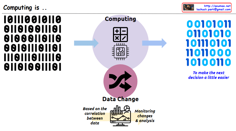
Computing is ..

This image illustrates the core concept of “Computing.” The key message is that computing is a process of transforming data to make people’s next decisions easier.

In the center, there is a circle with the title “Computing” along with calculator and computer chip icons. On the left side, there is binary input data (0s and 1s), which is shown being transformed through the central computing process into different binary output on the right side. Next to the binary output on the right is blue italic text saying “To make the next decision a little easier,” emphasizing that the purpose of this data transformation is to aid human decision-making.

At the bottom of the image, there is a section titled “Data Change” with cycling arrows representing data transformation. Below that, there’s a monitor displaying charts and graphs with descriptions “Based on the correlation between data” and “Monitoring changes & analysis,” showing that analyzing relationships between data is important for supporting decision-making.

With Claude