Computing is ..

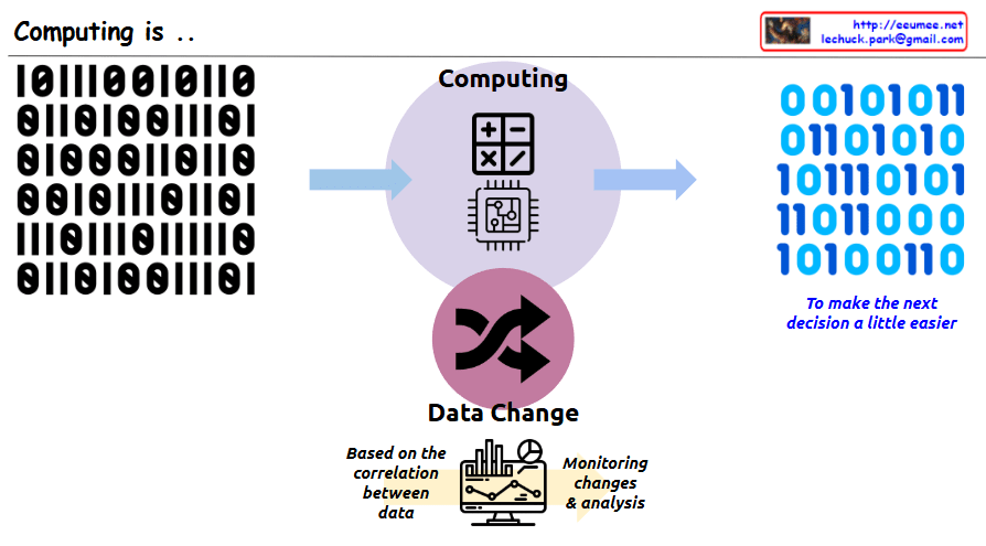
This image illustrates the core concept of “Computing.” The key message is that computing is a process of transforming data to make people’s next decisions easier.

In the center, there is a circle with the title “Computing” along with calculator and computer chip icons. On the left side, there is binary input data (0s and 1s), which is shown being transformed through the central computing process into different binary output on the right side. Next to the binary output on the right is blue italic text saying “To make the next decision a little easier,” emphasizing that the purpose of this data transformation is to aid human decision-making.

At the bottom of the image, there is a section titled “Data Change” with cycling arrows representing data transformation. Below that, there’s a monitor displaying charts and graphs with descriptions “Based on the correlation between data” and “Monitoring changes & analysis,” showing that analyzing relationships between data is important for supporting decision-making.

With Claude

Think by a Vector

This image presents a concept titled “Think by a Vector” that compares two approaches to handling data.

The image shows a data processing flow starting from what appears to be a network or system diagram on the left, which outputs binary data (represented as 0s and 1s) labeled as “Data Explosion.” This data can then be processed in two different ways:

  1. Raster approach (top path):
    • Labeled as “Checking All data one by one”
    • Described as “Impossible to handle all data”
    • Represented by squares/pixels, suggesting pixel-by-pixel processing
  2. Vector approach (bottom path):
    • Labeled as “Extract Features”
    • Uses “prediction with Features”
    • Includes text stating “must apply the perfect basic rules (Feature)”
    • Represented by a node/vector diagram showing connected points

The main message appears to be advocating for vector-based thinking or processing, which focuses on extracting and working with key features rather than processing every individual data point. This approach is presented as more efficient and effective than the raster-based approach.

With Claude

Data Center NOW

This image shows a data center architecture diagram titled “Data Center Now” at the top. It illustrates the key components and flow of a modern data center infrastructure.

The diagram depicts:

  1. On the left side: An “Explosion of data” icon with data storage symbols, pointing to computing components with the note “More Computing is required”
  2. In the center: Server racks connected to various systems with colored lines indicating different connections (red, blue, green)
  3. On the right side: Several technology components illustrated with circular icons and labels:
    • “Software Defined” with a computer/gear icon
    • “AI & GPU” with neural network and GPU icons and note “Big power is required”
    • “Renewable Energy & Grid Power” with solar panel and wind turbine icons
    • “Optimized Cooling /w Using Water” with cooling system icon
    • “Enhanced Op System & AI Agent” with a robotic/AI system icon

The diagram shows how data flows through processing units and connects to different infrastructure elements, emphasizing modern data center requirements like increased computing power, AI capabilities, power management, and cooling solutions.

With Claude

The Age of Utilization

This image is an infographic depicting “The Age of Utilization.”

On the left side, a gray oval contains “All knowledge of mankind” represented by various icons including letter and number blocks, books with writing tools, and a globe symbolizing the internet, illustrating the diverse forms of knowledge humanity has accumulated over time.

In the center, there’s a section labeled “Massive parallel processing” showing multiple eye icons with arrows pointing toward a GPU icon. This illustrates how vast amounts of human knowledge are efficiently processed through GPUs.

On the right side, a purple arrow-shaped area labeled “Easy to utilize” demonstrates how processed information can be used. At the top is an “EASY TO USE” icon, with “Inference” and “Learning” stages below it. This section includes Q&A icons, a vector database, and neural network structures.

The infographic comprehensively shows how humanity has entered a new era where accumulated knowledge can be processed using modern technology and easily accessed through question-and-answer formats, making all human knowledge readily available for utilization.

With Claude

100% is the direction, not Now

This image illustrates a key concept about leadership and decision-making.

The main message, titled “100% is the direction, not Now,” conveys that while perfection (100%) should be our aspiration and direction, it’s not a realistic immediate goal under real-world constraints.

Key elements in the diagram:

  • On the left, a silhouette of a person running toward the 100% goal
  • In the upper right, a circle marked “100%” with text below stating “100% is only with All the conditions of the world”
  • In the center, a thinking figure asking “Is it possible to consider all conditions?” alongside the constraints “with Limited Resource & Limited Time”
  • Below, the text “to make the most efficient decision based on current Conditions” next to “90%?”
  • At the bottom, “Leadership skills” is highlighted

The core message is that it’s nearly impossible to achieve 100% of our goals when considering all real-world limitations of time and resources. An important leadership skill is finding the balance and determining what a realistic “90%” achievement looks like in the present circumstances – making efficient decisions based on current conditions rather than pursuing an unattainable perfect outcome. Leaders must direct their teams toward the 100% ideal while making balanced decisions about what can actually be accomplished now.