Finding Rules

From Claude with some prompting
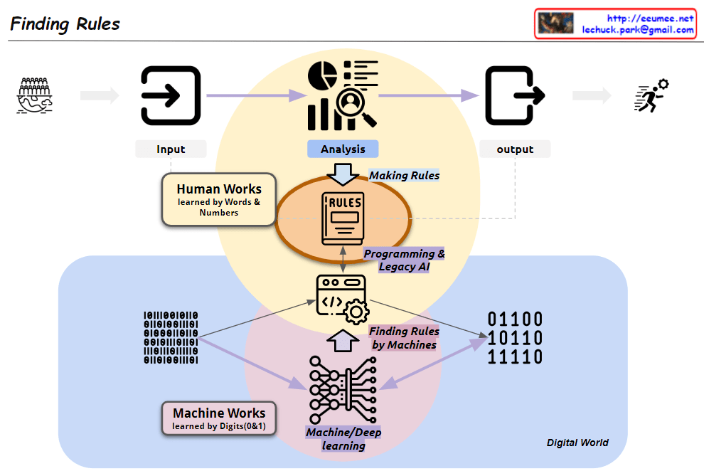
This image, titled “Finding Rules,” illustrates the contrast between two major learning paradigms:

  1. Traditional Human-Centric Learning Approach:
    • Represented by the upper yellow circle
    • “Human Works”: Learning through human language and numbers
    • Humans directly analyze data and create rules
    • Leads to programming and legacy AI systems
  2. Machine Learning (ML) Approach:
    • Represented by the lower pink circle
    • “Machine Works”: Learning through binary digits (0 and 1)
    • Based on big data
    • Uses machine/deep learning to automatically discover rules
    • “Finding Rules by Machines”: Machines directly uncover patterns and rules

The diagram showcases a paradigm shift:

  • Two coexisting methods in the process from input to output
  • Transition from human-generated rules to machine-discovered rules
  • Emphasis on data processing in the “Digital World”

Key components:

  • Input and Output: Marking the start and end of the process
  • Analysis: Central to both approaches
  • Rules: Now discoverable by both humans and machines
  • Programming & Legacy AI: Connected to the human-centric approach
  • Machine/Deep Learning: Core of the ML approach

This visualization effectively demonstrates the evolution in data analysis and rule discovery brought about by advancements in artificial intelligence and machine learning. It highlights the shift from converting data into human-readable formats for analysis to leveraging vast amounts of binary data for machine-driven rule discovery.

More abstracted Data & Bigger Error possibility

From Claude with some prompting
This image illustrates the data processing, analysis, and machine learning application process, emphasizing how errors can be amplified at each stage:

  1. Data Flow:
    • Starts with RAW data.
    • Goes through multiple ETL (Extract, Transform, Load) processes, transforming into new forms of data (“NEW”) at each stage.
    • Time information is incorporated, developing into statistical data.
    • Finally, it’s processed through machine learning techniques, evolving into more sophisticated new data.
  2. Error Propagation and Amplification:
    • Each ETL stage is marked with a “WHAT {IF.}” and a red X, indicating the possibility of errors.
    • Errors occurring in early stages propagate through subsequent stages, with their impact growing progressively larger, as shown by the red arrows.
    • The large red X at the end emphasizes how small initial errors can have a significant impact on the final result.
  3. Key Implications:
    • As the data processing becomes more complex, the quality and accuracy of initial data become increasingly crucial.
    • Thorough validation and preparation for potential errors at each stage are necessary.
    • Particularly for data used in machine learning models, initial errors can be amplified, severely affecting model performance, thus requiring extra caution.

This image effectively conveys the importance of data quality management in data science and AI fields, and the need for systematic preparation against error propagation. It highlights that as data becomes more abstracted and processed, the potential impact of early errors grows, necessitating robust error mitigation strategies throughout the data pipeline.

Service

From Claude with some prompting
The image is a diagram titled “Service” that illustrates two main processes:

  1. Top left: “Op. Process” (Operational Process)
    • Shown as a circular structure containing:
      • “Event!!”: Represented by an exclamation mark icon
      • “Operator”: Indicated by a person icon
      • “Processing”: Depicted by an icon of connected circles
    • This process is marked with “xN”, suggesting it can be repeated multiple times.
  2. Bottom left: “D/T Service” (presumably Data/Technology Service)
    • Also presented in a circular structure, including:
      • “Data”: Shown as a graph icon
      • “Analysis(Visual)”: Represented by a monitor icon with charts
      • “Program”: Depicted by a code or document icon
    • This process is also marked with “xN”, indicating repeatability.
  3. Right side: Integrated “Op. Process” and “D/T Service”
    • A larger circle contains the “Op. Process”, which in turn encompasses the “D/T Service”
    • Within the “D/T Service” circle, “Data Result” and “Operation” are connected by a bidirectional arrow.

This diagram appears to illustrate how operational processes and data/technology services interact and integrate, likely representing a data-driven operational and decision-making process.

optimization

From Claude with some prompting

  1. “Just look (the average of usage)”:
    • This stage shows a simplistic view of usage based on rough averages.
    • The supply (green arrow) is generously provided based on this average usage.
    • Actual fluctuations in usage are not considered at this point.
  2. “More Details of Usages”:
    • Upon closer inspection, continuous variations in actual usage are discovered.
    • The red dotted circle highlights these subtle fluctuations.
    • At this stage, variability is recognized but not yet addressed.
  3. “Optimization”:
    • After recognizing the variability, optimization is attempted based on peak usage.
    • The dashed green arrow indicates the supply level set to meet maximum usage.
    • Light green arrows show excess supply when actual usage is lower.
  4. “Changes of usage”:
    • Over time, usage variability increases significantly.
    • The red dotted circle emphasizes this increased volatility.
  5. “Unefficient”:
    • This demonstrates how maintaining a constant supply based on peak usage becomes inefficient when faced with high variability.
    • The orange shaded area visualizes the large gap between actual usage and supply, indicating the degree of inefficiency.
  6. “Optimization”:
    • Finally, optimization is achieved through flexible supply that adapts to actual usage patterns.
    • The green line closely matching the orange line (usage) shows supply being adjusted in real-time to match usage.
    • This approach minimizes oversupply and efficiently responds to fluctuating demand.

This series illustrates the progression from a simplistic average-based view, through recognition of detailed usage patterns, to peak-based optimization, and finally to flexible supply optimization that matches real-time demand. It demonstrates the evolution towards a more efficient and responsive resource management approach.

Service Development Env.

From Claude with some prompting
This image shows a diagram titled “Service Development Env.” (Service Development Environment). It illustrates the stages of a service development process:

  1. Facility: Represented by a building icon, serving as the starting point.
  2. Legacy System: Depicted by a computer screen icon.
  3. Collection: Shown as multiple document icons.
  4. ETL (Extract, Transform, Load): Represented by gear and database icons.
  5. Analysis: Indicated by a magnifying glass icon, including visualization and AI prediction capabilities.
  6. Deploy: Represented by a screen icon with charts, described as “Service = Data + Chart”.

The lower part of the diagram shows additional process steps:

  • Metrics: Includes Configurations.
  • Time Series: Stores data in (id, value, time) format.
  • Tags
  • Roll-Up & TSDB Agg (Time Series Database Aggregation)
  • Prompt with Charts

Overall, this diagram illustrates the entire service development process from data collection to analysis, visualization, and final service deployment. Each stage represents the steps of processing, storing, analyzing data, and ultimately delivering it to end-users.

The flow suggests a progression from legacy systems and facilities, through data collection and processing, to advanced analysis and deployment of data-driven services

Standardization & Platform Why?

From Claude with some prompting
This diagram illustrates the importance of standardization and platform development, highlighting two key objectives:

  1. Standardization:
    • Encompasses the stages from real work (machine and processing) through digitization, collecting, and verification.
    • Purpose: “Move on with data trust”
    • Meaning: By establishing standardized processes for data collection and verification, it ensures data reliability. This allows subsequent stages to proceed without concerns about data quality.
  2. Software Development Platform:
    • Includes analysis, improvement, and new development stages.
    • Purpose: “Make easy to improve & go to new”
    • Meaning: Building on standardized data and processes, the platform facilitates easier service improvements and new service development and expansion.

This structure offers several advantages:

  1. Data Reliability: Standardized processes for collection and verification ensure trustworthy data, eliminating concerns about data quality in later stages.
  2. Efficient Improvement and Innovation: With reliable data and a standardized platform, improving existing services or developing new ones becomes more straightforward.
  3. Scalability: The structure provides a foundation for easily adding new services or features.

In conclusion, this diagram visually represents two core strategies: establishing data reliability through standardization and enabling efficient service improvement and expansion through a dedicated platform. It emphasizes how standardization allows teams to trust and focus on using the data, while the platform makes it easier to improve existing services and develop new ones.

“if then” by AI

From Claude with some prompting
This image titled “IF THEN” by AI illustrates the evolution from traditional programming to modern AI approaches:

  1. Upper section – “Programming”: This represents the traditional method. Here, programmers collect data, analyze it, and explicitly write “if-then” rules. This process is labeled “Making Rules”.
    • Data collection → Analysis → Setting conditions (IF) → Defining actions (THEN)
  2. Lower section – “AI”: This shows the modern AI approach. It uses “Huge Data” to automatically learn patterns through machine learning algorithms.
    • Large-scale data → Machine Learning → AI model generation

Key differences:

  • Traditional method: Programmers explicitly define rules
  • AI method: Automatically learns patterns from data to create AI models that include basic “if-then” logic

The image effectively diagrams the shift in programming paradigms. It demonstrates how AI can process and learn from massive datasets to automatically generate logic that was previously manually defined by programmers.

This visualization succinctly captures how AI has transformed the approach to problem-solving in computer science, moving from explicit rule-based programming to data-driven, pattern-recognizing models.