AI Flame Graphs (eBPF)

📊 AI Flame Graphs (eBPF) Architecture Diagram Interpretation

This diagram visually unfolds three logical stages (Problem Identification, Technical Solution, and Derived Results) based on the core theme stated at the top: “Tracks bottlenecks caused by CPU-GPU asynchronous execution.”.

1. 🔴 Problem Identification (Left Red Section) This area highlights the fundamental issue of losing visibility due to asynchronous processing.

  • Disconnected Execution Flow: The gray blocks illustrate the execution stack, where commands originating from the Application (PyTorch) pass through the C++ Runtime, down to the Kernel Driver, and finally to the GPU Hardware.
  • Asynchronous Nature: The large downward arrow on the left emphasizes that this entire process occurs “asynchronously between the CPU and GPU.”
  • Resulting Limitation: As stated in the orange box at the bottom, when actual GPU Wait Gaps or EU Stalls occur, tracing the root cause back to the upper-level application code becomes inherently and extremely difficult.

2. 🔵 Technical Solution (Center Blue Section) This area explains the eBPF-based data correlation approach used to resolve the aforementioned visibility issues.

  • Intervention Layer: A green block with an arrow points directly to the ‘Kernel Driver’ layer in the left column. This indicates that low-overhead eBPF Probes are strategically inserted precisely at the OS Kernel Driver layer.
  • Correlation Mechanism: The bottom box outlines the technical remedy: it bridges the disconnected context by “Simultaneously capturing and correlating CPU command submissions with GPU hardware counters,” effectively linking the CPU’s actions with the GPU’s reactions in real-time.

3. 🟢 Derived Results (Right Green Section) This area demonstrates the foundation for integrated visualization and automated analysis achieved through eBPF application.

  • Integrated Visualization: It shows how previously isolated CPU call stacks and GPU execution delays are unified into a single Flame Graph for intuitive and cohesive analysis.
  • Operational Impact: Ultimately, it highlights how this technology empowers automated systems to instantly pinpoint and resolve the root causes of data center performance bottlenecks.

📌 Summary

This diagram is a structural overview of how eBPF technology resolves asynchronous bottlenecks between CPUs and GPUs in AI workloads. It clearly explains the process of inserting low-overhead eBPF probes at the kernel level to correlate disconnected execution data. By unifying this data into a single ‘Flame Graph,’ it provides the foundation for automated systems to perform real-time root cause analysis and infrastructure optimization.

#eBPF #FlameGraph #GPUOptimization #PerformanceProfiling #InfrastructureEngineering #SystemArchitecture

With Gemini
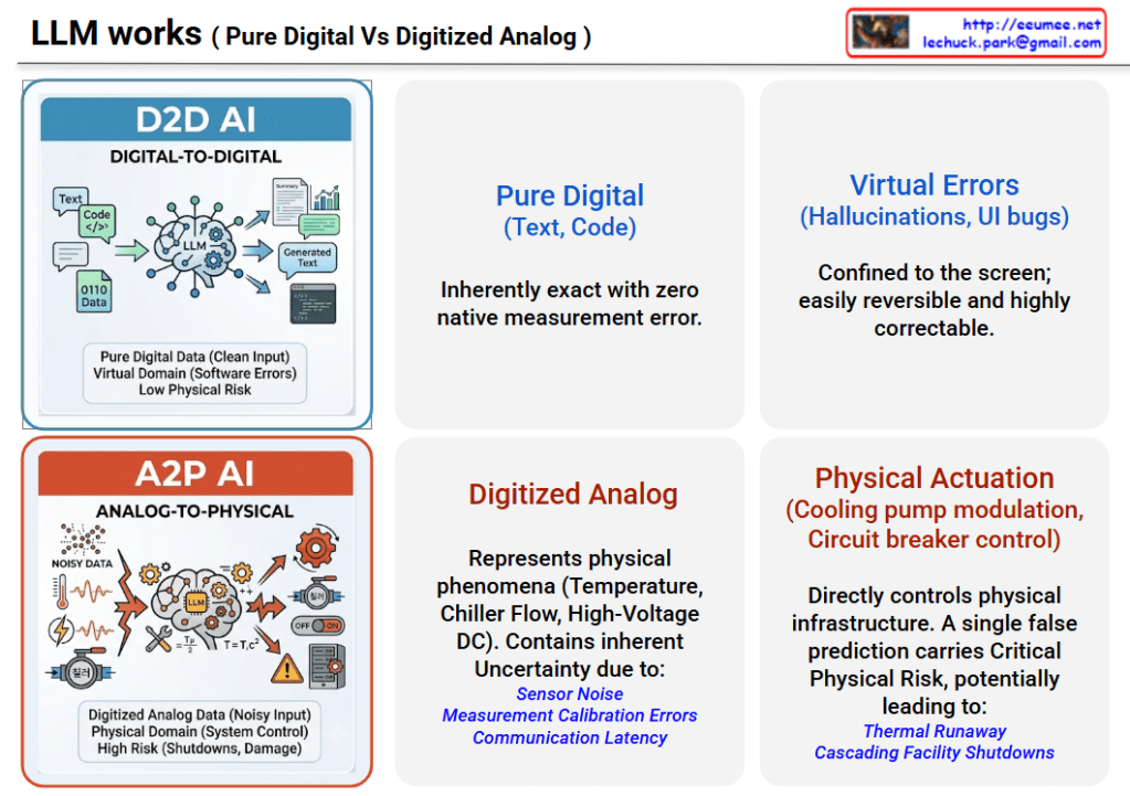
 LLM works ( Pure Digital Vs Digitized Analog )

How LLM Works: Pure Digital vs. Digitized Analog

This infographic is titled “LLM works (Pure Digital Vs Digitized Analog)” at the top, with the creator’s source information (website and email) displayed in the top right corner. The image is horizontally divided to provide an intuitive comparison between general IT-environment AI (D2D AI) and industrial/data center AI (A2P AI).

1. Top Section: D2D AI (Digital-to-Digital AI) Designed with a blue theme, this section illustrates an AI operating within a virtual environment.

  • Input: Icons depict clean, “Pure Digital” data, such as text and code, being fed into a Large Language Model (LLM).
  • Characteristics: The text emphasizes that this pure digital input is “inherently exact with zero native measurement error.”
  • Output & Risk: The errors produced here are classified as “Virtual Errors” (e.g., hallucinations or UI bugs). Because these errors are confined strictly to the screen, they pose a low physical risk and are described as highly correctable and easily reversible.

2. Bottom Section: A2P AI (Analog-to-Physical AI) Designed with an orange theme, this section depicts an AI used for data center and industrial facility control.

  • Input: Graphics illustrate noisy data representing physical phenomena—such as temperature, chiller flow, and high-voltage DC—flowing into the LLM.
  • Characteristics: This data is defined as “Digitized Analog.” It contains inherent “Uncertainty” driven by physical realities such as sensor noise, measurement calibration errors, and communication latency.
  • Output & Risk: The AI’s output results in direct “Physical Actuation” (e.g., cooling pump modulation or circuit breaker control). The text strongly warns that a single false prediction carries “Critical Physical Risk,” potentially leading to catastrophic real-world consequences like “Thermal Runaway” and “Cascading Facility Shutdowns.”

💡 Summary This infographic perfectly contrasts the fundamental differences between D2D AI, which operates safely within software and is easily correctable, and A2P AI, which interprets uncertain digitized analog data to control physical infrastructure, thereby carrying significant and potentially destructive real-world risks.

#LLM #DataCenterAI #OperationalTechnology #D2DAI #A2PAI #CyberPhysicalSystems #AIGuardrails #IndustrialAI

With Gemini

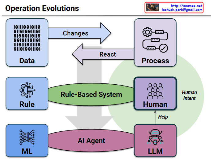
Operation Evolutions

This technical infographic, titled “Operation Evolutions,” elegantly maps out the paradigm shift in system and infrastructure management, moving from traditional manual workflows to advanced, AI-driven automation.

1. The Fundamental Loop (Top Layer)

At the very top, the diagram establishes the basic cycle of any operational system. “Data” (represented by binary code) undergoes “Changes,” which trigger a specific “Process.” Once the process executes, the system completes the loop via a “React” mechanism. This is the foundational input-output workflow.

2. The Traditional Paradigm (Middle Layer)

The middle section, centered around the green “Rule-Based System” oval, represents the legacy approach to operations. In this model, system actions are dictated by rigid, pre-defined “Rules.” When unexpected incidents occur or complex troubleshooting is required, the system relies heavily on manual “Human” intervention and analysis.

3. The Autonomous Shift (Bottom Layer)

A large, prominent downward arrow illustrates the structural evolution toward an “AI Agent” framework (the purple oval). In this next-generation architecture, static rules are replaced by adaptive “ML” (Machine Learning) models. More importantly, the heavy cognitive load previously placed entirely on human operators is now supported by an “LLM” (Large Language Model). This aligns perfectly with modern engineering goals of automating root cause analysis and streamlining incident resolution.

4. The Synergy of “Human Intent”

Perhaps the most crucial element is the large green circle labeled “Human Intent,” which encompasses the Process, Human, and LLM components. Additionally, there is a specific arrow pointing from the LLM up to the Human, labeled “Help.” This clearly communicates that AI agents and LLMs are not designed to replace engineers. Instead, they act as intelligent assistants that handle vast amounts of operational data, empowering human experts to focus on high-level architectural decisions and strategic oversight.

Summary

The diagram effectively captures the ongoing evolution of IT and infrastructure operations. It highlights the vital transition from rigid, rule-bound human management to an intelligent, AI-agent-driven ecosystem. In this new era, machine learning and large language models collaboratively assist human operators, ensuring that complex systems run efficiently while remaining firmly guided by human intent.

#AIAgent #AIOps #ITOperations #LLM #MachineLearning #InfrastructureAutomation #TechInfographic #SystemArchitecture

With Gemini

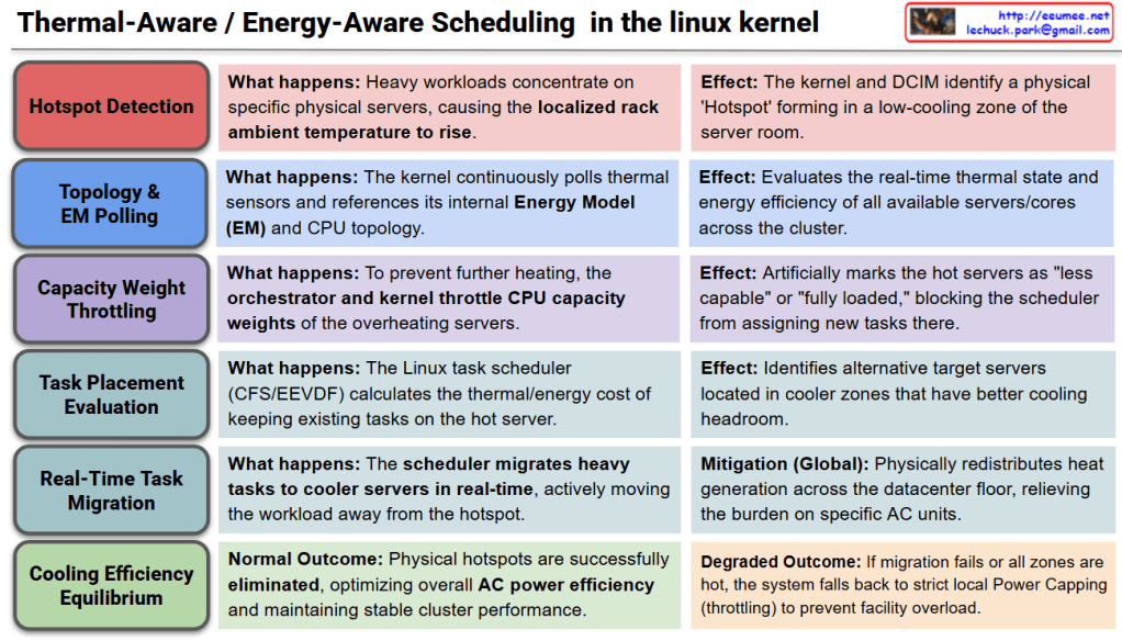
Thermal-Aware / Energy-Aware Scheduling in the Linux kernel

Thermal-Aware / Energy-Aware Scheduling

This diagram illustrates the macro-level, spatial cooling strategy within the Linux kernel. Instead of merely throttling hardware locally, the scheduler actively redistributes workloads across the datacenter floor to optimize overall cooling infrastructure. The process is broken down into six sequential stages:

  • Stage 1: Hotspot DetectionWhen heavy compute workloads concentrate heavily on specific physical servers, the localized ambient temperature around that rack begins to rise. As a result, the Linux kernel and the Datacenter Infrastructure Management (DCIM) system detect a physical ‘Hotspot’ forming within a low-cooling zone of the server room.
  • Stage 2: Topology & EM PollingTo assess the cluster’s environment, the kernel continuously polls hardware thermal sensors and cross-references this data with its internal Energy Model (EM) and CPU topology. This allows the system to evaluate the real-time thermal state and power efficiency of all available servers and cores across the entire cluster.
  • Stage 3: Capacity Weight ThrottlingTo prevent the hotspot from worsening, the cluster orchestrator and the local kernel intervene by artificially throttling the CPU capacity weights of the overheating servers. This mechanism marks the hot servers as “less capable” or “fully loaded” to the system, effectively blocking the scheduler from assigning any new tasks to that specific physical location.
  • Stage 4: Task Placement EvaluationThe Linux task scheduler (such as CFS or EEVDF) calculates the thermal and energy cost of keeping currently running tasks on the hot server. It evaluates the previously polled topology data to identify alternative target servers located in cooler zones that possess better cooling headroom.
  • Stage 5: Real-Time Task MigrationIn a decisive global mitigation step, the scheduler actively migrates heavy tasks to the cooler servers in real-time. By physically moving the workload away from the hotspot, the kernel seamlessly redistributes heat generation across the datacenter floor, immediately relieving the thermal burden on specific Air Conditioning (AC) units.
  • Stage 6: Cooling Efficiency Equilibrium
    • Normal Outcome: The physical hotspots are successfully eliminated. The datacenter achieves an optimal thermal equilibrium, maximizing overall AC power efficiency while maintaining stable, high-performance cluster operations.
    • Degraded Outcome: If task migration is impossible (e.g., all zones in the datacenter are equally hot), the system abandons spatial scheduling and falls back to strict local Power Capping (aggressive frequency/voltage throttling) to prevent total facility overload.

Summary

  • Unlike traditional local throttling, Energy-Aware Scheduling actively detects physical “hotspots” in the datacenter and artificially lowers the compute capacity weight of overheating servers.
  • The Linux scheduler utilizes its Energy Model (EM) to identify cooler servers and actively migrates heavy AI workloads away from the hotspot in real-time.
  • This macro-level load balancing redistributes heat generation across the datacenter floor, maximizing overall AC cooling efficiency and preventing localized cooling failures.

#LinuxKernel #EnergyAwareScheduling #ThermalManagement #DataCenterOptimization #TaskMigration #GreenComputing #HPC #CloudInfrastructure