This diagram illustrates the 3 Core Technological Components of AI World and their surrounding challenges.
AI World’s 3 Core Technological Components
Central AI World Components:
- AI infra (AI Infrastructure) – The foundational technology that powers AI systems
- AI Model – Core algorithms and model technologies represented by neural networks
- AI Agent – Intelligent systems that perform actual tasks and operations
Surrounding 3 Key Challenges
1. Data – Left Area
Data management as the raw material for AI technology:
- Data: Raw data collection
- Verified: Validated and quality-controlled data
- Easy to AI: Data preprocessed and optimized for AI processing
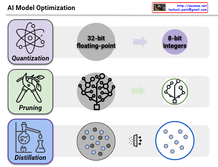
2. Optimization – Bottom Area
Performance enhancement of AI technology:
- Optimization: System optimization
- Fit to data: Data fitting and adaptation
- Energy cost: Efficiency and resource management
3. Verification – Right Area
Ensuring reliability and trustworthiness of AI technology:
- Verification: Technology validation process
- Right?: Accuracy assessment
- Humanism: Alignment with human-centered values
This diagram demonstrates how the three core technological elements – AI Infrastructure, AI Model, and AI Agent – form the center of AI World, while interacting with the three fundamental challenges of Data, Optimization, and Verification to create a comprehensive AI ecosystem.
With Claude