
Monkey Island
The Computing for the Fair Human Life.

This image is an infographic depicting “The Age of Utilization.”
On the left side, a gray oval contains “All knowledge of mankind” represented by various icons including letter and number blocks, books with writing tools, and a globe symbolizing the internet, illustrating the diverse forms of knowledge humanity has accumulated over time.
In the center, there’s a section labeled “Massive parallel processing” showing multiple eye icons with arrows pointing toward a GPU icon. This illustrates how vast amounts of human knowledge are efficiently processed through GPUs.
On the right side, a purple arrow-shaped area labeled “Easy to utilize” demonstrates how processed information can be used. At the top is an “EASY TO USE” icon, with “Inference” and “Learning” stages below it. This section includes Q&A icons, a vector database, and neural network structures.
The infographic comprehensively shows how humanity has entered a new era where accumulated knowledge can be processed using modern technology and easily accessed through question-and-answer formats, making all human knowledge readily available for utilization.
With Claude

This image illustrates a key concept about leadership and decision-making.
The main message, titled “100% is the direction, not Now,” conveys that while perfection (100%) should be our aspiration and direction, it’s not a realistic immediate goal under real-world constraints.
Key elements in the diagram:
The core message is that it’s nearly impossible to achieve 100% of our goals when considering all real-world limitations of time and resources. An important leadership skill is finding the balance and determining what a realistic “90%” achievement looks like in the present circumstances – making efficient decisions based on current conditions rather than pursuing an unattainable perfect outcome. Leaders must direct their teams toward the 100% ideal while making balanced decisions about what can actually be accomplished now.
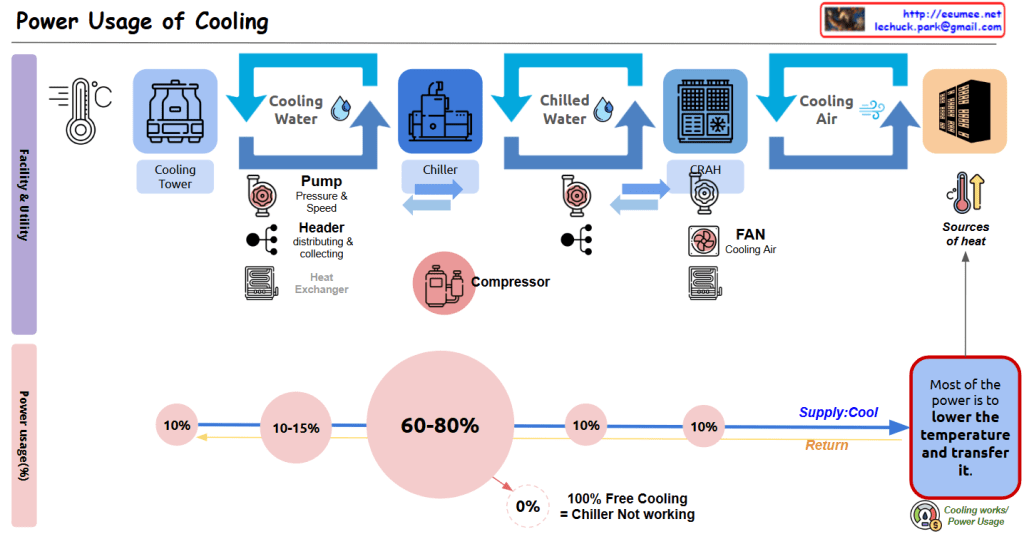
This diagram illustrates the cooling system configuration of a data center and the power consumption proportions of each component.
Cooling Facility Stages:
Several auxiliary devices operate in this process:
Cooling Facility Power Usage Proportions:
Purpose of Energy Usage (Efficiency):
This data center cooling system diagram illustrates how cooling moves from Cooling Tower to Chiller to CRAH to server racks, with compressors consuming the majority (60-80%) of power usage, followed by pumps (10-15%) and other components (10% each). The system primarily functions to lower temperatures and transfer heat, with the important insight that 100% free cooling eliminates the need for chillers, potentially saving significant energy.
With Claude

The diagram illustrates a blockchain-based AI service system where:
The arrows indicate connections or transactions between these components through the blockchain.
This appears to be illustrating a system where personal AI agents serve different user types (shoppers, cooks, farmers) with their transactions recorded on a blockchain.
With Claude

MCP (Model Context Protocol) is a conversion interface designed to enable LLMs (Large Language Models) to effectively interact with external resources. This protocol transforms text-format queries into API calls to access specific resources, allowing LLMs to provide more accurate and useful responses.
With Claude


“마왕, 우리가 이겼다.
그대에게 부르며 행진했다.“
누군가의 자취에 감사합니다.
