Prediction with data

This image illustrates a comparison between two approaches for Prediction with Data.

Left Side: Traditional Approach (Setup First Configuration)

The traditional method consists of:

  • Condition: 3D environment and object locations
  • Rules: Complex physics laws
  • Input: 1+ cases
  • Output: 1+ prediction results

This approach relies on pre-established rules and physical laws to make predictions.

Right Side: Modern AI/Machine Learning Approach

The modern method follows these steps:

  1. Huge Data: Massive datasets represented in binary code
  2. Machine Learning: Pattern learning from data
  3. AI Model: Trained artificial intelligence model
  4. Real-Time High Resolution Data: High-quality data streaming in real-time
  5. Prediction Anomaly: Final predictions and anomaly detection

Key Differences

The most significant difference is highlighted by the question “Believe first ??” at the bottom. This represents a fundamental philosophical difference: the traditional approach starts by “believing” in predefined rules, while the AI approach learns patterns from data to make predictions.

Additionally, the AI approach features “Longtime Learning Verification,” indicating continuous model improvement through ongoing learning and validation processes.

The diagram effectively contrasts rule-based prediction systems with data-driven machine learning approaches, showing the evolution from deterministic, physics-based models to adaptive, learning-based AI systems.

With Claude

Monitoring is from changes

Change-Based Monitoring System Analysis

This diagram illustrates a systematic framework for “Monitoring is from changes.” The approach demonstrates a hierarchical structure that begins with simple, certain methods and progresses toward increasingly complex analytical techniques.

Flow of Major Analysis Stages:

  1. One Change Detection:
    • The most fundamental level, identifying simple fluctuations such as numerical changes (5→7).
    • This stage focuses on capturing immediate and clear variations.
  2. Trend Analysis:
    • Recognizes data patterns over time.
    • Moves beyond single changes to understand the directionality and flow of data.
  3. Statistical Analysis:
    • Employs deeper mathematical approaches to interpret data.
    • Utilizes means, variances, correlations, and other statistical measures to derive meaning.
  4. Deep Learning:
    • The most sophisticated analysis stage, using advanced algorithms to discover hidden patterns.
    • Capable of learning complex relationships from large volumes of data.

Evolution Flow of Detection Processes:

  1. Change Detection:
    • The initial stage of detecting basic changes occurring in the system.
    • Identifies numerical variations that deviate from baseline values (e.g., 5→7).
    • Change detection serves as the starting point for the monitoring process and forms the foundation for more complex analyses.
  2. Anomaly Detection:
    • A more advanced form than change detection, identifying abnormal data points that deviate from general patterns or expected ranges.
    • Illustrated in the diagram with a warning icon, representing early signs of potential issues.
    • Utilizes statistical analysis and trend data to detect phenomena outside the normal range.
  3. Abnormal (Error) Detection:
    • The most severe level of detection, identifying actual errors or failures within the system.
    • Shown in the diagram with an X mark, signifying critical issues requiring immediate action.
    • May be classified as a failure when anomaly detection persists or exceeds thresholds.

Supporting Functions:

  • Adding New Relative Data: Continuously collecting relevant data to improve analytical accuracy.
  • Higher Resolution: Utilizing more granular data to enhance analytical precision.

This framework demonstrates a logical progression from simple and certain to gradually more complex analyses. The hierarchical structure of the detection process—from change detection through anomaly detection to error detection—shows how monitoring systems identify and respond to increasingly serious issues.

With Claude

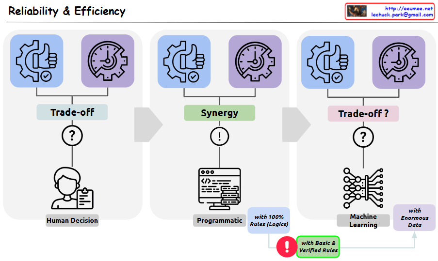
Reliability & Efficiency

This image is a diagram showing the relationship between Reliability and Efficiency. Three different decision-making approaches are compared:

  1. First section – “Trade-off”:
    • Shows Human Decision making
    • Indicates there is a trade-off relationship between reliability and efficiency
    • Displays a question mark (?) symbol representing uncertainty
  2. Second section – “Synergy”:
    • Shows a Programmatic approach
    • Labeled as using “100% Rules (Logic)”
    • Indicates there is synergy between reliability and efficiency
    • Features an exclamation mark (!) symbol representing certainty
  3. Third section – “Trade-off?”:
    • Shows a Machine Learning approach
    • Labeled as using “Enormous Data”
    • Questions whether the relationship between reliability and efficiency is again a trade-off
    • Displays a question mark (?) symbol representing uncertainty

Importantly, the “Basic & Verified Rules” section at the bottom presents a solution to overcome the indeterminacy (probabilistic nature and resulting trade-offs) of machine learning. It emphasizes that the rules forming the foundation of machine learning systems should be simple and clearly verifiable. By applying these basic and verified rules, the uncertainty stemming from the probabilistic nature of machine learning can be reduced, suggesting an improved balance between reliability and efficiency.

with Claude

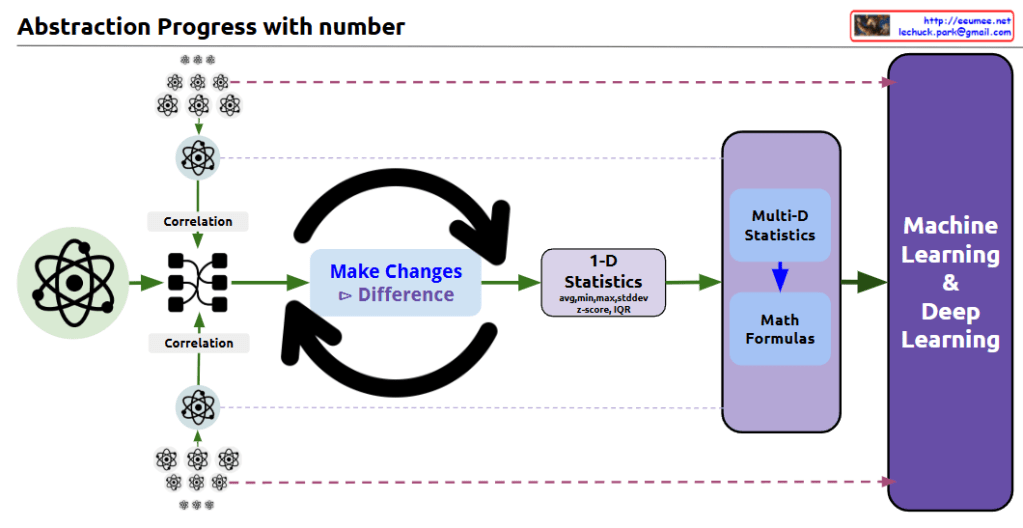
Abstraction Progress with number

With Claude
this diagram shows the progression of data abstraction leading to machine learning:

  1. The process begins with atomic/molecular scientific symbols, representing raw data points.
  2. The first step shows ‘Correlation’ analysis, where relationships between multiple data points are mapped and connected.
  3. In the center, there’s a circular arrow system labeled ‘Make Changes’ and ‘Difference’, indicating the process of analyzing changes and differences in the data.
  4. This leads to ‘1-D Statistics’, where basic statistical measures are calculated, including:
    • Average
    • Median
    • Standard deviation
    • Z-score
    • IQR (Interquartile Range)
  5. The next stage incorporates ‘Multi-D Statistics’ and ‘Math Formulas’, representing more complex statistical analysis.
  6. Finally, everything culminates in ‘Machine Learning & Deep Learning’.

The diagram effectively illustrates the data science abstraction process, showing how it progresses from basic data points through increasingly complex analyses to ultimately reach machine learning and deep learning applications.

The small atomic symbols at the top and bottom of the diagram visually represent how multiple data points are processed and analyzed through this system. This shows the scalability of the process from individual data points to comprehensive machine learning systems.

The overall flow demonstrates how raw data is transformed through various statistical and mathematical processes to become useful input for advanced machine learning algorithms. CopyRet

ARIMA

From Claude with some prompting
The image depicts the Autoregressive Integrated Moving Average (ARIMA) Integrated Moving Average Model, which is a time series forecasting technique.

The main components are:

  1. AR (Autoregressive):
    • This component models the past pattern in the data.
    • It performs regression analysis on the historical data.
  2. I (Integrated):
    • This component handles the non-stationarity in the time series data.
    • It applies differencing to make the data stationary.
  3. MA (Moving Average):
    • This component uses the past error terms to calculate the current forecast.
    • It applies a moving average to the error terms.

The flow of the model is as follows:

  1. Past Pattern: The historical data patterns are analyzed.
  2. Regression: The past patterns are used to perform regression analysis.
  3. Difference: The non-stationary data is made stationary through differencing.
  4. Applying Weights + Sliding Window: The regression analysis and differencing are combined, with a sliding window used to update the model.
  5. Prediction: The model generates forecasts based on the previous steps.
  6. Stabilization: The forecasts are stabilized and smoothed.
  7. Remove error: The model removes any remaining error from the forecasts, bringing them closer to the true average.

The diagram also includes visual representations of the forecast output, showing both upward and downward trends.

Overall, this ARIMA model integrates autoregressive, differencing, and moving average components to provide accurate time series forecasts while handling non-stationarity in the data.

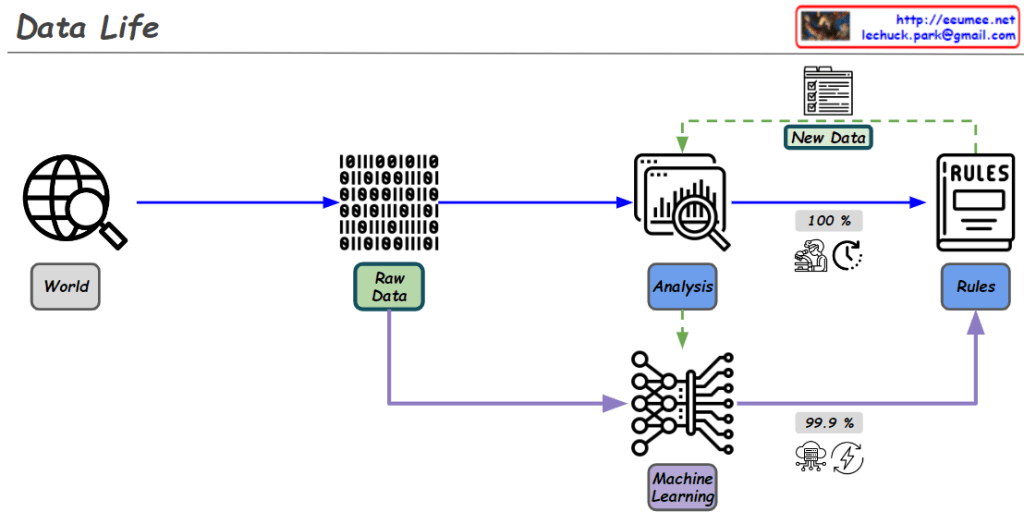
Data Life

From ChatGPT with some prompting
reflecting the roles of human research and AI/machine learning in the data process:

Diagram Explanation :

  1. World:
    • Data is collected from the real world. This could be information from the web, sensor data, or other sources.
  2. Raw Data:
    • The collected data is in its raw, unprocessed form. It is prepared for analysis and processing.
  3. Analysis:
    • The data is analyzed to extract important information and patterns. During this process, rules are created.
  4. Rules Creation:
    • This step is driven by human research.
    • The human research process aims for logical and 100% accurate rules.
    • These rules are critical for processing and analyzing data with complete accuracy. For example, creating clear criteria for classifying or making decisions based on the data.
  5. New Data Generation:
    • New data is generated during the analysis process, which can be used for further analysis or to update existing rules.
  6. Machine Learning:
    • In this phase, AI models (rules) are trained using the data.
    • AI/machine learning goes beyond human-defined rules by utilizing vast amounts of data through computing power to achieve over 99% accuracy in predictions.
    • This process relies heavily on computational resources and energy, using probabilistic models to derive results from the data.
    • For instance, AI can identify whether an image contains a cat or a dog with over 99% accuracy based on the data it has learned from.

Overall Flow Summary :

  • Human research establishes logical rules that are 100% accurate, and these rules are essential for precise data processing and analysis.
  • AI/machine learning complements these rules by leveraging massive amounts of data and computing power to find high-probability results. This is done through probabilistic models that continuously improve and refine predictions over time.
  • Together, these two approaches enhance the effectiveness and accuracy of data processing and prediction.

This diagram effectively illustrates how human logical research and AI-driven data learning work together in the data processing lifecycle.

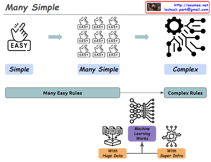
Many Simple with THE AI

From Claude with some prompting
This image illustrates the concept of “Many Simple” and demonstrates how simple elements combine to create complexity.

  1. Top diagram:
    • “Simple”: Starts with a single “EASY” icon.
    • “Many Simple”: Shows multiple “EASY” icons grouped together.
    • “Complex”: Depicts a system of intricate gears and connections.
  2. Bottom diagram:
    • Shows the progression from “Many Easy Rules” to “Complex Rules”.
    • Centers around the concept of “Machine Learning Works”.
    • This is supported by “With Huge Data” and “With Super Infra”.

The image provides a simplified explanation of how machine learning operates. It visualizes the process of numerous simple rules being processed through massive amounts of data and powerful infrastructure to produce complex systems.