Evolution … Changes

Evolution and Changes: Navigating Through Transformation

Overview:

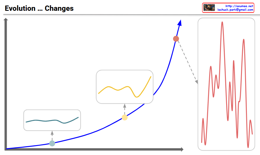
Main Graph (Blue Curve)

  • Shows the pattern of evolutionary change transitioning from gradual growth to exponential acceleration over time
  • Three key developmental stages are marked with distinct points

Three-Stage Development Process:

Stage 1: Initial Phase (Teal point and box – bottom left)

  • Very gradual and stable changes
  • Minimal volatility with a flat curve
  • Evolutionary changes are slow and predictable
  • Response Strategy: Focus on incremental improvements and stable maintenance

Stage 2: Intermediate Phase (Yellow point and box – middle)

  • Fluctuations begin to emerge
  • Volatility increases but remains limited
  • Transitional period showing early signs of change
  • Response Strategy: Detect change signals and strengthen preparedness

Stage 3: Turbulent Phase (Red point and box on right – top)

  • Critical turning point where exponential growth begins
  • Volatility maximizes with highly irregular and large-amplitude changes
  • The red graph on the right details the intense and frequent fluctuations during this period
  • Characterized by explosive and unpredictable evolutionary changes
  • Response Imperative: Rapid and flexible adaptation is essential for survival in the face of high volatility and dramatic shifts

Key Message:

Evolution progresses through stable initial phases → emerging changes in the intermediate period → explosive transformation in the turbulent phase. During the turbulent phase, volatility peaks, making the ability to anticipate and actively respond critical for survival and success. Traditional stable approaches become obsolete; rapid adaptation and innovative transformation become essential.


#Evolution #Change #Transformation #Adaptation #Innovation #DigitalTransformation

With Claude

AI Workload

This image visualizes the three major AI workload types and their characteristics in a comprehensive graph.

Graph Structure Analysis

Visualization Framework:

  • Y-axis: AI workload intensity (requests per hour, FLOPS, CPU/GPU utilization, etc.)
  • X-axis: Time progression
  • Stacked Area Chart: Shows the proportion and changes of three workload types within the total AI system load

Three AI Workload Characteristics

1. Learning – Blue Area

Properties: Steady, Controllable, Planning

  • Located at the bottom with a stable, wide area
  • Represents model training processes with predictable and plannable resource usage
  • Maintains consistent load over extended periods

2. Reasoning – Yellow Area

Properties: Fluctuating, Unpredictable, Optimizing!!!

  • Middle layer showing dramatic fluctuations
  • Involves complex decision-making and logical reasoning processes
  • Most unpredictable workload requiring critical optimization
  • Load varies significantly based on external environmental changes

3. Inference – Green Area

Properties: On-device Side, Low Latency

  • Top layer with irregular patterns
  • Executes on edge devices or user terminals
  • Service workload requiring real-time responses
  • Low latency is the core requirement

Key Implications

Differentiated Resource Management Strategies Required:

  • Learning: Stable long-term planning and infrastructure investment
  • Reasoning: Dynamic scaling and optimization technology focus
  • Inference: Edge optimization and response time improvement

This graph provides crucial insights demonstrating that customized resource allocation strategies considering the unique characteristics of each workload type are essential for effective AI system operations.

This visualization emphasizes that AI workloads are not monolithic but consist of distinct components with varying demands, requiring sophisticated resource management approaches to handle their collective and individual requirements effectively.

With Claude

Monitoring is from changes

Change-Based Monitoring System Analysis

This diagram illustrates a systematic framework for “Monitoring is from changes.” The approach demonstrates a hierarchical structure that begins with simple, certain methods and progresses toward increasingly complex analytical techniques.

Flow of Major Analysis Stages:

  1. One Change Detection:
    • The most fundamental level, identifying simple fluctuations such as numerical changes (5→7).
    • This stage focuses on capturing immediate and clear variations.
  2. Trend Analysis:
    • Recognizes data patterns over time.
    • Moves beyond single changes to understand the directionality and flow of data.
  3. Statistical Analysis:
    • Employs deeper mathematical approaches to interpret data.
    • Utilizes means, variances, correlations, and other statistical measures to derive meaning.
  4. Deep Learning:
    • The most sophisticated analysis stage, using advanced algorithms to discover hidden patterns.
    • Capable of learning complex relationships from large volumes of data.

Evolution Flow of Detection Processes:

  1. Change Detection:
    • The initial stage of detecting basic changes occurring in the system.
    • Identifies numerical variations that deviate from baseline values (e.g., 5→7).
    • Change detection serves as the starting point for the monitoring process and forms the foundation for more complex analyses.
  2. Anomaly Detection:
    • A more advanced form than change detection, identifying abnormal data points that deviate from general patterns or expected ranges.
    • Illustrated in the diagram with a warning icon, representing early signs of potential issues.
    • Utilizes statistical analysis and trend data to detect phenomena outside the normal range.
  3. Abnormal (Error) Detection:
    • The most severe level of detection, identifying actual errors or failures within the system.
    • Shown in the diagram with an X mark, signifying critical issues requiring immediate action.
    • May be classified as a failure when anomaly detection persists or exceeds thresholds.

Supporting Functions:

  • Adding New Relative Data: Continuously collecting relevant data to improve analytical accuracy.
  • Higher Resolution: Utilizing more granular data to enhance analytical precision.

This framework demonstrates a logical progression from simple and certain to gradually more complex analyses. The hierarchical structure of the detection process—from change detection through anomaly detection to error detection—shows how monitoring systems identify and respond to increasingly serious issues.

With Claude

AI DC Changes

The evolution of AI data centers has progressed through the following stages:

  1. Legacy – The initial form of data centers, providing basic computing infrastructure.
  2. Hyperscale – Evolved into a centralized (Centric) structure with these characteristics:
    • Led by Big Tech companies (Google, Amazon, Microsoft, etc.)
    • Focused on AI model training (Learning) with massive computing power
    • Concentration of data and processing capabilities in central locations
  3. Distributed – The current evolutionary direction with these features:
    • Expansion of Edge/On-device computing
    • Shift from AI training to inference-focused operations
    • Moving from Big Tech centralization to enterprise and national data sovereignty
    • Enabling personalization for customized user services

This evolution represents a democratization of AI technology, emphasizing data sovereignty, privacy protection, and the delivery of optimized services tailored to individual users.

AI data centers have evolved from legacy systems to hyperscale centralized structures dominated by Big Tech companies focused on AI training. The current shift toward distributed architecture emphasizes edge/on-device computing, inference capabilities, data sovereignty for enterprises and nations, and enhanced personalization for end users.

with Claude

Abstraction Progress with number

With Claude
this diagram shows the progression of data abstraction leading to machine learning:

  1. The process begins with atomic/molecular scientific symbols, representing raw data points.
  2. The first step shows ‘Correlation’ analysis, where relationships between multiple data points are mapped and connected.
  3. In the center, there’s a circular arrow system labeled ‘Make Changes’ and ‘Difference’, indicating the process of analyzing changes and differences in the data.
  4. This leads to ‘1-D Statistics’, where basic statistical measures are calculated, including:
    • Average
    • Median
    • Standard deviation
    • Z-score
    • IQR (Interquartile Range)
  5. The next stage incorporates ‘Multi-D Statistics’ and ‘Math Formulas’, representing more complex statistical analysis.
  6. Finally, everything culminates in ‘Machine Learning & Deep Learning’.

The diagram effectively illustrates the data science abstraction process, showing how it progresses from basic data points through increasingly complex analyses to ultimately reach machine learning and deep learning applications.

The small atomic symbols at the top and bottom of the diagram visually represent how multiple data points are processed and analyzed through this system. This shows the scalability of the process from individual data points to comprehensive machine learning systems.

The overall flow demonstrates how raw data is transformed through various statistical and mathematical processes to become useful input for advanced machine learning algorithms. CopyRet

Metric

From Claude with some prompting
the diagram focuses on considerations for a single metric:

  1. Basic Metric Components
  • Point: Measurement point (where it’s collected)
  • Number: Actual measured values (4,5,5,8,4,3,4)
  • Precision: Accuracy of measurement
  1. Time Characteristics
  • Time Series Data: Collected in time series format
  • Real Time Streaming: Real-time streaming method
  • Sampling Rate: How many measurements per second
  • Resolution: Time resolution
  1. Change Detection
  • Changes: Value variations
    • Range: Acceptable range
    • Event: Notable changes
  • Delta: Change from previous value (new-old)
  • Threshold: Threshold settings
  1. Quality Management
  • No Data: Missing data state
  • Delay: Data latency state
  • With All Metrics: Correlation with other metrics
  1. Pattern Analysis
  • Long Time Pattern: Long-term pattern existence
  • Machine Learning: Pattern-based learning potential

In summary, this diagram comprehensively shows key considerations for a single metric:

  • Collection method (how to gather)
  • Time characteristics (how frequently to collect)
  • Change detection (what changes to note)
  • Quality management (how to ensure data reliability)
  • Utilization approach (how to analyze and use)

These aspects form the fundamental framework for understanding and implementing a single metric in a monitoring system.

optimization

From Claude with some prompting

  1. “Just look (the average of usage)”:
    • This stage shows a simplistic view of usage based on rough averages.
    • The supply (green arrow) is generously provided based on this average usage.
    • Actual fluctuations in usage are not considered at this point.
  2. “More Details of Usages”:
    • Upon closer inspection, continuous variations in actual usage are discovered.
    • The red dotted circle highlights these subtle fluctuations.
    • At this stage, variability is recognized but not yet addressed.
  3. “Optimization”:
    • After recognizing the variability, optimization is attempted based on peak usage.
    • The dashed green arrow indicates the supply level set to meet maximum usage.
    • Light green arrows show excess supply when actual usage is lower.
  4. “Changes of usage”:
    • Over time, usage variability increases significantly.
    • The red dotted circle emphasizes this increased volatility.
  5. “Unefficient”:
    • This demonstrates how maintaining a constant supply based on peak usage becomes inefficient when faced with high variability.
    • The orange shaded area visualizes the large gap between actual usage and supply, indicating the degree of inefficiency.
  6. “Optimization”:
    • Finally, optimization is achieved through flexible supply that adapts to actual usage patterns.
    • The green line closely matching the orange line (usage) shows supply being adjusted in real-time to match usage.
    • This approach minimizes oversupply and efficiently responds to fluctuating demand.

This series illustrates the progression from a simplistic average-based view, through recognition of detailed usage patterns, to peak-based optimization, and finally to flexible supply optimization that matches real-time demand. It demonstrates the evolution towards a more efficient and responsive resource management approach.