Easy Prediction

From Claude with some prompting
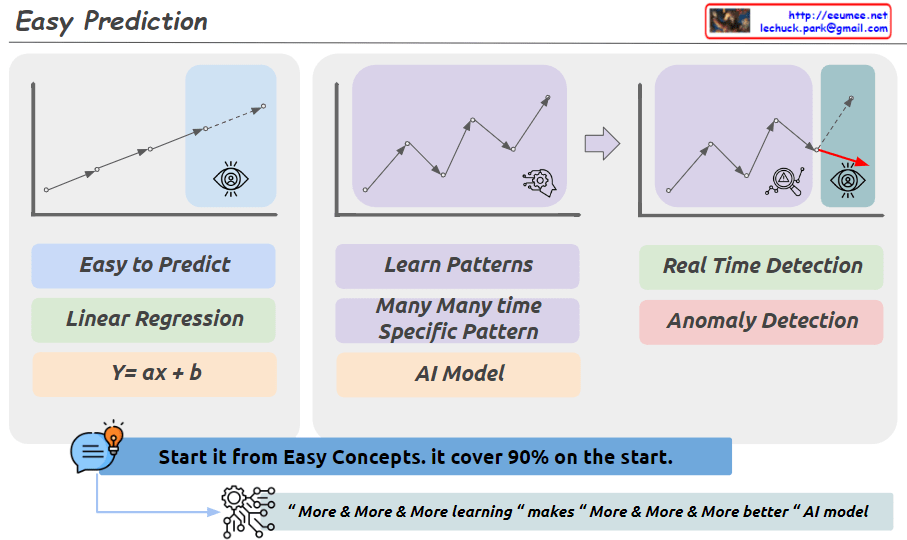
This image illustrates three main approaches to prediction and pattern recognition.

First, for easy prediction, a linear regression model (Linear Regression, y=ax+b) can be used. This is represented by a simple upward trendline. While a basic concept, it is emphasized that this can cover 90% of cases.

Second, for learning complex patterns that recur over time, an AI model is required. This is depicted by the jagged line shape.

Third, for real-time anomaly detection, sudden spike patterns need to be identified.

Additionally, at the bottom of the image, a new phrase has been added: “More & More & More learning makes More & More & More better AI model.” This conveys the idea that as an AI model learns from more and more data, its performance continues to improve.

In summary, the image highlights a step-by-step approach: starting with simple concepts to build a foundation, then utilizing AI models to learn complex patterns, and continuously improving the models through ongoing data learning and training. The key emphasis is on starting with the basics, while recognizing the potential of advanced AI techniques when combined with extensive learning from data.

Why digitalization?

From Claude with some prompting
The image depicts the effects of digitalization in three distinct stages:

Stage 1: Long-Term Accumulated Efficiency Gains Initially, efforts towards digitalization, such as standardization, automation, system and data-based work, may not yield visible results for a considerable amount of time. However, during this period, continuous improvement and optimization gradually lead to an accumulation of efficiency gains.

Stage 2: Eventual Leaps Once the efforts from Stage 1 reach a critical point, significant performance improvements and innovative breakthroughs occur, backed by the experience and learning acquired. The previously accumulated data and process improvement know-how enable these sudden leaps forward.

Stage 3: Extensive Huge Upturn with Big Data & AI Through digitalization, big data is built, and when combined with artificial intelligence technologies, unprecedented and massive levels of performance can be achieved. Data-driven predictions and automated decision-making enable disruptive value creation across a wide range of domains.

Therefore, while the initial stage of digital transformation may seem to yield minimal visible gains, persevering with continuous efforts will allow the accumulation of experience and data, eventually opening up opportunities for rapid innovation and large-scale growth. The key is to maintain patience and commitment, as the true potential of digitalization can be unlocked through the combination of data and advanced technologies like AI.

the key components of a Mixture of Experts

From Claude with some prompting
This image illustrates the key components of a Mixture of Experts (MoE) model architecture. An MoE model combines the outputs of multiple expert networks to produce a final output.

The main components are:

  1. Expert Network: This represents a specialized neural network trained for a specific task or inputs. Multiple expert networks can exist in the architecture.
  2. Weighting Scheme: This component determines how to weight and combine the outputs from the different expert networks based on the input data.
  3. Routing Algorithm: This algorithm decides which expert network(s) should handle a given input based on the specific inputs. It essentially routes the input data to the appropriate expert(s).

The workflow is as follows: The specific inputs are fed into the routing algorithm (3), which decides which expert network(s) should process those inputs. The selected expert network(s) (1) process the inputs and generate outputs. The weighting scheme (2) then combines these expert outputs into a final output based on a small neural network.

The key idea is that different expert networks can specialize in different types of inputs or tasks, and the MoE architecture can leverage their collective expertise by routing inputs to the appropriate experts and combining their outputs intelligently.

Raster(pixel) vs Vector

From Claude with some prompting
This image compares raster (pixel) and vector graphics. On the left, there are two pixel-based images showing simple shapes. In the middle, there is a grid representing pixel data, with 0s and 1s likely indicating whether each pixel is on or off.

On the right side, there is a vector graphic representation of a line, which is defined by attributes like length, direction angle, and starting location coordinates. Vector graphics can be resized and zoomed smoothly without losing quality, as illustrated by the zoomed-in vector line on the far right.

The key difference highlighted is that raster images are composed of individual pixels, while vector graphics are based on mathematical equations defining shapes and lines, allowing for smooth scaling and rendering at any resolution. This comparison helps understand the fundamental differences between these two common digital graphic formats and their respective strengths.

TSDB flow for alerts

From Claude with some prompting
This image illustrates the flow and process of a Time Series Database (TSDB) system. The main components are:

Time Series Data: This is the input data stream containing time-stamped values from various sources or metrics.

Counting: It performs change detection on the incoming time series data to capture relevant events or anomalies.

Delta Value: The difference or change observed in the current value compared to a previous reference point, denoted as NOW() – previous value.

Time-series summary Value: Various summary statistics like MAX, MIN, and other aggregations are computed over the time window.

Threshold Checking: The delta values and other aggregations are evaluated against predefined thresholds for anomaly detection.

Alert: If any threshold conditions are violated, an alert is triggered to notify the monitoring system or personnel.

The process also considers correlations with other metrics for improved anomaly detection context. Additionally, AI-based techniques can derive new metrics from the existing data for enhanced monitoring capabilities.

In summary, this flow diagram represents the core functionality of a time series database focused on capturing, analyzing, and alerting on anomalies or deviations from expected patterns in real-time data streams.

Integration DC

From Claude with some prompting
This diagram depicts an architecture for data center (DC) infrastructure expansion and integrated operations management across multiple sites. The key features include:

  1. Integration and monitoring of comprehensive IT infrastructure at the site level, including networks, servers, storage, power, cooling, and security.
  2. Centralized management of infrastructure status, events, and alerts from each site through the “Integration & Alert Main” system.
  3. The central integration system collects diverse data from sites and performs data integration and analysis through the “Service Integration” layer:
    • Data integration, private networking, synchronization, and analysis of new applications
    • Inclusion of advanced AI-based data analytics capabilities
  4. Leveraging analysis results to support infrastructure system optimization and upgrade decisions at each site.
  5. Improved visibility, control, and efficiency over the entire DC infrastructure through centralized monitoring and integration.

This architecture enables unified management of distributed infrastructure resources in an expanded DC environment and enhances operational efficiency through data-driven optimization.

By consolidating monitoring and integrating data analytics, organizations can gain comprehensive insights, make informed decisions, and streamline operations across their distributed data center footprint.