Metric Monitoring Strategy

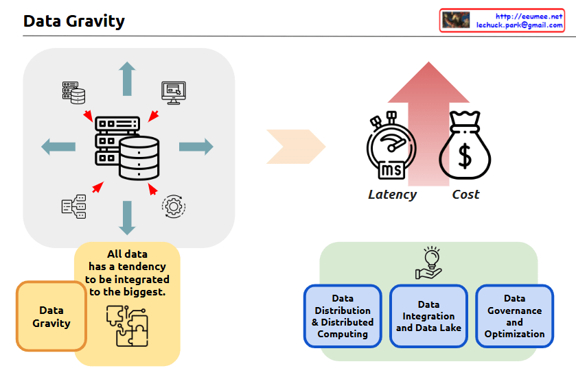
With a Claude’s Help
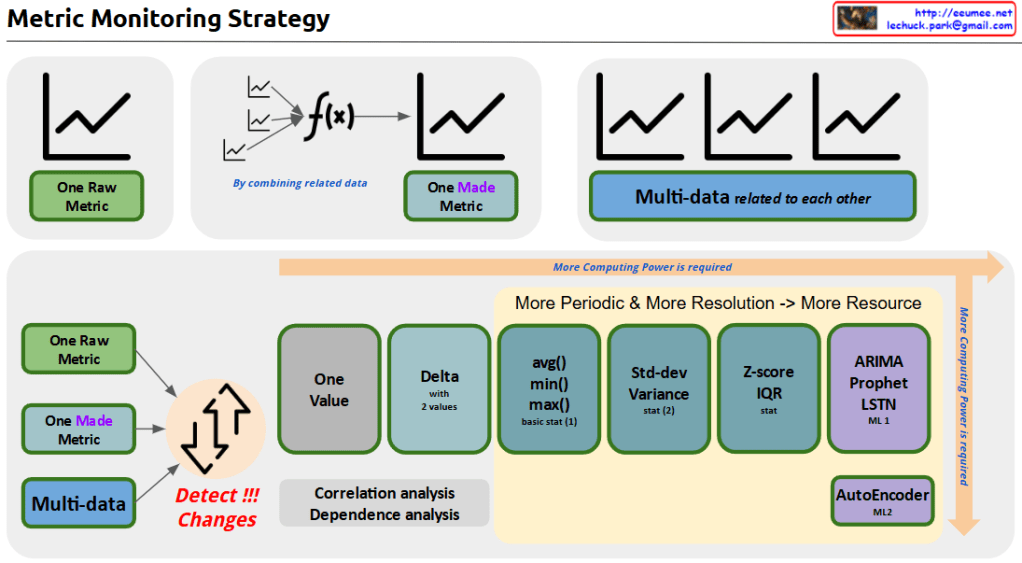
the Metric Monitoring System diagram:

  1. Data Hierarchy (Top)
  • Raw Metric: Unprocessed source data
  • Made Metric: Combined metrics from related data
  • Multi-data: Interrelated metrics sets
  1. Analysis Pipeline (Bottom)

Progressive Stages:

  • Basic: Change detection, single value, delta analysis
  • Intermediate: Basic statistics (avg/min/max), standard deviation
  • Advanced: Z-score/IQR
  • ML-based: ARIMA/Prophet, LSTM, AutoEncoder

Key Features:

  • Computing power increases with complexity (left to right)
  • Correlation and dependency analysis integration
  • Two-tier ML approach: ML1 (prediction), ML2 (pattern recognition)

Implementation Benefits:

  • Resource optimization through staged processing
  • Scalable analysis from basic monitoring to predictive analytics
  • Comprehensive anomaly detection
  • Flexible system adaptable to different monitoring needs

The system provides a complete framework from simple metric tracking to advanced machine learning-based analysis, enabling both reactive and predictive monitoring capabilities.

Additional Values:

  • Early warning system potential
  • Root cause analysis support
  • Predictive maintenance enablement
  • Resource allocation optimization
  • System health forecasting

This architecture supports both operational monitoring and strategic analysis needs while maintaining resource efficiency through its graduated approach to data processing.Copy

Data & Decision

with a Claude’s Help
This diagram illustrates the process of converting real-world analog values into actionable decisions through digital systems:

  1. Input Data Characteristics
  • Metric Value: Represents real-world analog values that are continuous variables with high precision. While these can include very fine digital measurements, they are often too complex for direct system processing.
  • Examples: Temperature, velocity, pressure, and other physical measurements
  1. Data Transformation Process
  • Through ‘Sampling & Analysis’, continuous Metric Values are transformed into meaningful State Values.
  • This represents the process of simplifying and digitalizing complex analog signals.
  1. State Value Characteristics and Usage
  • Converts to discrete variables with high readability
  • Examples: Temperature becomes ‘High/Normal/Low’, speed becomes ‘Over/Normal/Under’
  • These State values are much more programmable and easier to process in systems
  1. Decision Making and Execution
  • The simplified State values enable clear decision-making (Easy to Decision)
  • These decisions can be readily implemented through Programmatic Works
  • Leads to automated execution (represented by “DO IT!”)

The key concept here is the transformation of complex real-world measurements into clear, discrete states that systems can understand and process. This conversion facilitates automated decision-making and execution. The diagram emphasizes that while Metric Values provide high precision, State Values are more practical for programmatic implementation and decision-making processes.

The flow shows how we bridge the gap between analog reality and digital decision-making by converting precise but complex measurements into actionable, programmable states. This transformation is essential for creating reliable and automated decision-making systems.

Time Series Prediction : 3 types

with a Claude’s help
This image provides an overview of different time series prediction methods, including their characteristics and applications. The key points are:

ARIMA (Autoregressive Integrated Moving Average):

  • Suitable for linear, stable datasets where interpretability is important
  • Can be used for short-term stock price prediction and monthly energy consumption forecasting

Prophet:

  • A quick and simple forecasting method with clear seasonality and trend
  • Suitable for social media traffic and retail sales predictions

LSTM (Long Short-Term Memory):

  • Suitable for dealing with nonlinear, complex, large-scale, feature-rich datasets
  • Can be used for sensor data anomaly detection, weather forecasting, and long-term financial market prediction

Application in a data center context:

  • ARIMA: Can be used to predict short-term changes in server room temperature and power consumption
  • Prophet: Can be used to forecast daily, weekly, and monthly power usage patterns
  • LSTM: Can be used to analyze complex sensor data patterns and make long-term predictions

Utilizing these prediction models can contribute to energy efficiency improvements and proactive maintenance in data centers. When selecting a prediction method, one should consider the characteristics of the data and the specific forecasting requirements.

Data Gravity

With Claude’s help
The image is titled “Data Gravity” and it appears to be an infographic or diagram that illustrates some key concepts related to data and data management.

The central part of the image shows a set of icons and arrows, depicting how “all data has a tendency to be integrated to the biggest” – this is the concept of “Data Gravity” mentioned in the title.

The image also highlights three key factors related to data:

  1. Latency – Represented by a stopwatch icon, indicating the time or delay factor involved in data processing and movement.
  2. Cost – Represented by a money bag icon, indicating the financial considerations around data management and processing.
  3. Data Gravity – This concept is explained in the yellow box, where it states that “all data has a tendency to be integrated to the biggest.”

The image also shows three main components related to data management:

  1. Data Distribution & Distributed Computing
  2. Data Integration and Data Lake
  3. Data Governance and Optimization

These three components are depicted in the bottom half of the image, illustrating the different aspects of managing and working with data.

Overall, the image seems to be providing a high-level overview of key concepts and considerations around data management, with a focus on the idea of “Data Gravity” and how it relates to factors like latency, cost, and the various data management practices.

Operating with a dev Platform

with a Claude’s help
The main points covered in this image are:

  1. Increased Size and Complexity of Data
  • The central upward-pointing arrow indicates that the size and complexity of data is increasing.
  1. Key Operational Objectives
  • The three main operational goals presented are Stability, Efficiency, and an “Unchangeable Objective”.
  • Stability is represented by the 24/7 icon, indicating the need for continuous, reliable operation.
  • Efficiency is depicted through various electrical/mechanical icons, suggesting the need for optimized resource utilization.
  • The “Unchangeable Objective” is presented as a non-negotiable goal.
  1. Integration, Digital Twin, and AI-based Development Platform
  • To manage the increasing data and operations, the image shows the integration of technologies like Digital Twin.
  • An AI-powered Development Platform is also illustrated, which can “make it [the operations] itself with experience”.
  • This Development Platform seems to leverage AI to help achieve the stability, efficiency, and unchangeable objectives.
  1. Interconnected Elements
  • The image demonstrates the interconnected nature of the growing data, the key operational requirements, and the technological solutions.
  • The Development Platform acts as a hub, integrating data and AI capabilities to support the overall operational goals.

In summary, this image highlights the challenges posed by the increased size and complexity of data that organizations need to manage. It presents the core operational objectives of stability, efficiency, and immutable goals, and suggests that an integrated, AI-powered development platform can help address these challenges by leveraging the synergies between data, digital technologies, and autonomous problem-solving capabilities.

Evolutions

From Claude with some prompting
Summarize the key points from the image :

  1. Manually Control:
    • This stage involves direct human control of the system.
    • Human intervention and judgment are crucial at this stage.
  2. Data Driven:
    • This stage uses data analysis to control the system.
    • Data collection and analysis are the core elements.
  3. AI Control:
    • This stage leverages artificial intelligence technologies to control the system.
    • Technologies like machine learning and deep learning are utilized.
  4. Virtual:
    • This stage involves the implementation of systems in a virtual environment.
    • Simulation and digital twin technologies are employed.
  5. Massive Data:
    • This stage emphasizes the importance of collecting, processing, and utilizing vast amounts of data.
    • Technologies like big data and cloud computing are utilized.

Throughout this progression, there is a gradual shift towards automation and increased intelligence. The development of data and AI technologies plays a critical role, while the use of virtual environments and massive data further accelerates this technological evolution.

AI Prediction

From Claude with some prompting
This diagram illustrates an AI Prediction System workflow, which is divided into two main sections:

  1. Upper Section (VIEW):
  • Starts with a UI/UX interface
  • Executes queries with tags (metadata)
  • Connects to time series data storage
  • Displays data visualization charts
  • Includes model selection step
  • Finally generates prediction charts
  1. Lower Section (Automation):
  • Selected ID
  • Selected Model
  • Periodic, new tags and additional configuration
  • Batch work processing (consisting of 4 steps):
    1. Registering
    2. Read Data
    3. Generate Predictions
    4. Add Tag
  • Writing new time series data

The system provides two main functionalities:

  1. A user interface for direct data viewing and prediction execution
  2. Automated batch processing for periodic predictions and data updates

Key Components:

  • Time Series Data storage as a central database
  • View Chart for data visualization
  • Model Selection with time selection (learn & predict)
  • Predict Chart as the final output
  • Batch Works system for automated processing

The workflow demonstrates a comprehensive approach to handling both manual and automated AI predictions, combining user interaction with systematic data processing and analysis. The system appears designed to handle time series data efficiently while providing both immediate and scheduled prediction capabilities.