Data Life

From ChatGPT with some prompting
reflecting the roles of human research and AI/machine learning in the data process:

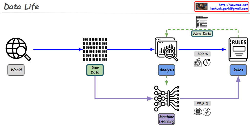
Diagram Explanation :

  1. World:
    • Data is collected from the real world. This could be information from the web, sensor data, or other sources.
  2. Raw Data:
    • The collected data is in its raw, unprocessed form. It is prepared for analysis and processing.
  3. Analysis:
    • The data is analyzed to extract important information and patterns. During this process, rules are created.
  4. Rules Creation:
    • This step is driven by human research.
    • The human research process aims for logical and 100% accurate rules.
    • These rules are critical for processing and analyzing data with complete accuracy. For example, creating clear criteria for classifying or making decisions based on the data.
  5. New Data Generation:
    • New data is generated during the analysis process, which can be used for further analysis or to update existing rules.
  6. Machine Learning:
    • In this phase, AI models (rules) are trained using the data.
    • AI/machine learning goes beyond human-defined rules by utilizing vast amounts of data through computing power to achieve over 99% accuracy in predictions.
    • This process relies heavily on computational resources and energy, using probabilistic models to derive results from the data.
    • For instance, AI can identify whether an image contains a cat or a dog with over 99% accuracy based on the data it has learned from.

Overall Flow Summary :

  • Human research establishes logical rules that are 100% accurate, and these rules are essential for precise data processing and analysis.
  • AI/machine learning complements these rules by leveraging massive amounts of data and computing power to find high-probability results. This is done through probabilistic models that continuously improve and refine predictions over time.
  • Together, these two approaches enhance the effectiveness and accuracy of data processing and prediction.

This diagram effectively illustrates how human logical research and AI-driven data learning work together in the data processing lifecycle.

Time Series Data

From Claude with some prompting
This image outlines the process of generating time series data:

  1. Signal Generation: A device produces the raw signal.
  2. Sampling: Converts continuous signal into discrete points.
  3. Digitization: Transforms sampled signal into binary code.
  4. Time Information Addition: Combines digital data with time information.
  5. Labeling/Tagging: Attaches additional descriptive information (e.g., point name, generating equipment, location) to each data point.

The final output is time series data in the format (Point label info, Value, Time), including descriptive information, measured value, and time for each data point. This process creates a comprehensive time series dataset that goes beyond simple numerical data, incorporating rich contextual information for each point.

Optimization 2

From Claude with some prompting
This image titled “Optimization II” illustrates the process of optimization between Supply and Usage. Here’s a comprehensive interpretation:

  1. The top shows a simple diagram depicting the basic relationship between Supply and Usage.
  2. The middle section presents graphs showing the fluctuations of Supply and Usage over time, comparing the states before and after optimization.
  3. The equation “Supply – Usage = Optimization Target” is provided, clearly defining the optimization goal.
  4. The bottom diagram illustrates the optimization process. It shows that optimization continues until the ‘Optimization Target Cost’ is less than the ‘Supply – Usage Cost’. This is to ensure that the cost of optimization doesn’t exceed the cost difference between supply and usage.
  5. The right-side graphs and explanation demonstrate that as the rate of change in usage increases (with high and low frequency), the need for optimization work becomes greater.
  6. The question “By What? By Manual? Software system?” is posed, prompting consideration of how to address this increased need for optimization – whether through manual processes or software systems.

Overall, this diagram emphasizes the importance of the optimization process between supply and usage, the efficiency of optimization costs, the increased need for optimization as usage patterns change, and the necessity to consider practical solutions for implementing these optimizations.

Time Series Data

From Claude with some prompting

  1. Raw Time Series Data:
    • Data Source: Sensors or meters operating 24/7, 365 days a year
    • Components: a. Point: The data point being measured b. Metric: The measurement value for each point c. Time: When the data was recorded
    • Format: (Point, Value, Time)
    • Additional Information: a. Config Data: Device name, location, and other setup information b. Tag Info: Additional metadata or classification information for the data
    • Characteristics:
      • Continuously updated based on status changes
      • Automatically changes over time
  2. Processed Time Series Data (2nd logical Data):
    • Processing Steps: a. ETL (Extract, Transform, Load) operations b. Analysis of correlations between data points (Point A and Point B) c. Data processing through f(x) function
      • Creating formulas through correlations using experience and AI learning
    • Result:
      • Generation of new data points
      • Includes original point, related metric, and time information
    • Characteristics:
      • Provides more meaningful and correlated information than raw data
      • Reflects relationships and influences between data points
      • Usable for more complex analysis and predictions

Through this process, Raw Time Series Data is transformed into more useful and insightful Processed Time Series Data. This aids in understanding data patterns and predicting future trends.

No More data

From Claude with some prompting
This image illustrates a flowchart about data and the learning process. Here’s a breakdown of the key elements:

  1. The title “No More Data” is at the top of the image.
  2. “Data in” section includes:
    • Experience: represented by a history icon
    • Number: shown as dice with 1, 2, 3
    • Text: represented by “IT” letters
    • Book: depicted by a book icon
    • Internet: symbolized by a global network icon
  3. These data sources feed into a “Learning & Learning” process, leading to a learning output represented by an icon resembling artificial intelligence or a brain.
  4. There’s a stage labeled “No More Data”, followed by the question “And the Next ??”
  5. Finally, there’s a lightbulb icon suggesting “New Creation?”

This diagram visualizes the process from data input to learning, and then poses the question of what happens when there’s no more data. It suggests the possibility of new creation as the next step. The flowchart prompts consideration of what follows after the learning phase when data input ceases, and whether this could lead to novel creation.

Optimization

From Claude with some prompting
This image illustrates the concept of “Optimization” through four graphs representing different optimization levels:

  1. Optimization Level 1: Shows basic usage and supply curves.
  2. Optimization Level 2: Similar to Level 1, but with supply (green arrows) managed more efficiently.
  3. Optimization Level 3: Demonstrates both usage and supply being managed more efficiently. Green arrows (supply) are adjusted at multiple points.
  4. Optimization Level 4: Usage and supply curves almost align, indicating optimal efficiency achieved.

In each graph, the orange line represents usage, while green arrows indicate supply. As the optimization level increases, the two lines become more aligned, showing improved efficiency.

The image title “Optimization” is at the top. The legend in the bottom left correctly shows that green arrows represent supply and orange arrows represent usage.

One Point

From Claude with some prompting
This image presents a concept diagram titled “One Point”. It illustrates the process from the smallest unit in the universe to human data collection.

Key elements include:

  1. “The Point”: Representing the smallest unit.
  2. “From the universe”:
    • Quantum: Symbolized by an atom icon
    • Energy: Depicted with a lightning bolt icon
  3. “Sensing”: Shown as a yellow arrow process
  4. “By Humans”:
    • “0 and 1”: Representing digital data
    • “Diff”: Likely indicating data processing
    • “Data”: The final output
  5. “gathering”: The process from 0 and 1 to Data

At the bottom, there’s an infinity symbol with the phrase “not much different (infinite by the view of micro & macro)”. This suggests little difference between microscopic and macroscopic perspectives.