Finding Rules

From Claude with some prompting
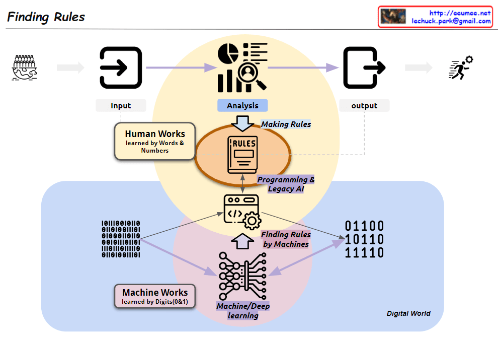
This image, titled “Finding Rules,” illustrates the contrast between two major learning paradigms:

  1. Traditional Human-Centric Learning Approach:
    • Represented by the upper yellow circle
    • “Human Works”: Learning through human language and numbers
    • Humans directly analyze data and create rules
    • Leads to programming and legacy AI systems
  2. Machine Learning (ML) Approach:
    • Represented by the lower pink circle
    • “Machine Works”: Learning through binary digits (0 and 1)
    • Based on big data
    • Uses machine/deep learning to automatically discover rules
    • “Finding Rules by Machines”: Machines directly uncover patterns and rules

The diagram showcases a paradigm shift:

  • Two coexisting methods in the process from input to output
  • Transition from human-generated rules to machine-discovered rules
  • Emphasis on data processing in the “Digital World”

Key components:

  • Input and Output: Marking the start and end of the process
  • Analysis: Central to both approaches
  • Rules: Now discoverable by both humans and machines
  • Programming & Legacy AI: Connected to the human-centric approach
  • Machine/Deep Learning: Core of the ML approach

This visualization effectively demonstrates the evolution in data analysis and rule discovery brought about by advancements in artificial intelligence and machine learning. It highlights the shift from converting data into human-readable formats for analysis to leveraging vast amounts of binary data for machine-driven rule discovery.

A series of decisions

From Claude with some prompting
The image depicts a diagram titled “A series of decisions,” illustrating a data processing and analysis workflow. The main stages are as follows:

  1. Big Data: The starting point for data collection.
  2. Gathering Domains by Searching: This stage involves searching for and collecting relevant data.
  3. Verification: A step to validate the collected data.
  4. Database: Where data is stored and managed. This stage includes “Select Betters” for data refinement.
  5. ETL (Extract, Transform, Load): This process involves extracting, transforming, and loading data, with a focus on “Select Combinations.”
  6. AI Model: The stage where artificial intelligence models are applied, aiming to find a “More Fit AI Model.”

Each stage is accompanied by a “Visualization” icon, indicating that data visualization plays a crucial role throughout the entire process.

At the bottom, there’s a final step labeled “Select Results with Visualization,” suggesting that the outcomes of the entire process are selected and presented through visualization techniques.

Arrows connect these stages, showing the flow from Big Data to the AI Model, with “Select Results” arrows feeding back to earlier stages, implying an iterative process.

This diagram effectively illustrates the journey from raw big data to refined AI models, emphasizing the importance of decision-making and selection at each stage of the data processing and analysis workflow.

Stability + Efficiency = Optimization

From Claude with some prompting
This image illustrates the concept of optimization, which is achieved through a balance between stability and efficiency.

  1. Stability:
    • Represented by the 24-hour clock icon, this refers to the consistency and reliability of a system over time.
  2. Efficiency:
    • Depicted by the gear/dollar sign icon, this represents the ability to maximize output or performance with minimal resources.
  3. Trade-off:
    • The central element shows the conflicting relationship between stability and efficiency.
    • Humans struggle to achieve both stability and efficiency simultaneously.
  4. Programmatic Automation:
    • The system icon suggests that automation or programmatic control can enable a “win-win” scenario, where both stability and efficiency can be optimized.
    • Systems have the capability to overcome the “trade-off” tendency that humans often exhibit.
  5. Optimization:
    • Represented by the gear and chart icon, this is the final, optimized state achieved through the balance of stability and efficiency.
    • By combining the human “trade-off” tendency and the system’s “win-win” capability, a more integrated optimization can be attained.

In summary, this image contrasts the differences between human and system approaches in the pursuit of optimization. By leveraging the strengths of both, the optimal balance between stability and efficiency can be achieved.

SCADA & EPMS

From Perplexity with some prompting
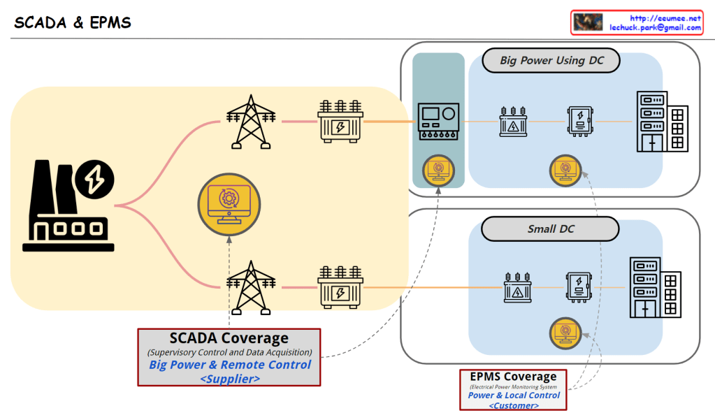
The image illustrates the roles and coverage of SCADA and EPMS systems in power management for data centers.

SCADA System

  • Target: Power Suppliers and Large Power Consumers (Big Power Using DC)
  • Role:
    • Power Suppliers: Remotely monitor and control infrastructure like power plants and substations to ensure the stability of large-scale power grids.
    • Large Data Centers: Manage complex power infrastructure and ensure stable power supply by utilizing some SCADA functionalities.
  • Coverage: Large power management and remote control

EPMS System

  • Target: Small Data Centers (Small DC)
  • Role:
    • Monitor and manage power usage within the data center to optimize energy efficiency.
    • Perform detailed local control of power management.
  • Coverage: Power monitoring and local control

Key Distinctions

  • SCADA focuses on large-scale power management and remote control, suitable for power suppliers and large consumers.
  • EPMS is used primarily in small data centers for optimizing energy consumption through local control.

In conclusion, large data centers benefit from using both SCADA and EPMS to effectively manage complex power infrastructures, while small data centers typically rely on EPMS for efficient energy management.

More abstracted Data & Bigger Error possibility

From Claude with some prompting
This image illustrates the data processing, analysis, and machine learning application process, emphasizing how errors can be amplified at each stage:

  1. Data Flow:
    • Starts with RAW data.
    • Goes through multiple ETL (Extract, Transform, Load) processes, transforming into new forms of data (“NEW”) at each stage.
    • Time information is incorporated, developing into statistical data.
    • Finally, it’s processed through machine learning techniques, evolving into more sophisticated new data.
  2. Error Propagation and Amplification:
    • Each ETL stage is marked with a “WHAT {IF.}” and a red X, indicating the possibility of errors.
    • Errors occurring in early stages propagate through subsequent stages, with their impact growing progressively larger, as shown by the red arrows.
    • The large red X at the end emphasizes how small initial errors can have a significant impact on the final result.
  3. Key Implications:
    • As the data processing becomes more complex, the quality and accuracy of initial data become increasingly crucial.
    • Thorough validation and preparation for potential errors at each stage are necessary.
    • Particularly for data used in machine learning models, initial errors can be amplified, severely affecting model performance, thus requiring extra caution.

This image effectively conveys the importance of data quality management in data science and AI fields, and the need for systematic preparation against error propagation. It highlights that as data becomes more abstracted and processed, the potential impact of early errors grows, necessitating robust error mitigation strategies throughout the data pipeline.