Memory Bound

This diagram illustrates the Memory Bound phenomenon in computer systems.

What is Memory Bound?

Memory bound refers to a situation where the overall processing speed of a computer is limited not by the computational power of the CPU, but by the rate at which data can be read from memory.

Main Causes:

  1. Large-scale Data Processing: Vast data volumes cause delays when loading data from storage devices (SSD/HDD) to DRAM
  2. Matrix Operations: Large matrices create delays in fetching data between cache, DRAM, and HBM (High Bandwidth Memory)
  3. Data Copying/Moving: Data transfer waiting times on the memory bus even within DRAM
  4. Cache Misses: When required data isn’t found in L1-L3 caches, causing slow main memory access to DRAM

Result

The Processing Elements (PEs) on the right have high computational capabilities, but the overall system performance is constrained by the slower speed of data retrieval from memory.

Summary:

Memory bound occurs when system performance is limited by memory access speed rather than computational power. This bottleneck commonly arises from large data transfers, cache misses, and memory bandwidth constraints. It represents a critical challenge in modern computing, particularly affecting GPU computing and AI/ML workloads where processing units often wait for data rather than performing calculations.

With Claude

STEP BY STEP

This image depicts a problem-solving methodology diagram titled “STEP by STEP.”

The diagram illustrates an efficient step-by-step approach to problem solving:

  1. “Do It First!! (Confirmation)” – This initial stage focuses on the fundamental and easy-to-solve portions (80%). The approach here emphasizes “Divide and conquer with MECE” (Mutually Exclusive, Collectively Exhaustive), “Logicalization,” and “Digitalization” as key perspectives for tackling problems.
  2. The second “DO IT” stage – This addresses the more complex portions (20%) and applies the same methodology used in the first stage.
  3. The third “DO IT” stage – This continues applying the methodologies from previous stages in an iterative process.

Each stage is divided into a 20% (blue) and 80% (green) ratio, demonstrating the application of the Pareto principle (80/20 rule). This suggests a strategy of first resolving the fundamental 80% of problems that are easier to solve, then approaching the more complex 20% using the same methodology.

The circular nodes and arrows at the top represent the progression of this sequential problem-solving process, with the red target icon in the upper left symbolizing the ultimate goal.

This methodology emphasizes a systematic approach to complex problems by breaking them down, addressing them logically, and digitalizing when necessary for efficient resolution.

With Claude

Basic Optimization

With a Claude
This Basic Optimization diagram demonstrates the principle of optimizing the most frequent tasks first:

  1. Current System Load Analysis:
  • Total Load: 54 X N (where N can extend to infinity)
  • Task Frequency Breakdown:
    • Red tasks: 23N (most frequent)
    • Yellow tasks: 13N
    • Blue tasks: 11N
    • Green tasks: 7N
  1. Optimization Strategy and Significance:
  • Priority: Optimize the most frequent task first (red tasks, 23N)
  • 0.4 efficiency improvement achieved on the highest frequency task
  • As N approaches infinity, the optimization effect grows exponentially
  • Calculation: 23 x 0.4 = 9.2 reduction in load per N
  1. Optimization Results:
  • Final Load: 40.2 X N (reduced from 54 X N)
  • Detailed calculation: (9.2 + 31) X N
    • 9.2: Load reduction from optimization
    • 31: Remaining task loads
  • Scale Effect Examples:
    • At N=100: 1,380 units reduced (5,400 → 4,020)
    • At N=1000: 13,800 units reduced (54,000 → 40,200)
    • At N=10000: 138,000 units reduced

The key insight here is that in a system where N can scale infinitely, optimizing the most frequent task (red) yields exponential benefits. This demonstrates the power of the “optimize the highest frequency first” principle – where focusing optimization efforts on the most common operations produces the greatest system-wide improvements. The larger N becomes, the more dramatic the optimization benefits become, making this a highly efficient approach to system optimization.

This strategy perfectly embodies the principle of “maximum impact with minimal effort” in system optimization, especially in scalable systems where N can grow indefinitely. 

synchronization

From Claude with some prompting
This diagram illustrates different types of synchronization methods. It presents 4 main types:

  1. Copy
  • A simple method where data from one side is made identical to the other
  • Characterized by “Make same thing”
  • One-directional data transfer
  1. Replications
  • A method that detects (“All Changes Sensing”) and reflects all changes
  • Continuous data replication occurs
  • Changes are sensed and reflected to maintain consistency
  1. Synchronization
  • A bi-directional method where both sides “Keep the Same”
  • Synchronization occurs through a central data repository
  • Both sides maintain identical states through mutual updates
  1. Process Synchronization
  • Synchronization between processes (represented by gear icons)
  • Features “Noti & Detect All Changes” mechanism
  • Uses a central repository for process synchronization
  • Ensures coordination between different processes

The diagram progressively shows how each synchronization method operates, from simple unidirectional copying to more complex bidirectional process synchronization. Each method is designed to maintain consistency of data or processes, but with different levels of complexity and functionality. The visual representation effectively demonstrates the flow and relationship between different components in each synchronization type.

The image effectively uses icons and arrows to show the direction and nature of data/process flow, making it easy to understand the different levels of synchronization complexity and their specific purposes in system design.

Service

From Claude with some prompting
The image is a diagram titled “Service” that illustrates two main processes:

  1. Top left: “Op. Process” (Operational Process)
    • Shown as a circular structure containing:
      • “Event!!”: Represented by an exclamation mark icon
      • “Operator”: Indicated by a person icon
      • “Processing”: Depicted by an icon of connected circles
    • This process is marked with “xN”, suggesting it can be repeated multiple times.
  2. Bottom left: “D/T Service” (presumably Data/Technology Service)
    • Also presented in a circular structure, including:
      • “Data”: Shown as a graph icon
      • “Analysis(Visual)”: Represented by a monitor icon with charts
      • “Program”: Depicted by a code or document icon
    • This process is also marked with “xN”, indicating repeatability.
  3. Right side: Integrated “Op. Process” and “D/T Service”
    • A larger circle contains the “Op. Process”, which in turn encompasses the “D/T Service”
    • Within the “D/T Service” circle, “Data Result” and “Operation” are connected by a bidirectional arrow.

This diagram appears to illustrate how operational processes and data/technology services interact and integrate, likely representing a data-driven operational and decision-making process.

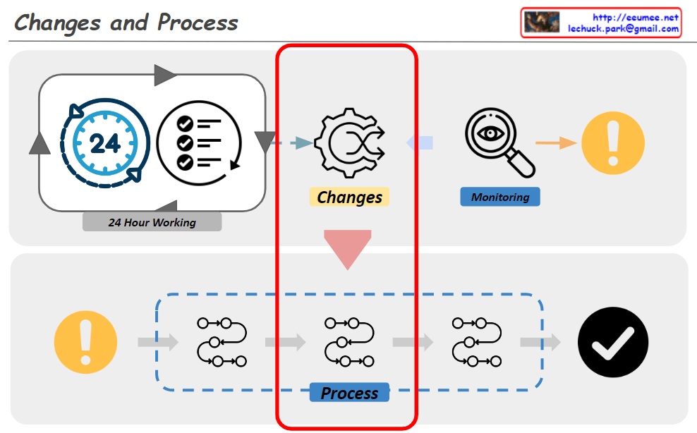
Changes -> Process

From Claude with some prompting
The diagram titled “Changes and Process” illustrates an organization’s system for detecting and responding to changes. The key components and flow are as follows:

  1. 24-Hour Working System:
    • Represented by a 24-hour clock icon and a checklist icon.
    • This indicates continuous monitoring and operation.
  2. Change Detection:
    • Depicted by a gear icon positioned centrally.
    • Captures changes occurring within the 24-hour working system.
  3. Monitoring:
    • Shown as a magnifying glass icon.
    • Closely observes and analyzes detected changes.
  4. Alert System:
    • Represented by an exclamation mark icon.
    • Signals important changes or issues that require attention.
  5. Response Process:
    • Illustrated as a flowchart with multiple stages.
    • Initiates when an alert is triggered and follows systematic steps to address the issue.
  6. Completion Verification:
    • Indicated by a checkmark icon.
    • Confirms the successful completion of the response process.

This system operates cyclically, continuously monitoring to detect changes and activating an immediate response process when necessary. This approach maintains the organization’s efficiency and stability. It demonstrates the organization’s ability to respond quickly and systematically to changing environments.

The diagram emphasizes the interconnectedness of continuous operation, change management, monitoring, and the execution of structured processes, all working together to ensure effective adaptation to changes.

Automation System

From Claude with some prompting
This image illustrates an Automation process, consisting of two main parts:

  1. Upper section:
    • Shows a basic automation process consisting of Condition and Action.
    • Real Data (Input) and Real Plan (Output) are fed into a Software System.
  2. Lower section:
    • Depicts a more complex automation process.
    • Alternates between manual operations (hand holding hammer icon) and software systems (screen with gear icon).
    • This represents the integration of manual tasks and automated systems.
    • Key features of the process:
      • Use of Accurate Verified Data
      • 24/7 Stable System operation
      • Continuous Optimization
    • Results: More Efficient process with Cost & Resource reduction

The hammer icon represents manual interventions, working in tandem with automated software systems to enhance overall process efficiency. This approach aims to achieve optimal results by combining human involvement with automation systems.

The image demonstrates how automation integrates real-world tasks with software systems to increase efficiency and reduce costs and resources.