Usage Evolutions : The Evolution of Human Tools and Knowledge Sharing

With a Claude’s Help
This diagram illustrates how humanity’s methods of sharing and expanding knowledge have evolved alongside the development of tools throughout history.

The Four Stages of Evolution

1. Experience-Based Era

  • Tool: Direct Human Experience
  • Characteristics: Knowledge sharing through face-to-face interactions based on personal experience
  • Limited scope of knowledge transfer and collaboration

2. Literature-Based Era

  • Tool: Books and Documents
  • Characteristics: Documentation of experiences and knowledge
  • Knowledge transfer possible across time and space

3. Internet-Based Era

  • Tool: Internet and Digital Platforms
  • Characteristics: Real-time information sharing and two-way communication
  • Formation of networks where multiple users simultaneously influence each other

4. AI-Based Era

  • Tool: Artificial Intelligence
  • Characteristics: Creation of new digital worlds through AI
  • Revolutionary expansion of knowledge creation, processing, and sharing

Key Characteristics of Evolution Process

  1. Increase in Data (More Data)
  • Exponential growth in the amount of information accumulated through each stage
  1. Enhanced Connectivity (More Connected)
  • Expansion of knowledge sharing networks
  • Dramatic increase in speed and scope of information transfer
  1. Increased Need for Verification (More Requires of Verification)
  • Growing demand for information reliability and accuracy
  • Heightened importance of data verification

This evolutionary process demonstrates more than just technological advancement; it shows fundamental changes in how humanity uses tools to expand and share knowledge. The emergence of new tools at each stage has enabled more effective and widespread knowledge sharing than before, becoming a key driving force in accelerating the development of human civilization.

This progression represents a continuous journey from individual experience-based learning to AI-enhanced global knowledge sharing, highlighting how each tool has revolutionized our ability to communicate, learn, and innovate as a species.

The evolution also underscores the increasing complexity and sophistication of our knowledge-sharing mechanisms, while emphasizing the growing importance of managing and verifying the ever-expanding volume of information available to us.

optimization

From Claude with some prompting

  1. “Just look (the average of usage)”:
    • This stage shows a simplistic view of usage based on rough averages.
    • The supply (green arrow) is generously provided based on this average usage.
    • Actual fluctuations in usage are not considered at this point.
  2. “More Details of Usages”:
    • Upon closer inspection, continuous variations in actual usage are discovered.
    • The red dotted circle highlights these subtle fluctuations.
    • At this stage, variability is recognized but not yet addressed.
  3. “Optimization”:
    • After recognizing the variability, optimization is attempted based on peak usage.
    • The dashed green arrow indicates the supply level set to meet maximum usage.
    • Light green arrows show excess supply when actual usage is lower.
  4. “Changes of usage”:
    • Over time, usage variability increases significantly.
    • The red dotted circle emphasizes this increased volatility.
  5. “Unefficient”:
    • This demonstrates how maintaining a constant supply based on peak usage becomes inefficient when faced with high variability.
    • The orange shaded area visualizes the large gap between actual usage and supply, indicating the degree of inefficiency.
  6. “Optimization”:
    • Finally, optimization is achieved through flexible supply that adapts to actual usage patterns.
    • The green line closely matching the orange line (usage) shows supply being adjusted in real-time to match usage.
    • This approach minimizes oversupply and efficiently responds to fluctuating demand.

This series illustrates the progression from a simplistic average-based view, through recognition of detailed usage patterns, to peak-based optimization, and finally to flexible supply optimization that matches real-time demand. It demonstrates the evolution towards a more efficient and responsive resource management approach.

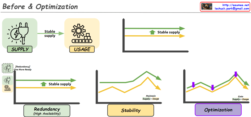
Before & Optimization

From Claude with some prompting
This image illustrates the process of “Before & Optimization” in a system, divided into three main stages:

  1. Initial State:
    • Shows “Supply” and “Usage” components.
    • Demonstrates a stable supply flowing to usage.
    • The graph indicates supply maintaining slightly above usage.
  2. Intermediate Stage:
    • Introduces “Redundancy (High Availability)”.
    • An additional supply unit labeled “One More Ready” is added.
    • The “Stability” graph shows supply consistently higher than usage, with the note “Maintain Supply > Usage”.
  3. Final Optimization Stage:
    • The “Optimization” graph shows supply and usage being closely aligned.
    • Purple arrows indicate adjustments to match supply with usage.
    • Labeled “Goto Supply = Usage”, showing the goal of matching supply to usage.

Overall, this image depicts the progression from ensuring stable supply, through adding redundancy for increased stability, to finally optimizing the system by matching supply closely with usage. It demonstrates the process of maintaining system stability while improving efficiency.