Golden Circle For DC Operation

From perplexity with some prompting
The image explains the “Golden Circle for DC Operation,” focusing on optimizing data center operations.

WHY: Data Center Operation Optimization

  • Purpose: To optimize the operation of data centers.
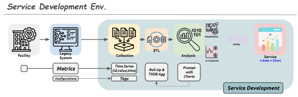
  • Service Development: Through data-driven processes, including monitoring, automation, tool development, and customer-focused services.

HOW: Consistent Process & Data Management

  • Method: Ensures reliable data through consistent processes and management.
  • Standardization: Achieved through data lists, hardware/software protocols, and service/process views and flows.

WHAT: Integrated Digital Operation Platform

  • Objective: To build an integrated digital operation platform.
  • Platform: Operator-led development that involves analysis, AI integration, and service creation.

This structure emphasizes efficiency, standardization, and a data-centric approach to data center operations.

optimization

From Claude with some prompting

  1. “Just look (the average of usage)”:
    • This stage shows a simplistic view of usage based on rough averages.
    • The supply (green arrow) is generously provided based on this average usage.
    • Actual fluctuations in usage are not considered at this point.
  2. “More Details of Usages”:
    • Upon closer inspection, continuous variations in actual usage are discovered.
    • The red dotted circle highlights these subtle fluctuations.
    • At this stage, variability is recognized but not yet addressed.
  3. “Optimization”:
    • After recognizing the variability, optimization is attempted based on peak usage.
    • The dashed green arrow indicates the supply level set to meet maximum usage.
    • Light green arrows show excess supply when actual usage is lower.
  4. “Changes of usage”:
    • Over time, usage variability increases significantly.
    • The red dotted circle emphasizes this increased volatility.
  5. “Unefficient”:
    • This demonstrates how maintaining a constant supply based on peak usage becomes inefficient when faced with high variability.
    • The orange shaded area visualizes the large gap between actual usage and supply, indicating the degree of inefficiency.
  6. “Optimization”:
    • Finally, optimization is achieved through flexible supply that adapts to actual usage patterns.
    • The green line closely matching the orange line (usage) shows supply being adjusted in real-time to match usage.
    • This approach minimizes oversupply and efficiently responds to fluctuating demand.

This series illustrates the progression from a simplistic average-based view, through recognition of detailed usage patterns, to peak-based optimization, and finally to flexible supply optimization that matches real-time demand. It demonstrates the evolution towards a more efficient and responsive resource management approach.

Service Development Env.

From Claude with some prompting
This image shows a diagram titled “Service Development Env.” (Service Development Environment). It illustrates the stages of a service development process:

  1. Facility: Represented by a building icon, serving as the starting point.
  2. Legacy System: Depicted by a computer screen icon.
  3. Collection: Shown as multiple document icons.
  4. ETL (Extract, Transform, Load): Represented by gear and database icons.
  5. Analysis: Indicated by a magnifying glass icon, including visualization and AI prediction capabilities.
  6. Deploy: Represented by a screen icon with charts, described as “Service = Data + Chart”.

The lower part of the diagram shows additional process steps:

  • Metrics: Includes Configurations.
  • Time Series: Stores data in (id, value, time) format.
  • Tags
  • Roll-Up & TSDB Agg (Time Series Database Aggregation)
  • Prompt with Charts

Overall, this diagram illustrates the entire service development process from data collection to analysis, visualization, and final service deployment. Each stage represents the steps of processing, storing, analyzing data, and ultimately delivering it to end-users.

The flow suggests a progression from legacy systems and facilities, through data collection and processing, to advanced analysis and deployment of data-driven services

Standardization & Platform Why?

From Claude with some prompting
This diagram illustrates the importance of standardization and platform development, highlighting two key objectives:

  1. Standardization:
    • Encompasses the stages from real work (machine and processing) through digitization, collecting, and verification.
    • Purpose: “Move on with data trust”
    • Meaning: By establishing standardized processes for data collection and verification, it ensures data reliability. This allows subsequent stages to proceed without concerns about data quality.
  2. Software Development Platform:
    • Includes analysis, improvement, and new development stages.
    • Purpose: “Make easy to improve & go to new”
    • Meaning: Building on standardized data and processes, the platform facilitates easier service improvements and new service development and expansion.

This structure offers several advantages:

  1. Data Reliability: Standardized processes for collection and verification ensure trustworthy data, eliminating concerns about data quality in later stages.
  2. Efficient Improvement and Innovation: With reliable data and a standardized platform, improving existing services or developing new ones becomes more straightforward.
  3. Scalability: The structure provides a foundation for easily adding new services or features.

In conclusion, this diagram visually represents two core strategies: establishing data reliability through standardization and enabling efficient service improvement and expansion through a dedicated platform. It emphasizes how standardization allows teams to trust and focus on using the data, while the platform makes it easier to improve existing services and develop new ones.

Changes -> Process

From Claude with some prompting
The diagram titled “Changes and Process” illustrates an organization’s system for detecting and responding to changes. The key components and flow are as follows:

  1. 24-Hour Working System:
    • Represented by a 24-hour clock icon and a checklist icon.
    • This indicates continuous monitoring and operation.
  2. Change Detection:
    • Depicted by a gear icon positioned centrally.
    • Captures changes occurring within the 24-hour working system.
  3. Monitoring:
    • Shown as a magnifying glass icon.
    • Closely observes and analyzes detected changes.
  4. Alert System:
    • Represented by an exclamation mark icon.
    • Signals important changes or issues that require attention.
  5. Response Process:
    • Illustrated as a flowchart with multiple stages.
    • Initiates when an alert is triggered and follows systematic steps to address the issue.
  6. Completion Verification:
    • Indicated by a checkmark icon.
    • Confirms the successful completion of the response process.

This system operates cyclically, continuously monitoring to detect changes and activating an immediate response process when necessary. This approach maintains the organization’s efficiency and stability. It demonstrates the organization’s ability to respond quickly and systematically to changing environments.

The diagram emphasizes the interconnectedness of continuous operation, change management, monitoring, and the execution of structured processes, all working together to ensure effective adaptation to changes.