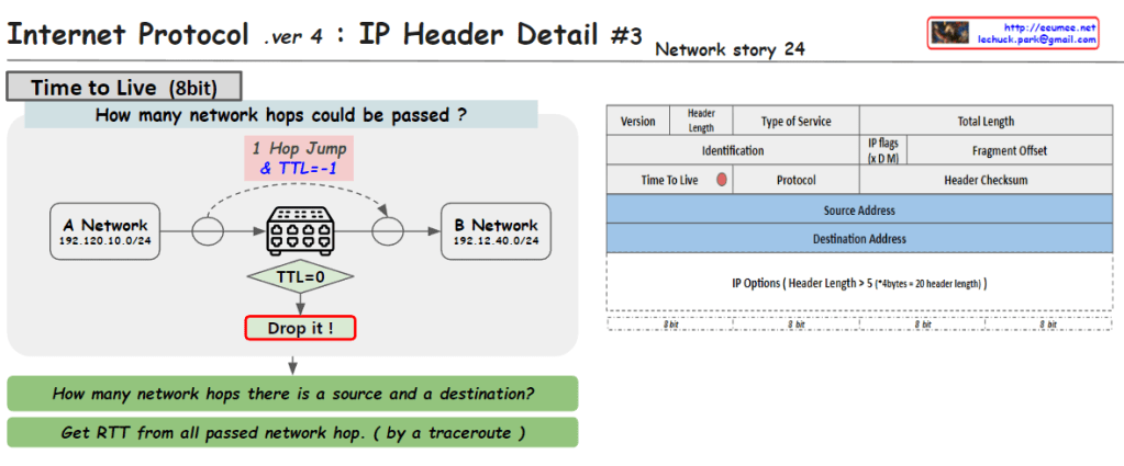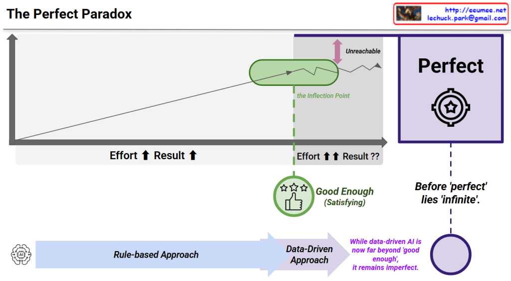
The Perfect Paradox – Analysis
This diagram illustrates “The Perfect Paradox”, explaining the relationship between effort and results. Here are the key concepts:
Graph Analysis
Axes:
- X-axis: Effort
- Y-axis: Result
Pattern:
- Initially, results increase proportionally with effort
- After the Inflection Point (green circle), dramatically increased effort yields minimal or even diminishing returns
- “Perfect” exists in an unreachable zone
Core Message
“Good Enough (Satisfying)”
- Located near the inflection point
- Represents the optimal effort-to-result ratio
The Central Paradox:
“Before ‘perfect’ lies ‘infinite’.”
This means achieving perfection requires infinite effort.
AI Connection
The bottom arrow shows the evolution of approaches:
- Rule-based Approach → Data-Driven Approach
Key Insight:
“While data-driven AI is now far beyond ‘good enough’, it remains imperfect.”
This suggests that modern AI achieves high performance, but pursuing practical utility is more rational than chasing perfection.
Summary
The Perfect Paradox shows that after a certain inflection point, exponentially more effort produces minimal improvement, making “perfect” practically unreachable. The optimal strategy is achieving “good enough” – the sweet spot where effort and results are balanced. Modern data-driven AI has surpassed “good enough” but remains imperfect, demonstrating that practical excellence trumps impossible perfection.
#PerfectParadox #DiminishingReturns #GoodEnough #EffortVsResults #PracticalExcellence #AILimitations #DataDrivenAI #InflectionPoint #OptimizationStrategy #PerfectionismVsPragmatism #ProductivityInsights #SmartEffort #AIPhilosophy #EfficiencyMatters #RealisticGoals